thanks and credit to
LilGoldWmn
http://www.sxc.hu/photo/844000 (5 years and 3332 days ago)

(5 years and 3335 days ago)
very bad idea lol
gl author
great!
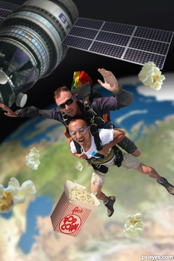
Those guys are very bright for being in space. Also the satelight is smaller than them so it looks as if they are jumping upwards. On top of that the popcorn is bigger than their heads.
I want to know why respect the proportion if the hole composition is not real? My opinion ofcourse.
Thanks everyone for the comments. First off sunlight still travels through space, it just doesn't reflect off anything. Thats why space is black, but also why the guys would be bright. A quick search for astronaut will prove this. As for the proportions, this isn't real. Space has no gravity and without a space suit these guys would die instantly from the pressure. My thought anyways is that when they jumped from the satellite they didn't fall, they just floated away.
I LIKE IT.. silly.. But I still LIKE IT!! hehehe.. good luck author
gl author great concept.!!
gl author great concept.!!
Great idea of precticing new extreme sport LOL 
Congrats !!! 
congrats..
Congrats!!
congrats!
Nice Congrats
Howdie stranger!
If you want to rate this picture or participate in this contest, just:
LOGIN HERE or REGISTER FOR FREE

(5 years and 3350 days ago)
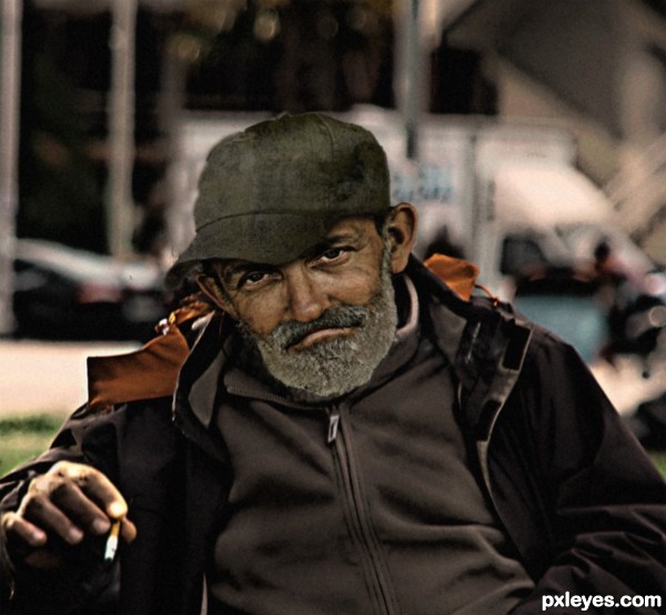
great expression of the guy..I would like to make the hand a little bigger. goodluck
as rakib888 said.. if you placed the hand next to the face you would have a bit of trouble believing the image.. quite and easy fix in my opinion.. but it is your vision author.. do what you feel is right
you are right, I had not noticed I've changed thanks
Howdie stranger!
If you want to rate this picture or participate in this contest, just:
LOGIN HERE or REGISTER FOR FREE

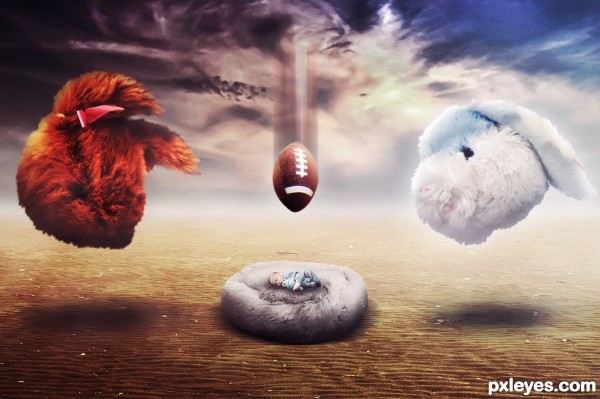
"This is in honor of children's fantasies, fears, anguish we feel when we're young"
(Se SBS and High Definition)
Hope you like!! (5 years and 3400 days ago)
Nice imagination! GL! 
bunny thunder storm
great work  i like it
Imaginative and really well executed! 
Great work and description!
Hey!!! Someone used the football!!!  NIce chop GL!
I am following your work for some time, and have not seen anyone able to overcome it congratulations
deep description, I would have gone with "its surreal" lol ... nice work & best of luck 
very interesting work and great execution...good luck author
Howdie stranger!
If you want to rate this picture or participate in this contest, just:
LOGIN HERE or REGISTER FOR FREE

(5 years and 3405 days ago)
great job...fantastic source find and great mix of all elements...best of luck author
This made me smile. Well done, author! 
Great transformation of the child source. Good work author. 

Congratulations!!
Congrats!! First and second, double congrats!!
Howdie stranger!
If you want to rate this picture or participate in this contest, just:
LOGIN HERE or REGISTER FOR FREE
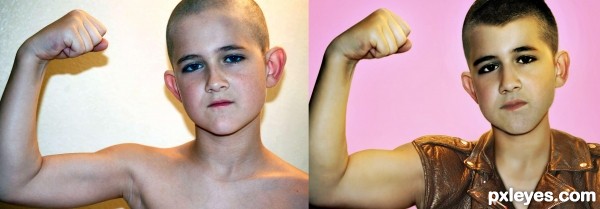
He doesn't look 21 minimum in the second picture...Maybe a bit more beard and a bit more facial creasing on the forehead and around the eyes.
^^ agreed. The older version of the boy has the same neck. you gave him more bicep and shoulder, but he needs more neck, he looks like he is trying on his Dad's leather jacket.
still looks the same age, just with hair and a shirt.
His face is still round (children have round faces comparing to adults); I suggest you adding Adam's apple too, besides a thicker neck.
I know it's subtle, but I can see the changes are very well done... (the high res is awesome) the work is very good as well..... but as the comments you've gotten tell me you may have to add a little more..
good luck author.. it's a very good chop.. just age issues
Howdie stranger!
If you want to rate this picture or participate in this contest, just:
LOGIN HERE or REGISTER FOR FREE