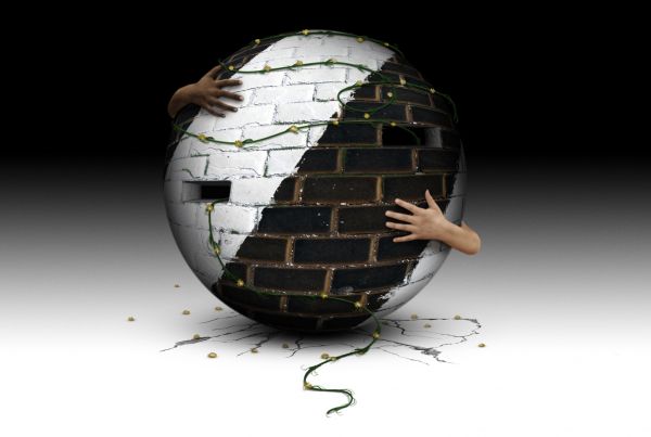
All source except hands. The symbolism here is that the balance of tolerance and acceptance between different people is often both rigid yet delicate...and most of all crucial to peace. (5 years and 3708 days ago)
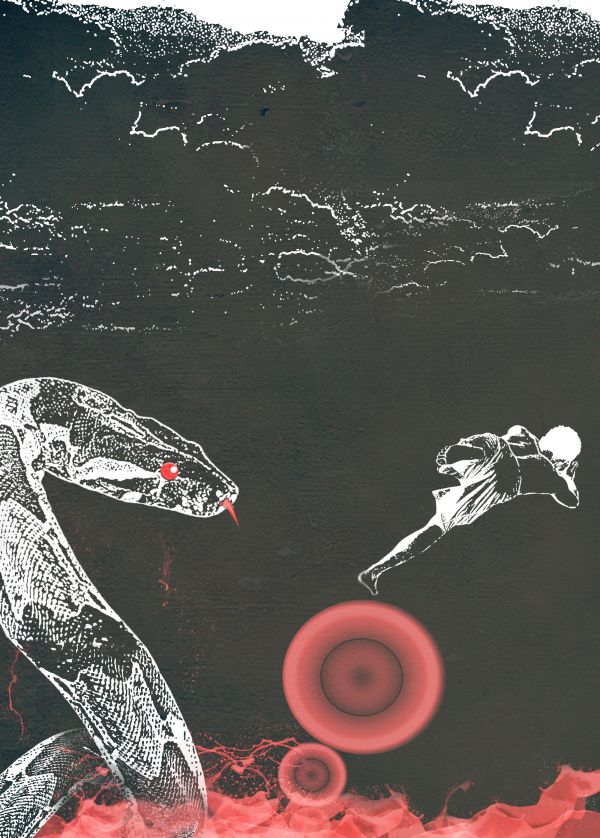
Apply some stamp(filter) on the stock picture(snake,boy,sky)
and in the circle , Its a small radial gradient.and last I apply some texture , to make it cool.
The sea is just bunch of splatter then I just adjust some hue/saturation on it.
(5 years and 3717 days ago)
Not bad 
wow thanks Clinge..first comment I have..new here btw
nice image,gl
Nice idea for a poster. Some work with the general contrast and colours maybe, but very good..
Its a perfect material for a print advertisement...
wow thanks... I just wanted to use 3 colors to make it more interesting and different from others.
Very different  GL
GL
Author, I hate it when people ask me to vote for their entry. Keep in mind, just because you get votes, doesn't mean they are going to be high votes. Just let the contest run it's course.
ok sorry jawshoewhah . thanks for correcting me
Howdie stranger!
If you want to rate this picture or participate in this contest, just:
LOGIN HERE or REGISTER FOR FREE
(5 years and 3727 days ago)
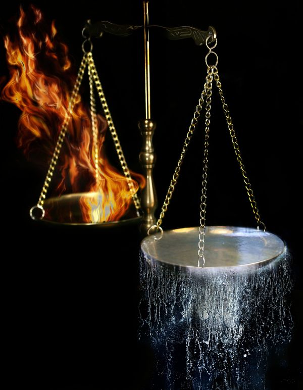
This is a unique entry! An excellent way to show the struggle against each element. Only nitpick would be maybe fix some of the edges on the chain with the water scale and around the back of the plate. GL!
Nice work 
fire is ok but the water is fabulous....great work author
Fabulous?... Maybe, but not boring 


Thanks to everybody for comments
Jawshoewhah, I hope I fixed what you meant, thanks 
YUP! You got it 
like this 
Wow! Fantastic entry 
I thought it was one of the best entries, worthy of at least placing..Go figure?
I thought it was one of the best entries, worthy of at least placing..Go figure?
Congrats 
Howdie stranger!
If you want to rate this picture or participate in this contest, just:
LOGIN HERE or REGISTER FOR FREE
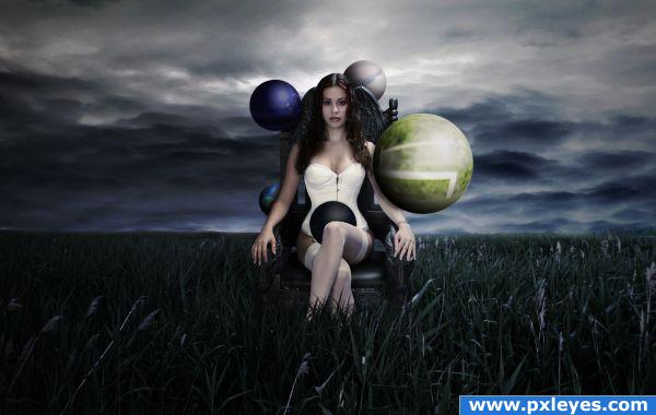
It was a difficult source to work with, but my idea was to show elements in the image. Some are the conventional elements and some aren't. I tried to include Water, Ice, Nature and the plastic fur from the ape was supposed to represent life... didn't quite turn out the way i wanted it to, but i suppose it's interesting enough to post.
For more info have a look at the step by step guide and hopefully i can squeeze some high resolution in the tiny iota of space i have left in my hard drive. (5 years and 3851 days ago)
very different perspective.liked ur idea.
Wow! Maybe adding somethimg to her left and right will make it more fantastic. Good Luck 
I feel little use of source image....but final results are nice ...GL
Though I really like the finished image and really like what you did with the sky and color...It almost seems that you used so little source that it could have been done with any image... Still nice work, though...
Just one word...............WOW................
great finished product... maybe a little more use of original image would have been good.
Howdie stranger!
If you want to rate this picture or participate in this contest, just:
LOGIN HERE or REGISTER FOR FREE
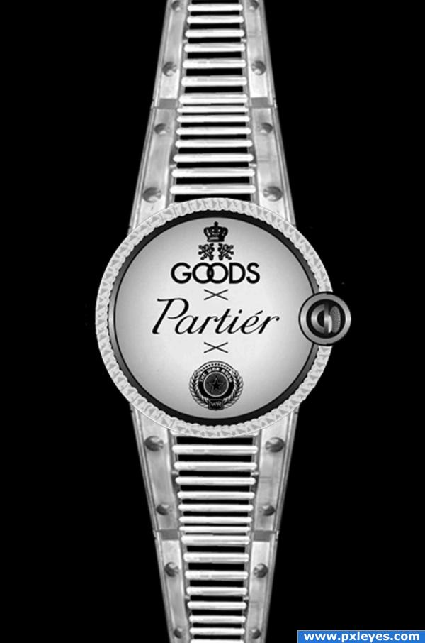
My watch with straps made from the source image and dial from an external image. (5 years and 3921 days ago)
the tech work is amazing.. I'm just a tad confused by the merge point.. You should repeat the pattern longer then do the perspective pinch.. this would get rid of that Half way kerfuffle.. IMHO
Hmm cool... Nice job 
Nice!
awesome!!
Nice work here, good idea, very creative.
nice job
good work
So how does one tell the time with this?
nice work
good idea & nice job author , i only think that the strap is a little bit blurry than the face , you may fix it .. GL 
cretive and nice idea
i need instruction to see time in this... 
Howdie stranger!
If you want to rate this picture or participate in this contest, just:
LOGIN HERE or REGISTER FOR FREE
good output.... i love that cracks and shade under the object... still i have a doubt with that hands! is there any concept?
I agree with anoop, that hands doesn't look perfect for that awesome work. but.. good marks from me!
Yeah.. awesome job besides the hands. I'd lose them or change them. (He should have a huge span , if it's the same person trying to hold the ball anyways..) Also the hands are too blurry for your sharp and nice image.
Apart from those hands the work is beautiful.....
awesome cracks!
I'm not bothered by the hands at all...I don't think an image like this has to make sense, just pique my interest, which it did. GL author...
nice work
Really like this one good thinking ...
Very Surreal image. GL!
Very good
Yaaaaaaaaaaaaaay! congrats pixelkid !!!
Congrats for your first place, Rob!
Congrats!
Congrats
Howdie stranger!
If you want to rate this picture or participate in this contest, just:
LOGIN HERE or REGISTER FOR FREE