(5 years and 3421 days ago)
Photography and photoshop contests
We are a community of people with
a passion for photography, graphics and art in general.
Every day new photoshop
and photography contests are posted to compete in. We also have one weekly drawing contest
and one weekly 3D contest!
Participation is 100% free!
Just
register and get
started!
Good luck!
© 2015 Pxleyes.com. All rights reserved.

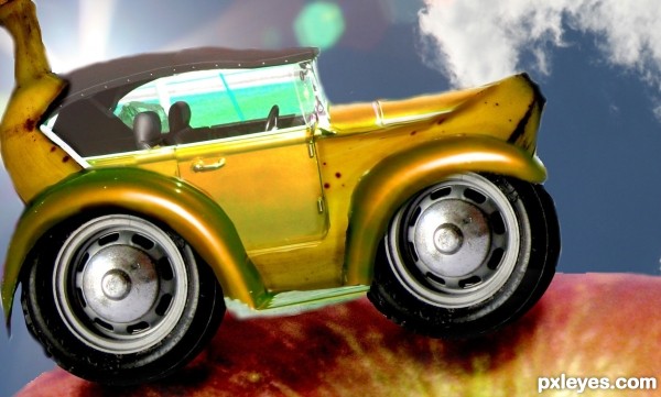
IMO if you got rid of the background and that apple and just had the banana car by itself in maybe a simpler back round it would be much better.
well at first i had it just floating in the air but with some terrain to ride stand on it looks way better imo.the apple seemed like a funny terrain for a banana car. the rainbow background thingy was just by lack of inspiration
I think the background doesn't favor the image. Removing and replacing with a more proper background it would be good
Also, it is a bit too unfocused under the banana, try sharping it so it matches the banana's sharpness, or get a different apple source.
changed the background
don't know its an improvement
sharpening the apple under the banana didnt work out
also cropped the whole thing down a bit
thanks for the tips btw
Much better Really
If you fix green tint of windows then it will be more eye pleasant.
Use the Pen tool, author, to make those shapes/edges look better, you can stroke with eraser, afterwards blur them a bit. It's not a bad idea, honestly.
Yes, really not a bad idea, just needed a little more tweaking...and I still don't like the apple. BUT the car is cool
Howdie stranger!
If you want to rate this picture or participate in this contest, just:
LOGIN HERE or REGISTER FOR FREE