Used stock off of deviant art from AttempteStock
Skinywitch
and Skybase.
Source image and one of my own images. (5 years and 3061 days ago)

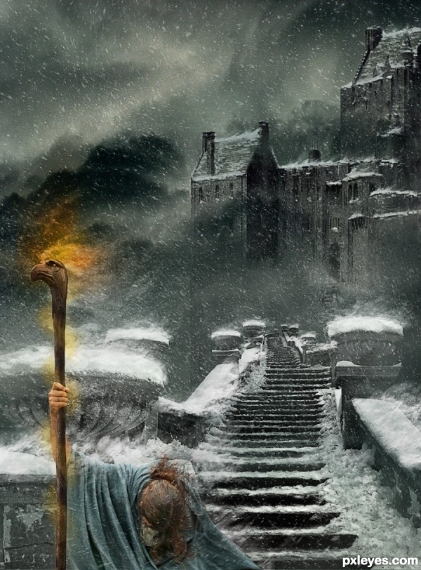
He had no choice, his magic had been outlawed and he had been banished from the Castle. As the blizzard raged about him the sorrow at leaving his home and family was overwhelming. Not knowing or caring where he could go or what his future might bring, he hung his head, weary beyond words; and his journey had only just begun.
His staff would sustain him, giving warmth and light but even it's magic could not diminish his sorrow or the tempest in his soul.
Thank you to AilinStock for the Wizard
Thank you to TsaalyoStock for the base of the Wizard's Staff
Castle, Sky and Eagle head on Wizards staff are my own photo's. See SBS
EDIT: Replaced staff and added my own image for top of it. Added light coiled around staff. Lightened Wizard and worked on lighting for him (darkened right side - lightened left) (5 years and 3408 days ago)
Excellently! GL 
Very nice effects with the snow! Looks pretty windy 
The building in the back has a strong light coming from the left, the wizard has light coming from the right top (flipping the wizard would take care of that).
The light of the staff looks unrealistic, the glow is on the snow that is far behind him. There should only be a glow on the snowflakes surrounding the staff. Hard to explain  Gl!
Gl!
Thanks Ressiv.
I have changed the lighting on the wizard (darkened the right side a bit) and softened the glow of the staff (not too much as it is a Magic staff). I do not want to flip him as it would change the composition.
I am not too sure that the lighting is off that much as the castle is quite high and there are a lot of clouds. The lighting can be quite different on both subject because of that  .
.
very nice work author 
yes.....! finally .....here it is ...the great pic manips ....just perfect...! my fave for sure,.....and......moreover I learned something from your skill,.....now I am just guessing the winner of this contest,.....must be this one.....

Fantastic work author...I love it...well done
The foreground figure is pretty indistinct. Otherwise this is a lovely moody image. 
Hey Bob ...thank for the comment/critique ...I sort of wanted him like that but after looking at the image on my work computer (darker screen) I lightened him a bit. Hopefully he stands out a little more now.
Thanks! 
i like the dramatic story of this piece of art...
very nice good work
Awesomely done! I shouldn't have underestimated brushes 
I now realize: you're a LOTR fan, righ?
The attention to detail is just incredible! Fantastic work author. 
Author...you astound me. Truely great talent you have. I'm starting to recognize your work, and i am always impressed. This one is goin to my favs. Beautiful work!
Thanks so much for the wonderful comments and favs. This was a troublesome manip ... your thoughts make it worth the effort.
@greymval LOTR - what's that 
(I have only read the books 10 times or more) but then I like that genre of fiction. Only thing that comes close is SF.
Love the story, sounds like a great beginning, also great art work, my fave in this contest =)
Very good image.
What a lot of work - fantastic image! Love the eagle's eye. 
Well deserved first place - congrats!
Congrats Arca, a beautiful piece, love the story too 
Good job Arca!
Congrats for the first place.. great mood and result.. 
Howdie stranger!
If you want to rate this picture or participate in this contest, just:
LOGIN HERE or REGISTER FOR FREE
Interesting image but to small usage of the source image...
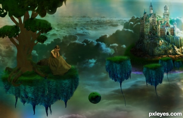
I used the source image everywhere. The islands were entirely source, the whole tree with the exception of a gradient layer, the rock behind the girl, background overlay. I don't know what more I could do at this point unless, make a castle out of carrots?
it could use a bit of a whole dodge wash or some sort of brightening filter to bring up the detail (this could be my eyes but the image looks dark and a bit mushy) it's a great image overall and as always IMHO.. good hard work
Suggest creating more contrast between foreground & background. Would also be good to light the floating things the same as the castle.
Thank you for the feedback, it certainly helps, sometimes while creating a manipulation I get a story in my head and become one minded about where that image should go. In this one, the girl was banished from the castle so the overall mood was dark except for some light on the castle. I attempted to fix it up by adding more gold light layers, one primarily on the girl and tree. Hope this helped some. Wasn't sure what to do to create a contrast between the foreground and background though other than darkening or brightening one.
this is a great peace of art and i can tell you put some efort into it.
i'm just trying to find where did you use the original carrot file that was provided for this contest. of course it may be just me who isnt finding it.
good job anyways
I like it when there is a story behind an image. Already some nice work here, but there is room for improvement.
To increase the contrast between foreground and background you could shift the hue of the foreground more to yellow or orange. Also, it would be nice if the tree was much bigger, extending more to the right. If you only show a small part of the leaves, it will give the impression that the whole tree is huge.
If you read the previous comment and go through the sbs it'll show the carrots and radishes use.
@pshoudini: Maybe you should look at the SBS before commenting. It always helps.
Congrats!!
Howdie stranger!
If you want to rate this picture or participate in this contest, just:
LOGIN HERE or REGISTER FOR FREE