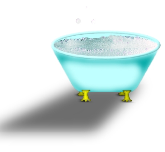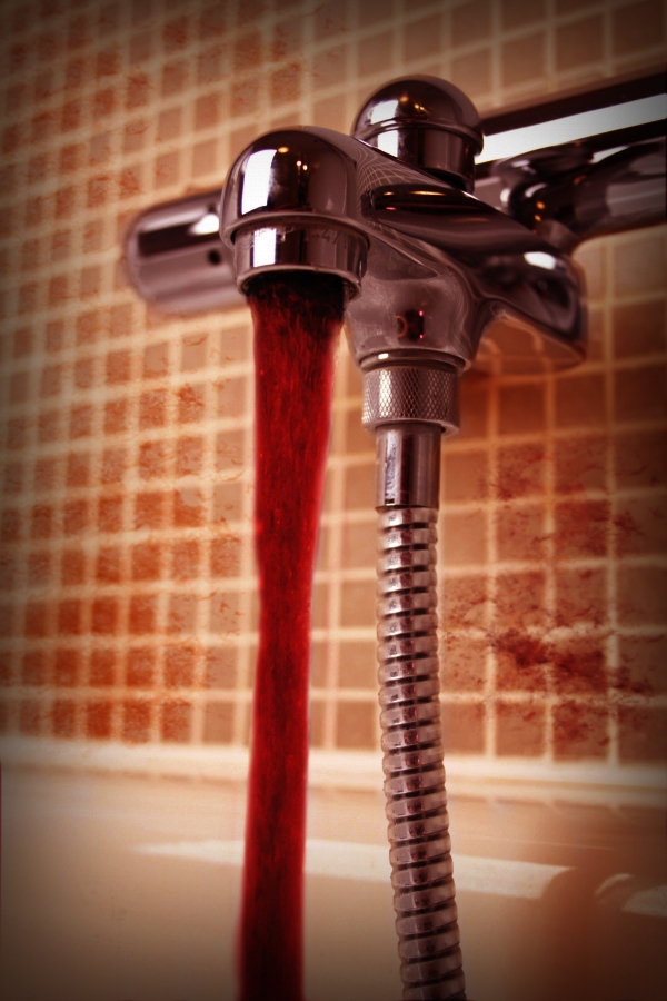
I was going to put a woman in here taking a bath, but once I started making it, I liked it like it was. I'm not well at making cartoon people so I didn't even want to ruin it. The source image only was used. (5 years and 3902 days ago)

SBS will be posted asap.
No outside sources were used.
Still a work in progress...Open to suggestions. Thanks! (5 years and 3939 days ago)
nice! try blending the stains better.. just play with the perspective a bit
Edit: actually, blur the stains. 
You could always thicken the blood with pictures of wax drippings.. just an Idea.. good luck author.. I'm not good with blood work  I get queezy
The phlebotomist dream! Good work author! Love it! 
sick
Blood spatters don't look like they're on the wall, just floating in front of it...and why no spatters on the tub?
good
creepy.. and neato.
nice work and creepy
nice coloring....love the idea....GL
This is GREAT! It's fantastically imaginative.. Ultra mega high marks from me
Sorry, i had to come and look at it again. Really, really good job 
Not to repeat cmyk46's comment regarding the spatters - but really, pay attention to that. If you could "add body" to the blood it would look more realistic - blood is much much thicker than water, so in case u do see running blood, it would not have "splashes" in it -in fact it would resemble lava more than water. Oh, long comment again. Well I actually started writing to say that I like the mood 
red wine 
Howdie stranger!
If you want to rate this picture or participate in this contest, just:
LOGIN HERE or REGISTER FOR FREE
no comments or suggestions? Is it that bad?
I don't think it's bad at all! I really like your idea and the way how you created it But maybe you can have another look at the shadow? It doesn't look right, but I can't really explain, why. Maybe it would look better, when you make it a bit more round? I'm not good at shadows, so I fear, that I'm no big help
  Good luck
try a reflection instead of a shadow... duplicate flip fade and line from the bottom and add a horizon line.. give it a little pazazz.. don't worry.. comments will come.. it just takes a little time at first good luck
the shadow is not good. you can't put a square shadow on a rounded object. it's not even positioned right. the rest is fine
very cool! and the shadow needs work
An old fashioned bath tub filled with bubbly.Very creative
Howdie stranger!
If you want to rate this picture or participate in this contest, just:
LOGIN HERE or REGISTER FOR FREE