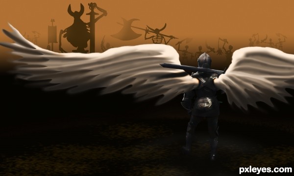
No Souls? No Problem... (5 years and 3026 days ago)
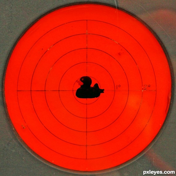
Very first project, just starting to explore, wanted something simple to get suggestions to learn. (5 years and 3037 days ago)
The duck is very dark...maybe some highlights to brighten it up a bit?
Thank you for that comment, need good critisim
Howdie stranger!
If you want to rate this picture or participate in this contest, just:
LOGIN HERE or REGISTER FOR FREE
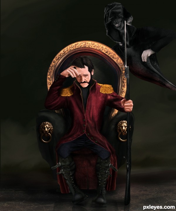
I was going to name this work as (Before the Battle) because my first inspiration made me draw the face stressed out, but i wanted to use the source image in more than just texturing, so i decided to make that evil character which imposed upon me changing the name, there were few options those related to wars and can match my entry, so i picked this one because this evil character represents war makers.
I spent hours and hours painting this to get the original concept i was thinking about, some flaws must be made during the painting process, therefore feed back is appreciated.
Many thanks to silegl69 from sxc.hu for his permission on the statue photo.
Edit: Further modifications have been done. (5 years and 3105 days ago)
No comments, just WOW!!
Yes, I agree. Fantastic piece. Very well done!
Amazing
Kowabunga 
Its very dark and beautiful. Wonderfully done!
thanks a lot for the nice comments 
Incredible work, very good job! Isn't the chair a bit too light on the left side (the gold bar), with the man sited there should be way less light going there. High votes and fav from me 
Thanks Akassa, modifications done 
Now beat that!!! excellent job
JEEZ, you have loads of talent! this is fantastic work. 
Excellent job. Certainly an original idea and great execution.

Absolutely wonderful work!
Congrats, wonderful work 
thank you for your nice comments and congrats 
Howdie stranger!
If you want to rate this picture or participate in this contest, just:
LOGIN HERE or REGISTER FOR FREE
(5 years and 3124 days ago)
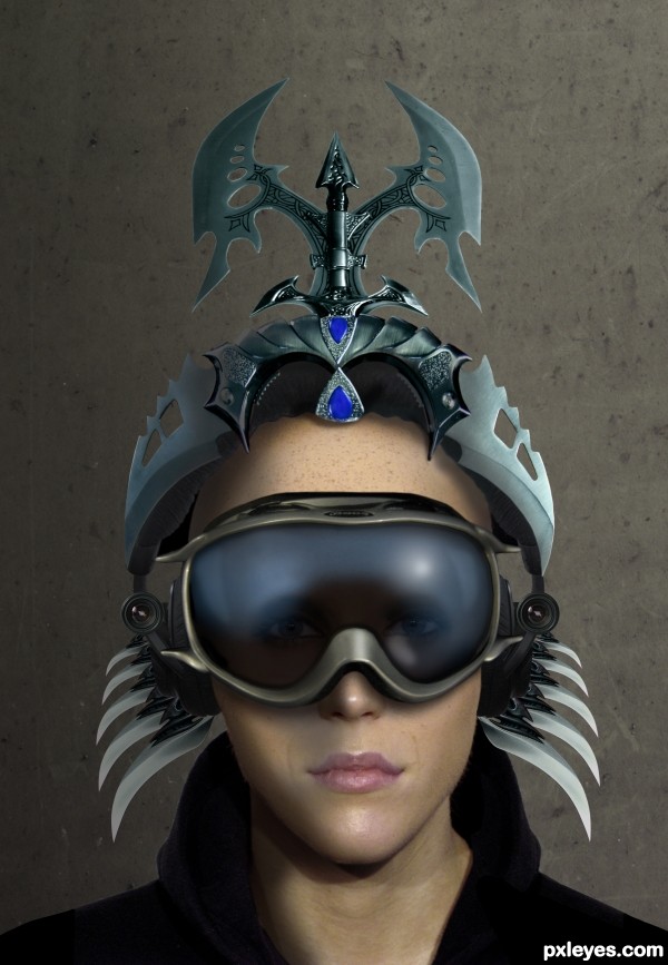
very well built nice details -- like the goggles and the eyes -- Only one small thing would be maybe a touch of blur on the lower side pieces as them seem a bit to sharp in comparison with the image of the face
and the face is also too smooth compared with the spooky wild helmet and its harsh accesories, .........
Smooth? You did see it's a woman, right?
yeah I did,....make her look wilder by adjusting her skin tone, so SHE will not look as if she just came from a beauty parlor, SHE is a warrior not a miss beauty parlor, right?
She has a really large forehead, judging from the positioning of the facial features. I really like the light reflections on her face, though.
he he ,,,very nice ,,good luck!
Very nice.
Great entry! My fav author!
Nicely done..Congrats 
Thanks, everyone...much appreciated! 
Congrats, nice work man 
I really like this. Great job.
Howdie stranger!
If you want to rate this picture or participate in this contest, just:
LOGIN HERE or REGISTER FOR FREE
(5 years and 3130 days ago)
Yes, nice use of the source..... good luck.
Howdie stranger!
If you want to rate this picture or participate in this contest, just:
LOGIN HERE or REGISTER FOR FREE
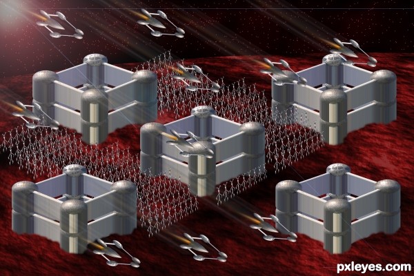
Like the mood and the army of squeletons!! Good work author!
Howdie stranger!
If you want to rate this picture or participate in this contest, just:
LOGIN HERE or REGISTER FOR FREE