source image used in:
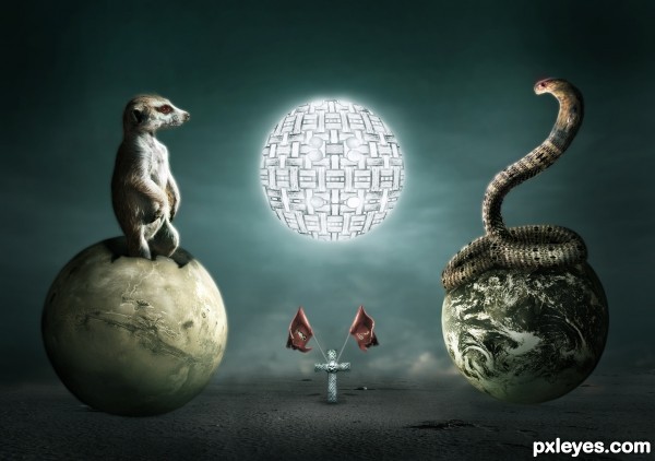
snake and moon
see SBS for detail (5 years and 3248 days ago)
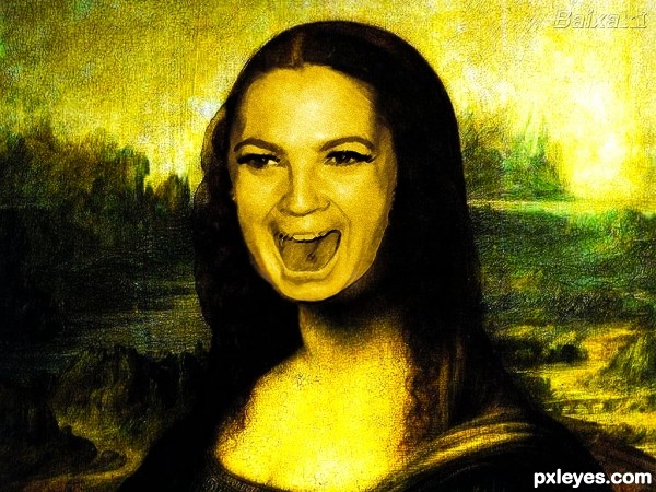
Mona lisa~ vs ~Dru Barimor (5 years and 3259 days ago)
Please post source links.
Sources added ! thank you
the face especially on the bottom seems a bit to stuck on -- maybe some warping or dodging would improve this
Thank you sir , i guess i fixed it now !
Howdie stranger!
If you want to rate this picture or participate in this contest, just:
LOGIN HERE or REGISTER FOR FREE
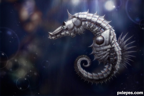
I knew I wanted to do this contest but it took me a long time to deiced what. I was almost going to but armor on a regular horse, but that just seemed to typical, then I realized I was just thinking of the wrong type of horse :) (5 years and 3265 days ago)
very nice armor design, top three for sure  !
!
Very cool
Very cool
this is great!
You've made the right decision imho,putting armour on a sea horse is original 
very elegant! Good LucK
Thanks everyone!!!! so glad to hear all the positive feedback 
great job good score.

Fantastic
Great choice, fantastic outcome! 
Always a pleasure to see your work! Wonderful entry!
Fantastic work author ..GL!!
wooo! this is amazing! beautiful.
Congrats!!
Congrats again Robert,  absolutely stunning work
congrat
Congratulation again 
Congratulations ! 
Saw this on the front page. Its brilliant! Congratulations! 
Why thank you!
first of all congrats!
You may not like what i am going to say...
the contest is to armour creatures, although your creation is great, the seahorse is fully-covered and there is no hint of the original seahorse.
it is a case of re-working based on the shape of the seahorse and not "armouring"
the other two entries are not as perfect as yours, but theirs are closer to the theme.
my hat's off to your art though  I don't think I can top that easily...at level 5 only
Howdie stranger!
If you want to rate this picture or participate in this contest, just:
LOGIN HERE or REGISTER FOR FREE
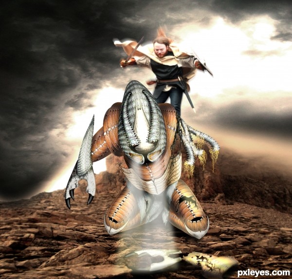
Sorry for poor SBS, I wish i had a little more time.
Credits to:
Mourge-stawk from DA
AdenarKaren from DA
Dewfooter form DA
(5 years and 3376 days ago)
I can imagine what a great battle it was,....I like a dramatizing pic like this one.....
This is great! The white beams of light seem a bit 'hazy' instead of light. Perhaps experiment with a few different blending modes. Duplicate some of the layers if you need more strength. Great job, though author!
Amazing! GL!
Pretty cool design.
In CG there's a concept named "density"= meaning the amount and quality of the texture applied in the image.
Graphic designer try to level the overall density so that their works won't look photoshop/collage.
The main density rupture in this entry is that everything besides the creature is blurry, and most we can see more details on the creature than on the foreground, even if they are both part of the focal point.
Some people use noise/fog brushes to create atmosphere and level the density.
I hope my comment is coherent enough and helps. Congrats on your awesome color palette!
Very nice....ditto to greymval....focus is difficult...texture should be consistent. a great entry none the less. Good Luck author.
I love the image although i am having a hard time seeing the source. But I give kudos for the imagination.
Congrats for your fourth place....nice work....
Howdie stranger!
If you want to rate this picture or participate in this contest, just:
LOGIN HERE or REGISTER FOR FREE
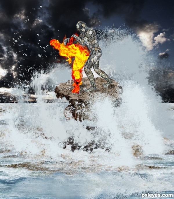
(5 years and 3385 days ago)
great imagination author...add more flames on the edges of the flaming guy...now look a bit to much cut-ed...best of luck
A bit chaotic...but I can totally appreciate the work you did on the stone man. Nice job!
they are fighting right ? 
good work 
Like gornats implied, that position is open to interpretation , people might ask if Stone is pawning or pounding Fire.
I wish i could help with a better stock source but all Ranum's wrestlers have the same issue.
In case you wanna change it, you could search for judo stock or try using this :
http://www.sxc.hu/photo/172104
yes but I think the title makes it clear guys, lol. Great imagination here, well done =- )
I had not noticed, but you are right, maybe I should change the title. the passion of the elements ha ha, thanks for your comments
Lol, I'm glad you have the sense of humour., author.
Howdie stranger!
If you want to rate this picture or participate in this contest, just:
LOGIN HERE or REGISTER FOR FREE
This Battle will start at any moment so just keep watching..lol
nice work author
good SBS and awesome high resolution
pretty fun! Good luck!
Wonderful work here.
Very nice author!!! I like this style!
very interesting image...nice blending of colors

only suggestion, now the spheres look like they on the ground... suggest add glow or something to hint that they are floating
splendid lighting!
Excellent! pretty good idea..I don't know why I like so much meercats! they are so curious.
thanks friends.....
thanks aheman for suggestion..
Nice image, tells a good story.
thanks Mossy B...
superbb sbs author....u done a grt job..
Nice entry
thanks mehul and anoop...s
wowzers, great stuff! Love the idea and execution, good luck!
thanks Derivatix..
Great design,good luck author !
thanks Bart...
Lovely idea! You put a lot of work in your piece author, best of luck!
thanks Carla..
Howdie stranger!
If you want to rate this picture or participate in this contest, just:
LOGIN HERE or REGISTER FOR FREE