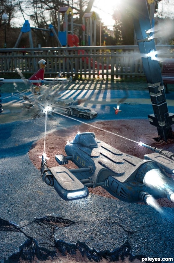
Playground Battle (5 years and 3348 days ago)
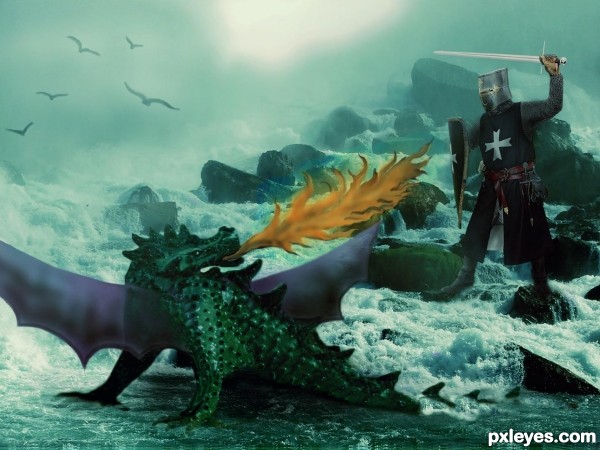
This starfish evolved into a dragon. Now the brave knight faces it. Thanks to hissi at flickr.com for the background water and rocks and to One lucky guy at flickr.com for the knight. (5 years and 3383 days ago)
UGH... dats a lotta work you dun dun there....
great job author...now I'll go take a nap.. hehehe
Cool idea. The starfish is nicely turn into a dragon skin 
very nice idea author...u made big effort in this...best of luck
Howdie stranger!
If you want to rate this picture or participate in this contest, just:
LOGIN HERE or REGISTER FOR FREE
(5 years and 3406 days ago)
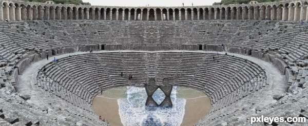
lol! whats with the water??? and why is it so deep on such a flat surface? just saying. no offense but is the use of water a lazy way of making the legs look more real- you dont need to work on the detail+footprints+shadows? dont get me wrong, its not a bad entry, but im wondering what the reason is for the water? its like it just came out of no where...
The mirror effect is poorly executed, there is a very noticeable "dip" at the center. You might try the Clone tool to make it a bit more even with both sides.
Howdie stranger!
If you want to rate this picture or participate in this contest, just:
LOGIN HERE or REGISTER FOR FREE
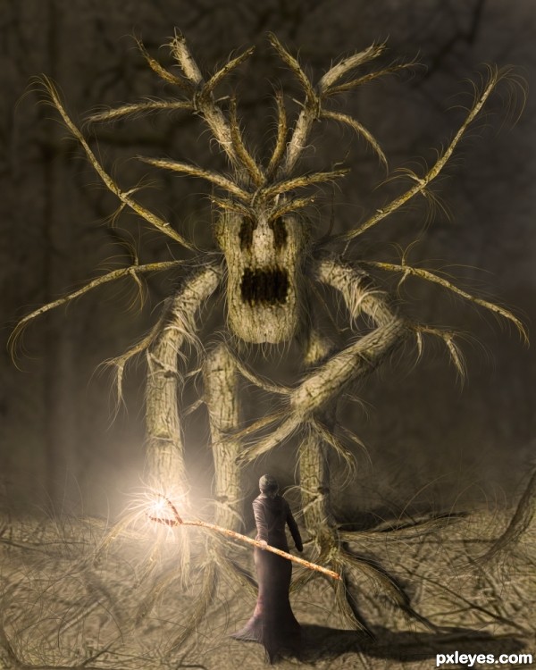
The brave sorceress is ready for her most hard test!!
No additional sources used. (5 years and 3454 days ago)
Really good job here. I love the overall feel of this work, and the lighting effects are well done.
smart uses of the provided pic,.......well done ,,..
This is so good! I love it! The monster reminds me of the Wickerman movie.
Really nicely done! The lighting, color and details pull it all together. Good luck!
Great piece of work, good luck author
I suggest blurring the woman's shadow a little more and adding a gradient mask that gradually reduces in opacity, right now the shadow looks a bit too strong.
Overall as an image i think it's fantastic though  The light.. the use of source.. the creature.. all look wonderful
  Well done!
Luuuv it!
Magnificent work author...i like the colors,effects,mood...simply perfect...Only one idea not suggestion,u could create some kind of light sphere at the top of the wand,to give the more effect on the spell...Instant fav from me and best of luck of course...
Nice entry, GL
Stupendous work ... I would not want to have to battle that one... he looks like one very mean creature!
What a beast! 
Congrats on first place!
Congrats, great idea and execution!
Congrats Marco, another awesome work, keep it up my friend!
Thank you to all for the nice comments and votes 
Congrats on first place 
Congrats on your win...
Congratulations!
Congrats!!! 
Congratulations ... this is one great creation!
Congrats for your first place, Zakfuego! Great image! 
Congrats!!
Howdie stranger!
If you want to rate this picture or participate in this contest, just:
LOGIN HERE or REGISTER FOR FREE
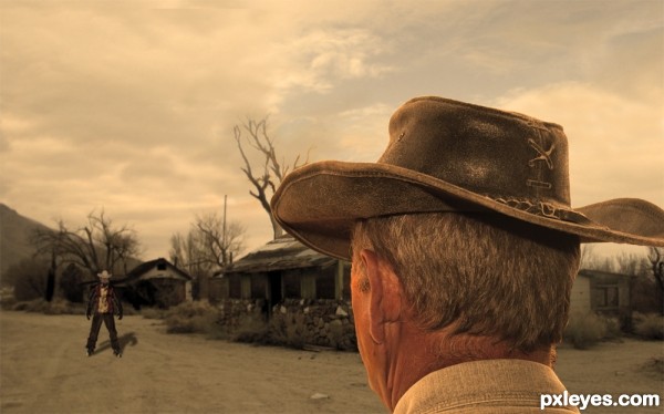
EDIT: corrected lighting in the sky... (5 years and 3506 days ago)
Creative viewpoint for a gunfight scene. Innovative idea to fashion the far guy using snowboard dude as the base. Shadows are an issue, however. Far guy's shadow is totally unrealistic; for example, his feet can't cast a shadow in every direction like they're surrounded by some sort of black glow. The near guy appears to be lit by a fairly strong light from the left. Far guy's shadow and highlighting should conform to that. Ditto for other elements in the scene.
nice idea -- only one small thing the hat looks more like Crocodile Dundee than the Wild west
@Dan: Thanks a ton..  I was initially confused on the source of light in my BG and so eventually decided to be done with a dull midday shadow right under his feet.. Now I hope that I have made the shadow for the second guy correctly..Please correct me if I am still a disaster..
@Alan: Thank you for your comment.. i tried looking up the difference between the two hats.. i see some differences but I couldnt identify which one this is.. I removed the cable around his neck.. am not sure if this makes it more West 
 ..
..
I find the edges of the man's shadow a bit too hard, you may want to blur it a bit to blend it more into the background.
Great idea for a West scene!
Great idea, I am thinking that there should be a lot more shadow under the hat of the first guy as the light would be coming from above and not from the side. Especially at the back of his head. Good luck!
I think the shadow is much better now, although Akassa might have a point about its edges. Now that Alan mentions it, the hat does seem more Australian outback than American west., but I'm willing to overlook that.
@ Akassa: Thank you.. I hope i have not overdone the blur now 
 ..
..
@thefinalcut : Thank you for your comment.. I see it as a late evening scene (Long shadows).. Although at first sight I felt the shadows were wrong too, when i thought about it, I feel the shadows are pretty okay under the hat.. I hope the rest of voters feel the same too.. Thanks again for the time 

Overall look of the image is just fabulous...but u have here few lighting and shadow issues...if we imagine that is brightest spot is the sky is sun or light source,then the shadow of the distanced guy should be totally opposite from the position like its now...other thing,u should make his front part,shirt and the pants darker and make some highlights on the edges...Sorry for my nit picks author,but this image have lots of potential and would be shame that u don't use that...best of luck
thanks erathion.. If you see the source image, the bright spot is probably not the sun (clean blue sky near the spot) ... I guess it should have been some lens effect and I guess it has become too obvious after applying some filters.. I will tone that bright spot further down to make sure it does not appear to be the sun..
I prefer my work to be criticized for details rather than just being ignored 
 Thanks again...
nice but ....
I liked... It's cool... congratulations...
love it!
Howdie stranger!
If you want to rate this picture or participate in this contest, just:
LOGIN HERE or REGISTER FOR FREE
FUN entry author.. (maybe change the hue just a bit on the ship so it doesn't blend so perfectly with the ground (Just an Idea, it looks great just the way it is)
Great , i love it , nice idea , GL
Really nicely done! On the fence about the bling stars on the ship though.
My kid is loving this. Nice chop
wow, very creative and good drawing!
Give it some tone and this will look great!
Fantastic work author...very very nice and unique work...best of luck
wonderful image... great construction on the war machines..
I am just awstruck...wooooooooowwww....love it author
Lovely idea and great execution.........Good Luck Author.
Beautiful entry..... congrats for third.....
Excellent job maintaining the source. Congrats on third.
Congrats on the third place.
And that's great to see you back.
congratulations...
Congrats!!
congratulations...
Congrats
Howdie stranger!
If you want to rate this picture or participate in this contest, just:
LOGIN HERE or REGISTER FOR FREE