(5 years and 3746 days ago)
- 1: source1
- 2: thanks to robby m
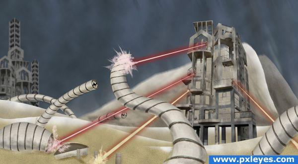
Colonization of planet 4642 seemed easy enough at first....
Only source image. (5 years and 3833 days ago)
Great job... I like this compilation aaaallllooootttt/! keep up the awesome entries!
Nice job creating depth with the blurred building...nice work, author!
nice
cool!
congrats 
Howdie stranger!
If you want to rate this picture or participate in this contest, just:
LOGIN HERE or REGISTER FOR FREE
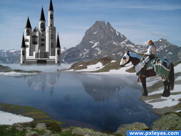
Knight coming home from battle stops to reflect on the violence and killing.
Thanks:
http://commons.wikimedia.org/wiki/File:Pic-du-midi-dossau.jpg
mountain lake
Ian Grant
http://gumbo-alokoi.deviantart.com/art/Knight-1-2-58413988
knight
Gumbo-Alokoi
http://synthexstock.deviantart.com/art/Skull-brushes-42384638
http://rotfuchs.deviantart.com/art/Window-Brushes-31620054 (5 years and 3862 days ago)
I like your idea. The horse looks a little big to me. Also it has a funny looking shadow as well as looking a littl cut and pasted(look athe the horses feet)
Good work. The knight is very sharp compared to his surroundings and should be blurred a little to match. The masking is also a little off around the horse's feet and at the tips of the towers on the castle. The shadow could also probably be a bit darker. Cool idea and image though!
Nice work - great job with the reflection, but yes, i think the horse is way too big. Good luck!
Very cool! The only thing is the fog where the castle is. It's too straight. It should be more cloud-like. Great job anyway  GL
GL 
well done !! I think the caste is a bit to detailed (you can blur it a LITTLE bit) but anyway, great work  !!
!!
Nice pick of sources. Castle is not bad, but if you can play a bit with liquify for the lower towers you can fix its perspective a bit more (make the lower roofs less round, because you dont look as much against it as the taller towers). Good luck!
The haze should slightly fade the entire castle to make it look like it's far away.
well put together combination of images
no the horse is not too big...look at the source image, however in the over picture the mounted knight and horse do seem large, author I like the way you have the reflction of horse and knight in the water, overall not bad 
like the idea... nice image.. needs a little work to be a great image. GL
wow nice .very nice idea.i feel the castle is too blurred,may be to create a far awaz effect.overall good work
Too bad I saw that too late. Love it! Wonderful concept and idea.
Howdie stranger!
If you want to rate this picture or participate in this contest, just:
LOGIN HERE or REGISTER FOR FREE
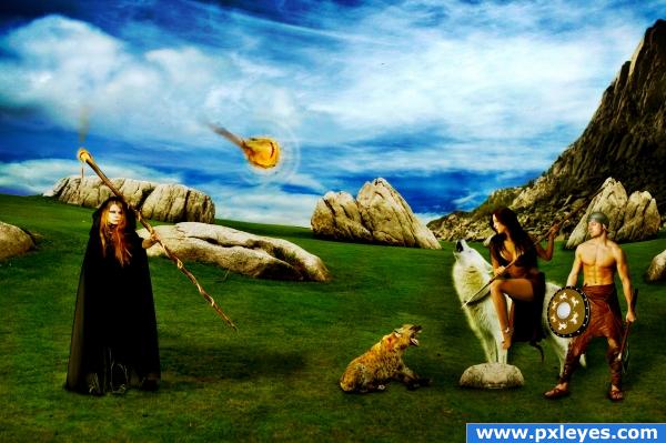
A battle between a sorcerer and two barbarians, hope you enjoy it as much as i did :)
Credits ad thanks to...
- mjranum-stock (http://mjranum-stock.deviantart.com) for the barbarian warrior pcitures.
- liam-stock (http://liam-stock.deviantart.com) for the wonderfull sorcerer.
- nefarostock (http://nefarostock.deviantart.com) for the scary hyena o.o
- matrija-stock (http://matrija-stock.deviantart.com) for the pretty sky.
- deadeyestock (http://deadeye-stock.deviantart.com) for the nice cliff picture.
- erulisse2 (http://erulisse2.deviantart.com) for the workable fur brushes. (5 years and 3897 days ago)
Mixed light sources, bad shadows...
What lights? The only mixed one i can see is the staff's but it's rly hard to invert that shadow.
wow very wizardyly! lov it love these kinds o' images!
its a nice idea but they dont look like they are batteling
neat
to improve this image you may like to explore a colour overlay or the such like at the last stage. this would give a colour connection between all your sources and take that CHOP PIECED together look. creating a more "REALISTIC" creation. good idea and nice images used. GL
Added more definition/lights.
The "dog" is the only one who looks ready for battle! Good luck.
Howdie stranger!
If you want to rate this picture or participate in this contest, just:
LOGIN HERE or REGISTER FOR FREE
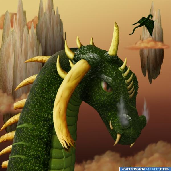
Source and paint (5 years and 3944 days ago)
great job
great work!!!!! 
This is really cool! Well done.. a lot of hard work! High marks from me!
Good job...maybe blur the background a bit...
One word for this AWESOME!!
I would never thought to do this very nice----G:
Very nice work 
Great work!!!!
well done! gl !
everything is GREAT!!! really like the floating mountain.. poor guy.. all the broken horns .. very nice image
nice job. GL
I LOVE THIS IMAGE !!!!!!!!!!!!!!!!
Very nice work, like the horns
Nice work - IMHO there is one horn on the back that looks out of place, the sort of rippled one? Nice work though 
Good eye, animmax. I created a whole story for this guy. See, when he was just a hatchling, one of his siblings decided to fight him. The sibling chomped on the just budding horn (see the teeth marks?), causing the horn to become deformed forever. It was the first battle our dragon was in and his sibling is no more.
Really nice detail. The floating island in the background looks a little flat but this is a really nice peice.
great job!!! 
Hahaha - good story!! 
nice job author .... GOOD LUCK 
Congrats! Very well done.
Congratulations for 3rd
Congrats IDt8r!
congrats!
congrats
congrats!!
Congrats for 3rd!!!!!!!!
Congrats for 3th, nice use of texture.
Congrats!
Thank you for your votes and kind comments. 
Howdie stranger!
If you want to rate this picture or participate in this contest, just:
LOGIN HERE or REGISTER FOR FREE
Nice looking transformation...good luck!

I agree.. very good!
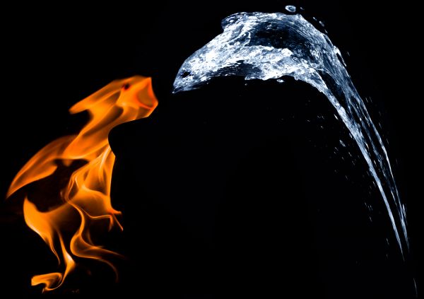
Is that a cobra and a mongoose? Unique idea. Very creative!
thanks to brO for his pics
nice thinkin
Is there a reason that there appears to be a smooth crisp line on the right hand side of the flame? Maybe blur the edge? Overlay some other flame sources already in the required shape? It looks like its just been sliced out. Good Luck.
Howdie stranger!
If you want to rate this picture or participate in this contest, just:
LOGIN HERE or REGISTER FOR FREE