(5 years and 3304 days ago)
- 1: source1
Thanks doortoriver (5 years and 3336 days ago)
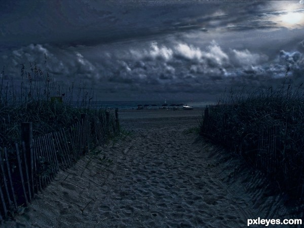
Nice change ... I like the way the one boat is lit by the moon. I think there would be some light on the water (especially where the wave is peaking/hitting the beach ... it could even be used to draw the eye into the image). Just a thought! 
Great suggestion Arca, thanks. I was thinking the same thing. Edit made. 
Light source is from upper right. Shadows match that source, not the one you've made.
i disagree with ya ky
Love the change ... I liked it but like it even more now ... very nice change! Love the people out Moonbathing  ... maybe they are all waiting for an eclipse!
Sorry, but the light source in the original pic is way up on the right.
Classical approach  Proper use of all those Ps adjustment tools !!! Step 4 is a must, who needs strong highlights at night
Very effective, great mood! The clouds almost seem to move.
cmyk1234142 bla bla bla is right! not often, but this time! needs shadow work!
Very very nice work author...mood is great...this look like maybe hour before sunrise with heavy rain clouds...well done
very pretty
Sigh, what I would do to see this type of lighting in REAL LIFE.. with so much city light it's hard to find (though it is kind of cool when Turtle season is happening down here in Florida they shut off all the beach lights and just let the moon be on it's own, and all the little teenagers guarding sections of beach, it's a hoot (good luck author, nice work)
Really nice work, author, all those adjustments made for a very effective change. I have been on those very beaches, and this looks incredibly realistic. Love moonbaths! 
Howdie stranger!
If you want to rate this picture or participate in this contest, just:
LOGIN HERE or REGISTER FOR FREE
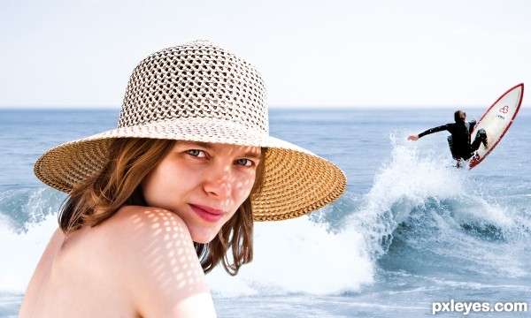
not much to say: I worked with adjustment layer (levels, hue/saturation, color, photofilter) and layer masks. I added some highlights to the surfer with the dodge tool. (5 years and 3358 days ago)
nice clean work author...best of luck
Where's the splash effect? There's a splash with the wave in the background but it's not an effect.
Howdie stranger!
If you want to rate this picture or participate in this contest, just:
LOGIN HERE or REGISTER FOR FREE
Thanks ASPIRE (5 years and 3416 days ago)
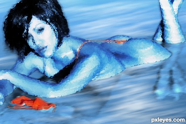
The filter effect needs to be adjusted around the edges of the body, She looks like she has corrosion holes along the edges, especially where her body meets the water.
The trick with filters is to make them not look like filters. Tricky, to be sure, but half the fun is experimenting!
Ice beach.. is that a play on words ?  With some real ice instead of that water it would have looked better.
Howdie stranger!
If you want to rate this picture or participate in this contest, just:
LOGIN HERE or REGISTER FOR FREE
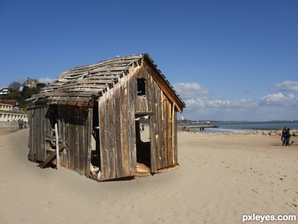
My place on the beach.... (5 years and 3426 days ago)
Fix the shadows and this would be a good blend. Look at the people on the beach and their shadows
Thanks, i did do a bit to the back and side of the hut but you are right, not enough. Thanks for your comment jawshoewhah!!
You need to add a shadow of the house int he sand.
There is a real problem of shadow on the left bottom of the house, try to put a dark shadow close to the house.
woow this looks like real photo
Thanks guys your input is most welcome.
Your work is good..... but lacks of a shadow..... good luck
Howdie stranger!
If you want to rate this picture or participate in this contest, just:
LOGIN HERE or REGISTER FOR FREE
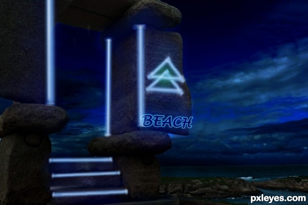
Nice lights, I would put more of a glow at the back of the beach sign though GL author
very cool work author...best of luck
Howdie stranger!
If you want to rate this picture or participate in this contest, just:
LOGIN HERE or REGISTER FOR FREE