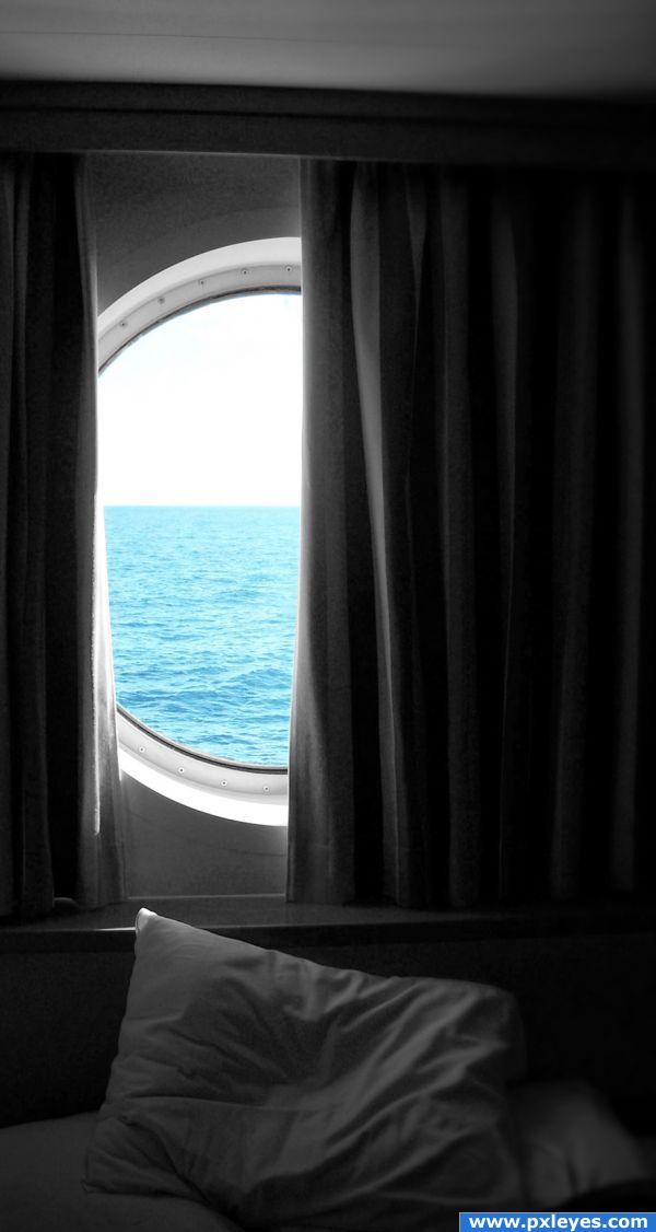
I used two layers (one black and white and the other colored)I then put a realing mask over the color layer and selected the area I no longer wanted where I used a black brush to hide. (5 years and 3833 days ago)
- 1: image
(5 years and 3837 days ago)
Loving this nice entry 
good job -- nice choice of image
Veery nice
Excellent!
very nice
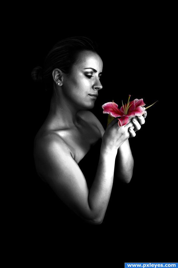
Very good source choice  And also a good job with the flower. Good luck!
she is almost statue like, metalic even.. looks rather nice. well done.
Sweet entry Author i like this 
Howdie stranger!
If you want to rate this picture or participate in this contest, just:
LOGIN HERE or REGISTER FOR FREE
(5 years and 3842 days ago)
wow... a magic?? LoL
Nice use of source image!
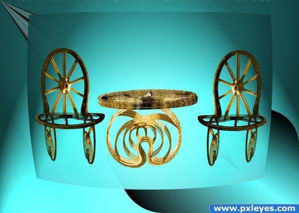
Nice idea, the furniture looks quite good, but not completely sure about the background. Perhaps a bit distracting, imo. Good luck!
could almost be an ad for the home shopping network  and next we have a LOVELY set of lawn furniture..hehehe
Try setting these creatively made pieces of furniture on a floor and give them shadows...that will be great! 
Boy would not want to set in one of those chairs
Howdie stranger!
If you want to rate this picture or participate in this contest, just:
LOGIN HERE or REGISTER FOR FREE
=hey guys...
m really disappoint tht no one is commenting or liking my work :(
even site owner Removed my entry where i showed all the sources...
nyways... (5 years and 3850 days ago)
Which would you prefer, a negative comment, or no comment?
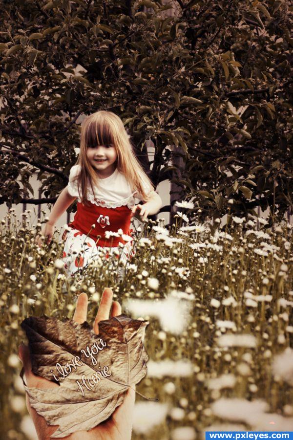
probably no comments as it seems minimal use of source. I would suggest using the source, duplicating and manipulating to make the tree in the background..goodluck anyways, and don't be upset about the no comments, some people don't get any at all.
"Hunie" ? Is that the name of the girl, or do you mean Honey/Hunnie ? And try to make the hand larger. GL
I really like the colors in this.To be frank I like when the source is clearly visible than to look the sbs where the source is used.
Howdie stranger!
If you want to rate this picture or participate in this contest, just:
LOGIN HERE or REGISTER FOR FREE
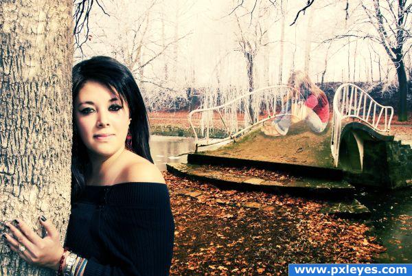
Hey guys,
i waz Looking at the bridges for sometime then i come up with a expression tht is
Behind Every Simle theres not a Delight
Hope u will like my Image... (5 years and 3852 days ago)
Background figure is too large, and probably wouldn't have a shadow if it's transparent...
You really need to upload a HIGH RES image so we can see the image better.. you've got a great idea here... (High res images get better votes because it helps peeps to see the work) it's a good start.. I can see Lots of potential.. just need to be able to see the work)
EDIT: THANK GOD FOR HI RES... I love confusing weird wonderful entries like this.. now that I can see it.. it's a gazillion times better....
be careful of jewelry... It can destroy an image (In theatre.. you'd be fired if you walked out on stage with the wrong ear rings).... but it is your vision... go for it (masking out the jewelry would be helpful just because of the way it dates the piece.. but that's just me)... (god I am a yapper arn't I? hehehe)
I think this image would have been FAR better without the subject on the bridge! Without it...it might seem simple but very effective! With it...it seems convoluted and distracting. Just my opinion...
Thanks Guys for ur Suggestions, ill take care in future...
I like the idea of the girl in the forground, but I am very confused by the girl on the bridge, or rather why shes transparent.
girl on background is a soul who is in deep pain but she is hiding by her fake smile
The name is awesome! And yes. The ghost thing is too large compared to the bridge and the other girl! Other then that, great job. Good Luck 
Howdie stranger!
If you want to rate this picture or participate in this contest, just:
LOGIN HERE or REGISTER FOR FREE
great colour in the water.. nice image
Howdie stranger!
If you want to rate this picture or participate in this contest, just:
LOGIN HERE or REGISTER FOR FREE