(5 years and 3114 days ago)
(5 years and 3134 days ago)
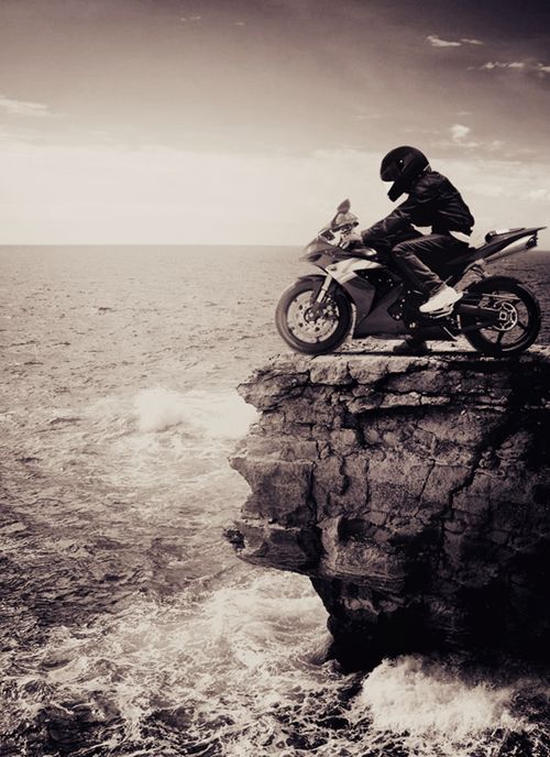
Very convincing work author...
wow great work here
author this is really beautiful
Lovely 
Howdie stranger!
If you want to rate this picture or participate in this contest, just:
LOGIN HERE or REGISTER FOR FREE
(5 years and 3138 days ago)
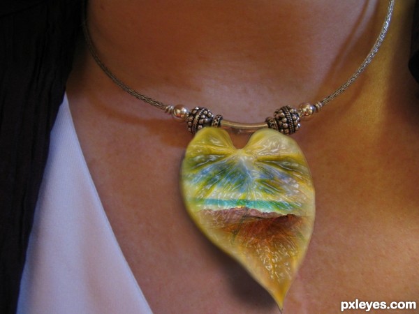
simple but lovely entry author.. WELL DONE. 
good thaught author 
thanks
Magical
nice!!!
should use filter "plastic"... using blur at the edges make it look 'un-solid' 
thank you very much for the tip aheman!
now its better?
I would put holes in it and put some wire from it to the necklace because at this point, it just looks like it is stuck on her neck, not from the necklace.
Howdie stranger!
If you want to rate this picture or participate in this contest, just:
LOGIN HERE or REGISTER FOR FREE
(5 years and 3143 days ago)
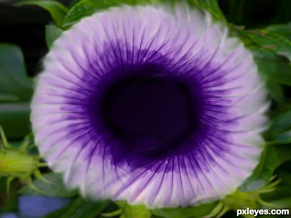
how about an sbs?
Lovely flower, SBS would have give it higher votes indeed!
Howdie stranger!
If you want to rate this picture or participate in this contest, just:
LOGIN HERE or REGISTER FOR FREE
(5 years and 3150 days ago)
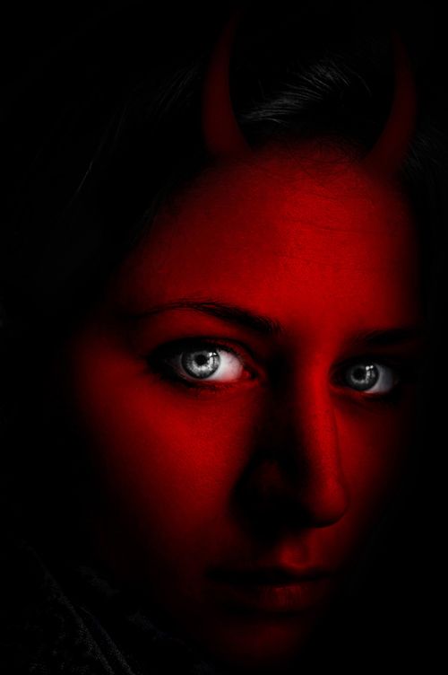
Good that you added an sbs, or I wouldn't see how you used the source. Your use of source is quite minimal.
On the horns...they look very 2 dimensional, and not actually attached to her head. Perhaps work on blending them in better. They also are not evenly spaced or balanced on her head either. Look at pictures of horned animals to get a grasp on what I mean, but pay close attention how those horns grow from the skull of the animal, not just sit atop the skin. Your horns need to be better seated in the skull.
I hope that's not to crtitical, I just think it would help.
good work author gl

Take Jade's advice. This isn't a great use of the source, but you can easily improve it.
Thanks for all comments!!..I'll try to make some changes soon.
Too minimal a use of the source, and a somewhat lackluster manipulation because the overall values are too dark. The horns are barely visible at all.
Yes to minimal use of Source Image, the Main Source Object is the light bulb not the Red light from the Background. The Horns looks 2D, not realistic, not authentic.
Howdie stranger!
If you want to rate this picture or participate in this contest, just:
LOGIN HERE or REGISTER FOR FREE
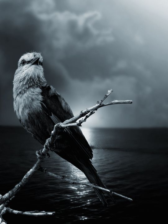
Interesting concept, but needs a high res version to show how well you've incorporated the source image.
believable... lacks a little "wow" factor
Blend very realistic, it seems an old photo! Very good !
Great blend
looks good to me, I agree about the hi-res needed though.. GL!
Nice one, good luck!
Howdie stranger!
If you want to rate this picture or participate in this contest, just:
LOGIN HERE or REGISTER FOR FREE