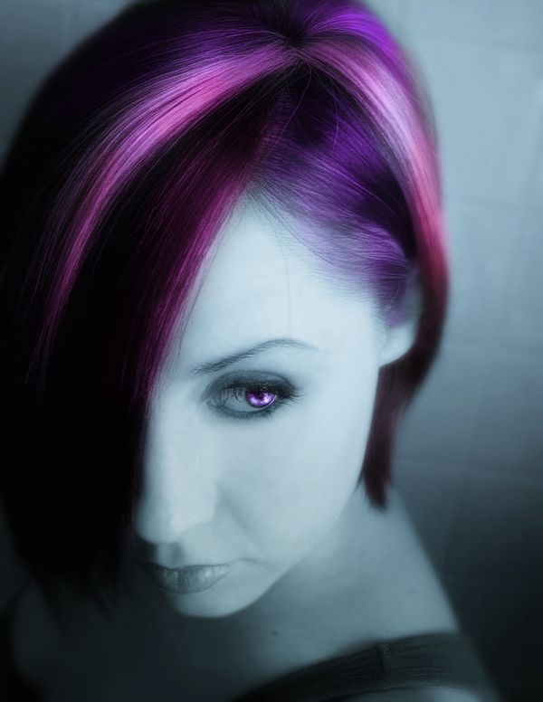
(5 years and 2958 days ago)
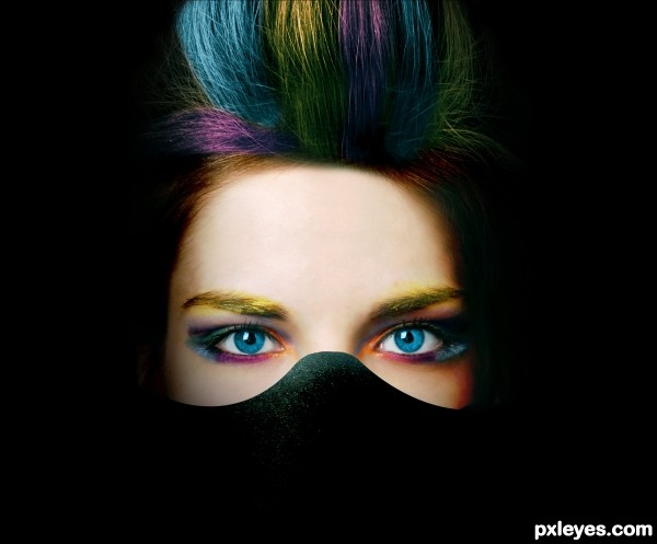
(5 years and 2958 days ago)
Howdie stranger!
If you want to rate this picture or participate in this contest, just:
LOGIN HERE or REGISTER FOR FREE
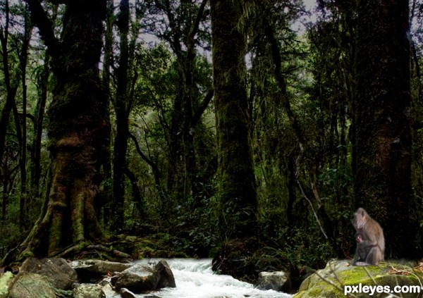
Step 1: Downloaded the source image
Step 2: Downloaded the image of a stream from morguefile.com (http://www.morguefile.com/archive/display/723420)
Step 3: Dragged and placed on top of the source image
Step 4: With layer mask blended both the layers
Step 5: Downloaded another image of monkeys from morguefile.com
(http://www.morguefile.com/archive/display/186666)
Step 6: Cutout of the monkeys made and placed suitably
(5 years and 2964 days ago)
Please fix your links.
Howdie stranger!
If you want to rate this picture or participate in this contest, just:
LOGIN HERE or REGISTER FOR FREE
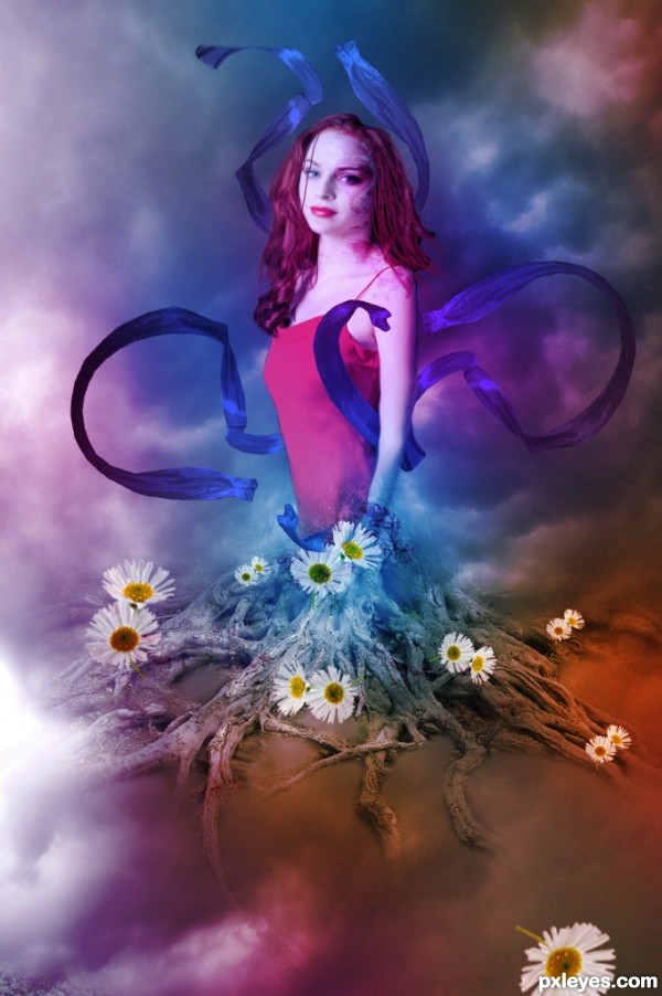
credits and thanks:
http://faestock.deviantart.com
www.cgtextues.com
http://vampbabe-stock.deviantart.com (5 years and 2984 days ago)
Transition between the roots & body is dubious. Where's her left hand? Daisies just look like an add-on to the image.
The roots look to be in front of the body, making a very odd visual image, since she has no lower body, no left hand, and no rear end...
The forearm also appears to be overly thinned from the elbow down to the wrist.
why the flowers are so blurry is beyond me. i mean i know why they are blurred, but there is no reason for it other than laziness. While i like the idea of your composition, and some of the other issues have already been touched on, i will mention the flowers. They are blurred because you made the first ones small to place onto the tree and did not duplicate yourself an original of the larger sized flowers. then when you resized the small flowers to big ones it made them blurry. always save an original layer you can go back to with your objects.
Howdie stranger!
If you want to rate this picture or participate in this contest, just:
LOGIN HERE or REGISTER FOR FREE
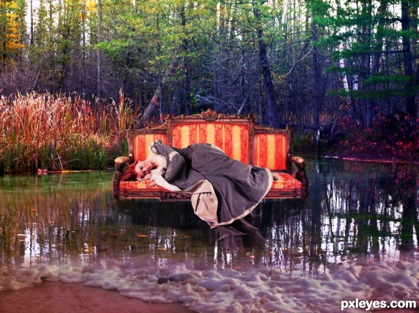
using photoshop cs5 (5 years and 3012 days ago)
COOL..
This is my kind of image .. I like fantasy so he is my constructive comment and then how it could be improved.
1 where is the hi-res version
2 You have given the girls dress a reflection that needs work the meeting point of the dress to the water is your starting point and remember the reflection needs shadow .
3 The chair has a shadow but doesn’t have a reflection !
4 the shadow under the chair needs work . reduce the opacity of the shadow under the chair.
5 why has a pond that is still and flat got frothy bubbles around the edge?
Howdie stranger!
If you want to rate this picture or participate in this contest, just:
LOGIN HERE or REGISTER FOR FREE
Good hair color, skin tones not so good.
Nice job...I really like this composition author! Really nicely chosen color.
This looks really nice, good job
oh ... this looks very professional ... good work
Thanks for all comments!
Congrats!!
Hey thanks spaceranger !..
Howdie stranger!
If you want to rate this picture or participate in this contest, just:
LOGIN HERE or REGISTER FOR FREE