(5 years and 3067 days ago)
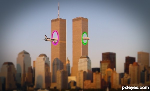
I changed the colors of the portals, i hope now i'm legal, and not break any copyright laws... (5 years and 3161 days ago)
LOLOL! Great image!
Have you seen the new movie short that came out?
http://www.youtube.com/watch?v=4drucg1A6Xk
Thank you MossyB !
Yes, i've seen it. From that came inspiration 
I LOVE THAT VIDEO!! 
Plane parts are at the wrong angle. They don't match up. Plane should be the same gray as the source pic, and not same hues as the buildings, to create contrast.
I love the idea, lol!
Nice 
CMYK46, i agree with you for the wrong angle of the plane, but only on the back of the plane...i simply can't do the right perspective  I'm not good enough, i'm a begginer, and i want to learn as much as possible, but i can't do it right, i tried a lot...
I think the colors are good... why the plane should be the same gray as the source pic, if it match the city photo.. ?
For contrast! And all you had to do to match the angle on the plane parts was draw a line down the axis of the tail section (on a separate layer) and match up the nose section according to that line and it would be visually correct.
I'm not sure about blurring the foreground either, but I still like the idea of your image, and hope my comments have helped you. 
I see now what you meant with the angle... I first thinked about the perspective of the back.
You are right, the plane seems a little broken...and i verified now, the front was JUST a litle rotated and smaller, i alligned them perfectly now, and i will upload the result... not much difference. Probably this is the way that portals works 
Lol, like it. Not sure about your angle discussion here. If there's anything wrong here, it would be that the wings would still crash in that building.
Yes you're right...
nice..
Thank you !
what exactly is this supposed to represent ?? is it from a movie or what ?? that was a terrible tragedy that day.
Good Idea..lol!!
How I wish this had happen! Wonderful work author!
Howdie stranger!
If you want to rate this picture or participate in this contest, just:
LOGIN HERE or REGISTER FOR FREE
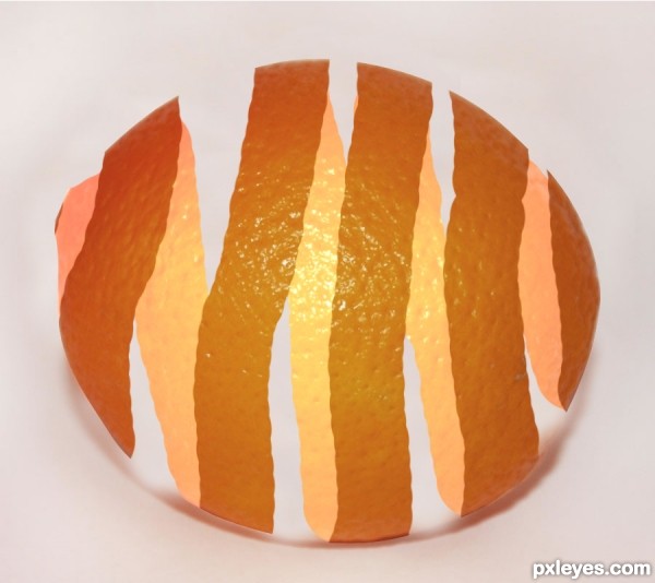
Selected orange,
copied orange to new layer,
brightened underlying layer,
used mask to create peel affect,
edited shadow! (5 years and 3560 days ago)
hmmmmmmmmmmmmmmmm
Give the peel some thickness & fix the shadow.
Can I edit the photo after it's in the contest?
Just go to My stuff/My contests/Edit entry
I'm wondering if it would be better if it was darker on the inside of the peal, and lighter on the outside. But it's still a nice creation = )
Thanks, Emik! And thank you, CMYK46 for telling me how to do that. I just got disqualified on one of my other creations because I had the wrong links, and I didn't know how to edit it. 
I was just there two weeks ago. I had to ask questions, and had one of my creations disqualified too. Soon you'll have it all down =)
maybe remove or change the texture from the inside of the peel. and as CMYK46 says ,add some depth, good luck
You you don't know how to do something, try the forum. You'll get an answer a lot faster than you will emailing admin. Orange still looks paper thin.
cool, cool effect! it works great on eggs too! and apples...and... anyway, love it 
Howdie stranger!
If you want to rate this picture or participate in this contest, just:
LOGIN HERE or REGISTER FOR FREE
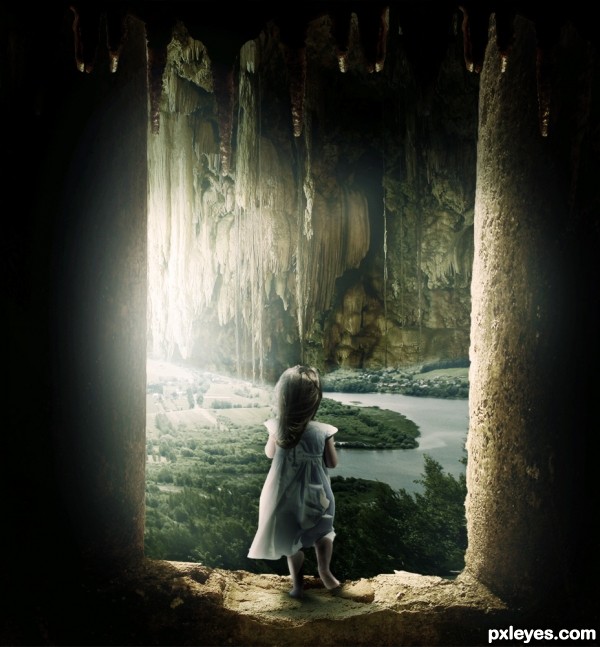
Thanks to Stockmichelle :)
Sorry about the small file size.. my computer was struggling. (5 years and 3573 days ago)
Great image, I really like the scale of everything. GL!
Thanks! I made a couple of changes on the lighting and i made the colours a little more vibrant.
I love this image, the only thing (and it might just be an optical illusion), but her right foot looks awkward, as if pointing the opposite way. Maybe it's just me though, otherwise really awesome creation.
Nice image!! you possible have some unwanted marks at the top of the image more evident on the columns?keep an eye on your edges (stalactites) white edges can be distracting.
It takes my breath away, author! 
this is amazing,.....as always you do all your work....! deep bow to you....

Nice work author  . some nitpicks, Agree about child right foot, it need some work. Light source is from left, but there is strong light on left side wall.
I actually like the light on the left. Not sure if it should be that way, but it add a little magic to the piece.
great work author...u made it in your style...best of luck
loved it...
Very nice image, not sure whats producing the light but hey thats all part of the mystery 
Exactly Geexman 
Thank you all for your comments and favourites! 
erikuri say:...It takes my breath away, author! .....me too author....can i put this work in my favorite?....or maybe not!... ))
))
awesome1
Beautiful! 
Congrats for your first place, Matteo! 
Wow! This one i really didn't expect!
Thank you all very much!!
Congrats Ponti, beautiful image 
congrats,.....I knew you deserve it....
Congrats Matteo, another great work 
Matteo, congratulations for so tender entry! 
Congratulations for your winning 
congrats
Congratulations !!!!
Congrats, great image!
Another amazing entry! Congratulations!! Keep it up.
Congratulations !
AWESOME entry, Congrats!!
Howdie stranger!
If you want to rate this picture or participate in this contest, just:
LOGIN HERE or REGISTER FOR FREE
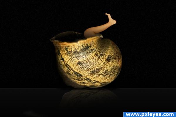
Made with GIMP; SBS shown.
Suggestions welcomed. (5 years and 3887 days ago)
Howdie stranger!
If you want to rate this picture or participate in this contest, just:
LOGIN HERE or REGISTER FOR FREE
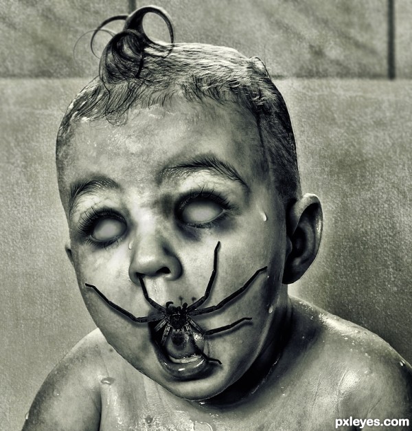
Scary!!! Very nice!!
Creepy and cool. Nice work, author!
Howdie stranger!
If you want to rate this picture or participate in this contest, just:
LOGIN HERE or REGISTER FOR FREE