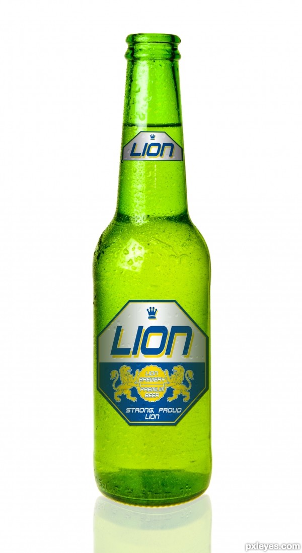
have a refreshing sip of lion beer in the evening, quenches your thirst and gives you new strength for next days work.
Please have a look at the full res, thank you. (5 years and 3232 days ago)
(5 years and 3325 days ago)
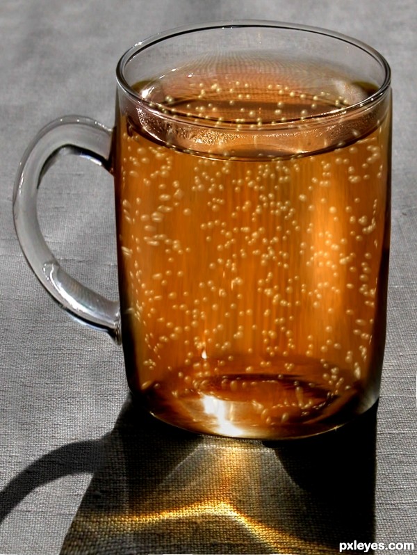
I love the bubbles !!!!
Looks like soda  ....... good work
Needs a head if it's beer...
great imagination!
amazing structure author!
good work author
Howdie stranger!
If you want to rate this picture or participate in this contest, just:
LOGIN HERE or REGISTER FOR FREE
(5 years and 3355 days ago)
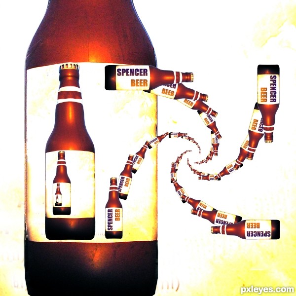
Nice pattern, but it's not really a Droste Effect.
A drost effect is when you have an image of an image with itself which then repeats, not just taking an image and repeating it.
http://en.wikipedia.org/wiki/Droste_effect
You are incorrect MossyB, it's a perfect droste, each bottle turns into a smaller one, follow any beer and it will get smaller and smaller, I just happened to use Four Droste paths, I could have just done one path, but I decided to do four so it wouldn't look like a fractal
(It helps if you look at the sbs, you'll see the droste pattern easier there)
No, you have merely repeated the bottle. Look at the Droste Cocoa image in the Wikipedia link, and you will see how it is a Droste image, because the entire image is within the image, not just the woman repeated and getting smaller.
I am not incorrect in this situation, YOU are, and the original Droste Cocoa image shows you why...
I am not a photoshop person so I don't know who is right or wrong here. But IMO this is VERY COOL!
No MossyB, You are incorrect (and getting your info from Wiki? This makes you even more incorrect. (I know reading a book is hard, all those words, but I think it would benefit you)
Recursive was first, then came Droste, and that's in Art History books. (I did retain a lot of knowledge from college, and one of our biggest debates was on Droste) Droste is actually used as an example of Recursion.
A picture of a Single Beer Bottle repeated upon it's self in a smaller version and continued in a pattern is Droste. A picture with in a Picture slowly sinking into infinity is Droste.
The Definition of Recursion: See Recursion (hehehe.. still love that joke)
MossyB, it is quite clear that you used to be a member here under some other name (we aren't stupid dear, it's more clear then the fate of a lab rat being placed in a vat with a starving python.). If you posted all your previous images from old contests and proved your knowledge (your portfolio isn't enough to make an accurate judgement, just not enough there) your comments on an entry like this would be much more acknowledged.
I HATE DOING THIS, but when you are wrong, you are wrong and I know it's hard but you should just deal with it. You make a LOT of comments, and I'm sure they are appreciated, but your ability in art should match the candor of your comments, and it doesn't. Terse commentary of self importance doesn't make one an expert, and until you prove otherwise, you will get the backlash of an opposing point of you. (I've been in a hospital, it doesn't make me a brain surgeon)
(Yes I'm a windbag, but it kept me from having to deal with bullies, no matter how big they thought they were).
Droste effect is an impossibility (it can never be achieved in reality only feel like reality..but it can be attempted, as I have done here) Sort of like your need to always be right all the time.. I'm afraid that doesn't exist.
You comment has been taken, your opinion has been vilified accordingly. As is my right, as it is your right to beat a dead horse, (though I am curious why you would want to, it just makes me look vindicated and you just very cranky and bossy). In your opinion, the only thing that can be Droste is a frame inside frame inside frame... (or picture in picture) and that's too little of a place for me and my art to reside in.
Droste created a wonderful Idea of art, I'm sure he'd approve of people using modern technology to play and improve on that idea. It's one of the great things about Art, we all have our own Idea, and this was mine, and I will defend it until death. Or until a Mod comes along and removes it. In that case.. I'm sorry for the Mod, I was raised to defend myself, and I do. Makes Mommy Proud. 

Once again, I COMBINED 4 Droste patterns on top of themselves, but because I used the optical illusion in such tiny increments it looks just repeated, but it's not. (and the mathematics I had to use to achieve this effect was a nightmare.. the size difference of each recurrent bottle is less then 10 percent, no easy task mind you, and making them progress in size took a lot of leg work) Shrinking the bottle 50 percent would have been much simpler and obvious, but I like to challenge myself, I'm always learning.
@rbsgrl, you are so sweet, I could squeeze you til you squeak
Imo its an eye catchy entry author ..well done 

SQUEAK!!!!! SQUEAK!!!!! SQUEAK!!!!! SQUEAK!!!!!
Beers and Broads, I love these contests! Well done and GL Author!
Super cool beer-y droste piece...best of luck
hey u changed it  BTW its cooler now

Howdie stranger!
If you want to rate this picture or participate in this contest, just:
LOGIN HERE or REGISTER FOR FREE
(5 years and 3480 days ago)
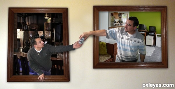
Except for whatever those black sticks are in the bottom/right corner, it's a nice chop. You should try to remove them. Pattern stamp would be my suggestion and just copy and paste a section of the trim pattern from the existing pattern over it. GL!
it appears to be some sort of plant from the background source, it does kind of those the image off balance a bit...thanks
There are some light source things issues near the beer can. Where the hands meet the right guy has an outline on top and I think that a shadow where the left guy's thumb meets the can would help too. It looks pretty good in low-rez and it's a good humorous idea. Good luck!
I honestly think this is the most on-theme entry in this contest so once again, GL!
Aces! Very clever. Same guy, different clothes?! Very on-theme, nice one, author. 
Howdie stranger!
If you want to rate this picture or participate in this contest, just:
LOGIN HERE or REGISTER FOR FREE
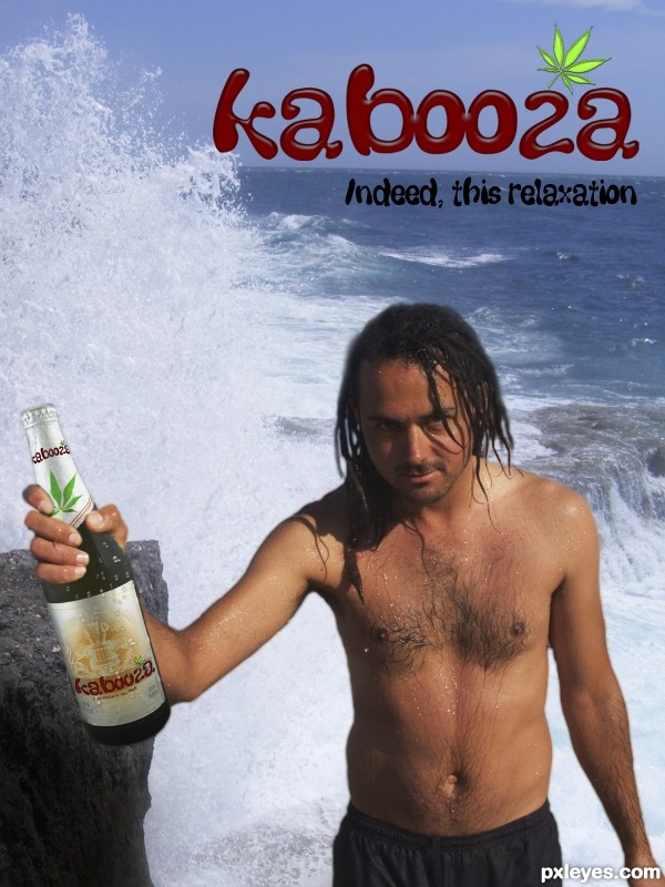
Thanks youngie42,Wikipedia,Big Richard C, funadium (5 years and 3577 days ago)
Source 1 is Copyrighted!
Sorry. Changed the source.
Convincing advert. I like how the leaf graphics and the stoner dude (not fashion model) make it clear what sets this beer apart. I think a shadow is needed on the bottle neck between his forefinger and middle finger [see your Caveman Dan source]. The crashing surf suggests to me that "Indeed, this is refreshment" might be a more appropriate tag line.
Thank you DanLundberg.
Good start for the contest. The leaf Idea is nice, but avoid Inner bewel effect. Keep it very simple. Best of luck.
good idea
Howdie stranger!
If you want to rate this picture or participate in this contest, just:
LOGIN HERE or REGISTER FOR FREE
Very well done!
very realistic, it's good!
great work...
Nice label, but the lighting is off. The bottle shows lighting from the left, while the label is lit from the center. Other than that, this is very well done.
thank you MossyB, I can understand your point of view but I'd like to disagree. Don't be fooled by that highlight on the bottle neck. It's just the reflection of a small striplight to model the bottle.
If you look at it a bit longer, you will find that the light on the bottle is very even. I actually used 4 lights for this shot, one coming from behind to make the liquid inside glow, one from the bottom, one from the front and that small striplight to put a highlight on the bottle neck. If you look at books regarding product photography you will see how it's done. Lion beer would not want the light to be off center when advertising the product.
Very compelling with lots of appealing nuances. I do feel repeating "LION" after "STRONG, PROUD" is an unnecessary redundancy, however. What especially concerns me are the perfectly straight horizontal edges/elements of the labels that are clearly on a curved surface. (Note, for example, the disconnect between the curved bottom of the bottle and the straight bottom of the big label.)
I Like it!!!..
thank you all very much for your comments, I really appreciate them. About the straight horizontal lines: I do not see them to be a problem, as the label is pretty much level with the eye, whereas the bottom is slightly below. If you look at a bottle standing in front of you, you will notice that the higher your eyes go, the curvier the bottom gets. If your eyes are level with the bottom, you will see the bottom as a straight line. But thank you for pointing that out, it's an interesting aspect.
great..
Great job author...one of the best in the contest for sure...best of luck
Clean work of art! One of my favorites indeed!
Congrats well done
Congrats!!
Congrats on your Win
Howdie stranger!
If you want to rate this picture or participate in this contest, just:
LOGIN HERE or REGISTER FOR FREE