(5 years and 3622 days ago)
(5 years and 3673 days ago)
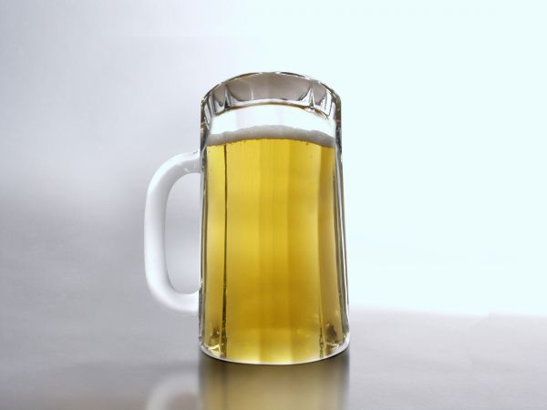
The glass at the top (bottom) looks flat, there is no depth. Same with the beer-head, compared to your source image. Good idea, might be worth fixing 
How did you keep the beer from spilling out? Haha!
You should upload a high res version if possible. This is actually a very nice chop and honestly, other than high res, I don't think you should change a thing. 
Why would you suggest he/she not change it ? we can see in the sbs that he/she removed parts of the base of the glass. Obviously it would look better if it was not removed. So, I would suggest that you DO change it. lol
dude is always trying to mooch off my comments :P
nice
Thanks fot the tips and comments.
See what the SBS said? Ehh???!!!! Um, I'm sorry I see nothing wrong of any sort. Barnacle, I swear your blind because there's nothing wrong with it. The bottom and top look perfected rounded and chopped very clean and very convincing. Author, this is definitely one of the best entries I've seen and the high res helps. I see you placing. GL! 
lol, thanks Nator. I guess we can't expect everyone to have our expert eye 
great 
Howdie stranger!
If you want to rate this picture or participate in this contest, just:
LOGIN HERE or REGISTER FOR FREE
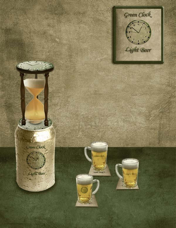
Simple techniques used here,lots of masking,warping and other simple stuff.If it's needed i will upload SBS but i think that is very obvious how is this deviations made.
is not left-handed-http://lindowyn-stock.deviantart.com/
engindeniz-http://www.sxc.hu/photo/1209277
Alessandro Paiva-http://www.sxc.hu/profile/Ale_Paiva
Resources + Images-http://euphoricdesire-stock.deviantart.com/
Thanks guys for the great resources... (5 years and 3691 days ago)
I think the perspective of the glasses doesn't match the can perspective. And the can label needs a little bit of curves...
Thank u Erikuri i made some changes...
Glasses are tiny compared to the can, and the perspectives are different on glasses, can & beer inside hourglass...
I think it needs more shadow work to really make it stand out. Shadows or contrast or something. It has some really nice flat textures happening in it which make it more illustrative feeling.
@CMYK u are right about the perspective,glasses are made with purpose that small or better to say,idea is that Can is big...@Ysayde u are right about shadowing...i made this at 5 a.m. so i am sure that i have a lots of mistakes...Thanks guys for advices...
Hey, friend, you can wake up early morning to photoshop!... Brave soldier! Ah, now mugs are better than glasses. 
But, sorry if I annoy you... I still think that label - on mugs too - needs some roundness... 
Howdie stranger!
If you want to rate this picture or participate in this contest, just:
LOGIN HERE or REGISTER FOR FREE
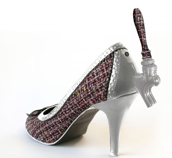
For the man who is tired of having to always walk all the way to the bar to get the next round... buy the special lady in your life the latest in practical fashion!
These stylish heels come with a built in beer tap, and a discrete position to attach the hose.
For a real beer on the go, buy your lady the refrigerated 'keg in a backpack' which she can wear, and dispense beer whenever you need it - day or night!
Hope you enjoy, it gave me a chuckle, I'm wondering if I'll be able to patent these... :) (5 years and 3731 days ago)
Nice chop and funny idea. 
lol even i would give up men for that hehehe
Do you have a store on ebay for those yet. Good chop 
I like this but i think the handle needs shodows and/or highlights, and it needs to be lined up more centrally to the base that's pivoting... and blend it a little more carefully so it looks like its one piece... but good effort...
Thanks for the kind comments! @ James, thankyou for noticing that the angle of the handle is slightly off, but I don't want to add too much more depth as the lighting is very even in this shot and I think it would take away from the realism, some other opinions on this would be apreciated...
fair enough 
Great work very nice lighting
Good one...Nice idea....
Good work!
woman who is wearing this is dream of the all men 
Very nice xD party shoes with beer included.
nice heel... 
clever idea!
nice second ray
Congrats for your second place, Ray!
Congrats!
Congratulations for 2nd
Congrats on 2nd place Ray...wonderful work!
Congrats! 
Congratz sweetheART ;}
Howdie stranger!
If you want to rate this picture or participate in this contest, just:
LOGIN HERE or REGISTER FOR FREE
source (5 years and 3739 days ago)
You don't do drugs, do you author? 
Ha ha, this looks cool, gl. 
haha,lol
heheheheheee ...lol...cool image 
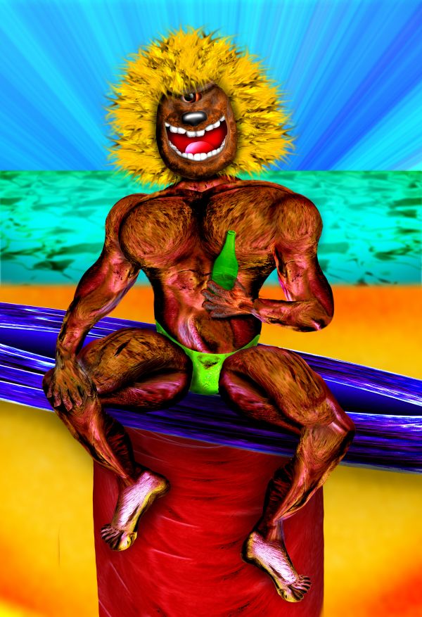
one crazy beach boy....great work author
very nice 
If in fact this is the result of some drug usage........could you perhaps share some of this wildly creative substance? 
Mountain Dew and a lot of worry
Howdie stranger!
If you want to rate this picture or participate in this contest, just:
LOGIN HERE or REGISTER FOR FREE
Looks good...funny, too!

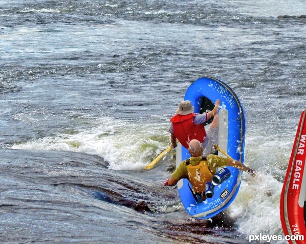
Don't drink before driving! Oops, rafting! Hehehe... Pure adrenaline! Very cool, author! GL!
Great job author...Fantastic blend and great mood.IMHO would be better without red one,or place him some where else...Just an idea...good luck
hehehe.. (note to self.. never go boating with author)
great chop with this, author!
Nice work....GL
nice job.......... all the best to u author ..............
real looking.. good job...
CONGRATS PAPA SMURF!!!!
congrats on 5th place... ichappell...
Howdie stranger!
If you want to rate this picture or participate in this contest, just:
LOGIN HERE or REGISTER FOR FREE