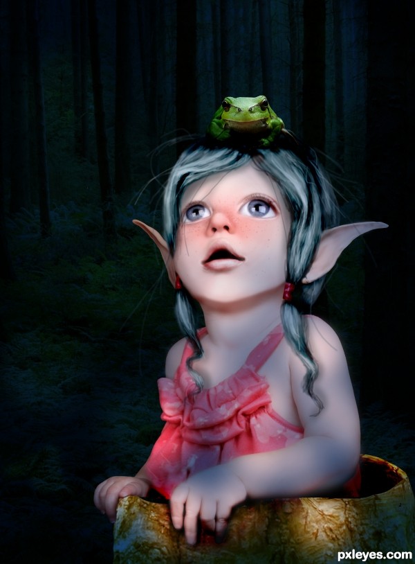
drew the hair, the hair bands, the skin overlay, and the freckles. (5 years and 3176 days ago)
- 1: froggy
- 2: tree trunk
- 3: forest

drew the hair, the hair bands, the skin overlay, and the freckles. (5 years and 3176 days ago)
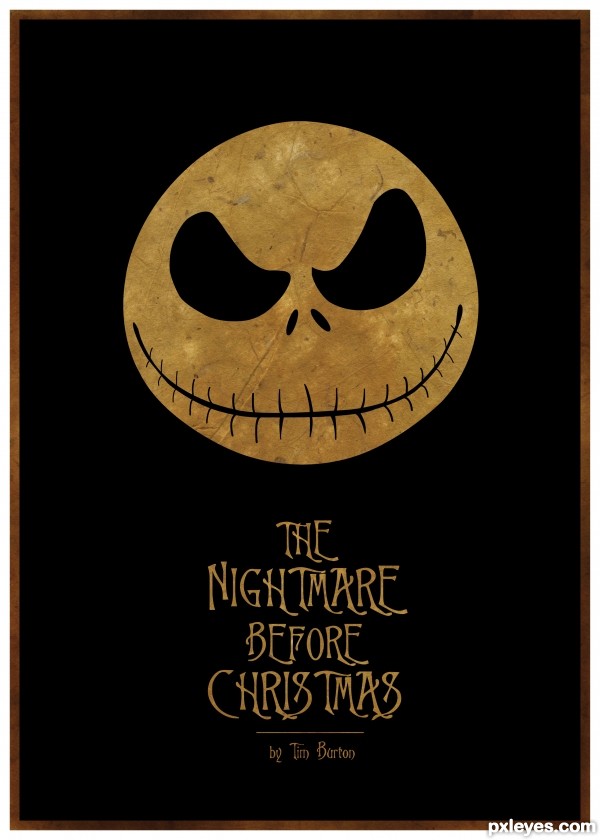
Another Tim Burton movie poster by me...
One of my all time fav movies had to do it, wasn't sure it the white or texture looked best though.
Check my SBS to see the black and white version.
Used Illustrator only. (5 years and 3195 days ago)
Love it!!!! ehehe
IMO the texture works better. GL author, nice job. 
Yeah I thought the texture might give it more character/mood, glad you like 
wonderful!!!!
Excellent!!!!
love this! and glad you went with the texture, it just pulls in the mood of the movie! fantastic! good luck author!
Thanks guys I hope this does well, will try submit another today still.
congrats!
Congrats!
Howdie stranger!
If you want to rate this picture or participate in this contest, just:
LOGIN HERE or REGISTER FOR FREE
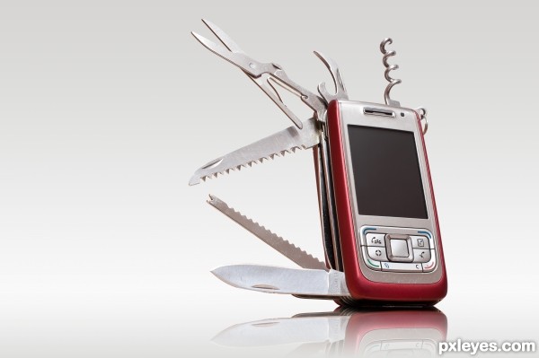
Another swiss army knife, I know the idea is not very original but I wanted to do one for me :)
All sources used are of my own, taken on purpose for the entry.
(5 years and 3381 days ago)
I wish i gad one of those  great job GL
Very sharp image, nice masking, smooth & believable result. Maybe I miss a Swiss flag in the screen  . Good luck!
Great work author  GL
GL
Very realistic, good job!!
Very good thinking on this. Love the idea 
great work author...this is one very practical knife/phone....reflection is perfect and that is always hard thing to do...best of luck
Love the refection and the framing. Great work. GL
Nice touch with the reflection.
Love it! 
 GL!
GL! 
Would be a real drag to answer the phone after opening a bottle of wine if you forgot to close the cork screw! ... Ouch!
Congrats Abe!  Great job!
wow congrats 
Howdie stranger!
If you want to rate this picture or participate in this contest, just:
LOGIN HERE or REGISTER FOR FREE

(5 years and 3403 days ago)
You have light sources coming from both sides of your image, which would work from a surrrealistic standpoint, but the woman is then illuminated from beneath, which is just to visually inconsistent for a successful image.
Howdie stranger!
If you want to rate this picture or participate in this contest, just:
LOGIN HERE or REGISTER FOR FREE
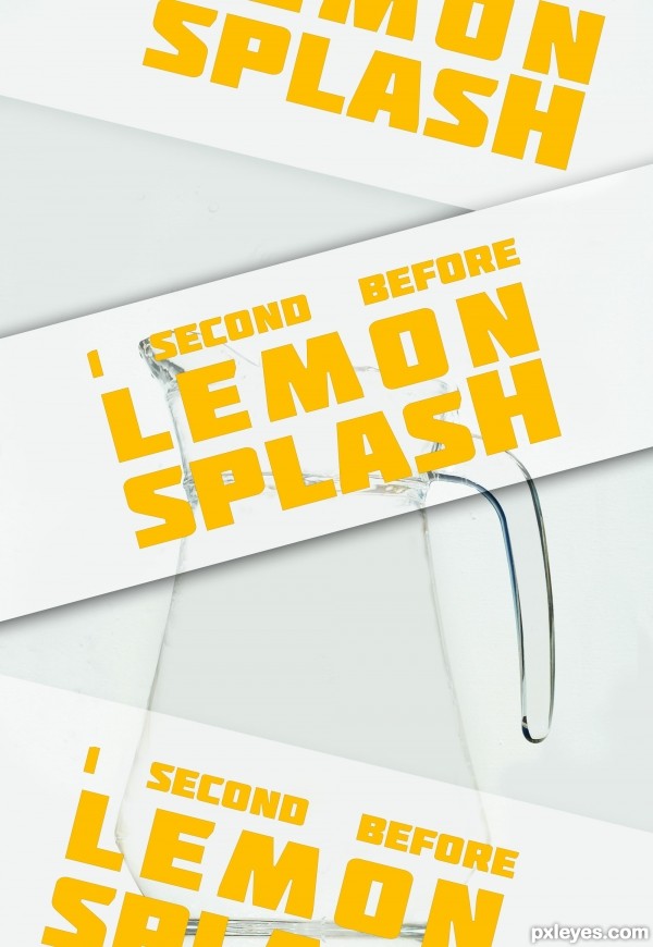
typo poster
eraser tools
no sense ...
in french: Pas d'idée, ni de message en particulier, juste une image ou j'ai travailler la gomme ...
(5 years and 3419 days ago)
What font pack is that?
typo source = font pack = http://www.fontsquirrel.com/fonts/Molot
THANKS!!!
I like it.
Can barely see the image with the posters going down in front of it. Next time just leave the wording in the title or description so we can see what you created.
Howdie stranger!
If you want to rate this picture or participate in this contest, just:
LOGIN HERE or REGISTER FOR FREE
Really nice work with the mottled lighting and the skin painting.
Playful and sweet
thank you!
if only the frog can be as "painterly",.... as well as background.. good one
thank you. i thought about it, retouching the frog, but i just wanted the girl to be "painterly" i will think about it some more... :P
Lovely entry
congrats
Congratulations....very nice work
Congrats!
thank you!
Howdie stranger!
If you want to rate this picture or participate in this contest, just:
LOGIN HERE or REGISTER FOR FREE