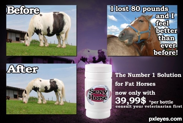
(soft pop music in the background)
Are you a horse?
Do you have a few extra pounds you need to lose?
You tried everything and no results?
Don't worry Sexy Horse diet pills will help you to get the great body you always wanted.With just 39,99 $ you get one + one FREE bottle.If you call us now you 'll get a FREE pair of horseshoes. (5 years and 3534 days ago)






Cute Idea author... one suggestion would be to put all the text in white and use BLACK STROKE 3 - 10 PXLs (see what effect it has on the drop shadow) the split color doesn't work on the 80 pound text) Also try to keep all the fonts at the same size... (Before and After should be the same size as the font on the right... (Unless you are offering information text boxes.. like in a newspaper.. then the font would have to be shrunk to look like newspaper text) ... also center the text on the bottle and sphereize it vertical so it wraps around the bottle (adding a nice label shape oval etc.. is always fun..
You have a great base and I'm sure more peeps will be along to help more, I'm just giving you some suggestions to start.. great IDEA!!! good luck
EDIT: MUCH IMPROVED.. can only get better!!!
Thanks Drivenslush.I think it looks better now.
Funny idea and nice fix. Good tips from Drivenslush. My only suggestion is to bring the label down just a little and it should curve a bit to match the bottle shape. Love the before image... looks like a horsapottomus!
The "testimonial" should not cover the body of the horse. You have a lot of "empty space" with the sky.
I lost 80 pounds, and I
................feel better than
....................ever
...................before!
(the dots are the horse outline)
would be a more "dynamic" text placement.
Also, the "Before" and "After" should be placed better on top of each image, not straddling them and the background
Thanks for the tips spaceranger and MossyB. I appreciate that you helped.
Oh and horsapottomus describes perfectly and funny the before image.
Nice refinements, looks really good!
=))..awesome
lol good idea made me lauph. good job
Oh wow. lots of nice comments.
Thank you people
funny, good job
Great idea and nice improvements ... it is a wonderful concept. Your creativity and willingness to learn is impressive. Bravo!!!
Lol great humor! I love your description! haha
funny...gl
Howdie stranger!
If you want to rate this picture or participate in this contest, just:
LOGIN HERE or REGISTER FOR FREE