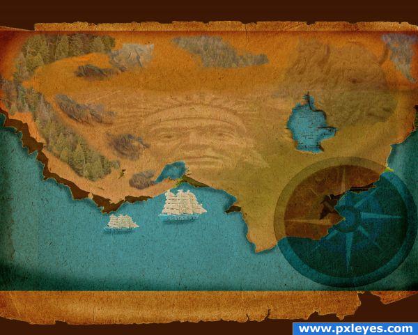
Used a picture I took of a brick wall, used other sources also. (5 years and 3919 days ago)
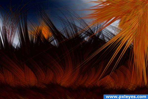
no external sources. SBS took time, becouse files were too informative... :) (5 years and 3948 days ago)
I'm assuming that you used parts of the bug to make the grass? If you check the box "Publish Later" you can write the sbs before submitting. Then return to My Contests to submit when you're done! Yeah!
uhm no offense but you could of made this even from scratch without a source...
Ditto Eladine...
ohh... welll... provocators...  i write those lines then there too, which i allready wrote to eladine in pm... (ditto) actually i may build even this bug without that original source... (ditto) so... possibly point of this picture is somewhere else, if you get it (sbs will help, just wait), i don't care
  cheers!
nice colour cordination
XD i actualy do like the work tho is somethign i think wouldnt look bad ina gallery with a simple frame arround it
Love the colours. Author, please don't try to persuade me that you don't care  I am more than sure you care at least about the time spend to create this beautidul mood.
  If I were you, I would have added the bug in the foreground marching on the grass
 giggle snort.. hehehe
hee... tnx Cornelia, btw colors are from original, except heaven... but about bug... i tought i don't need that kind of pretext for this picture...  cheers!
It's a nice abstract. I think that putting anything else in the image would take away from that. I would hang it over my couch. It would look nice with my livingroom's color scheme, I think.
Howdie stranger!
If you want to rate this picture or participate in this contest, just:
LOGIN HERE or REGISTER FOR FREE
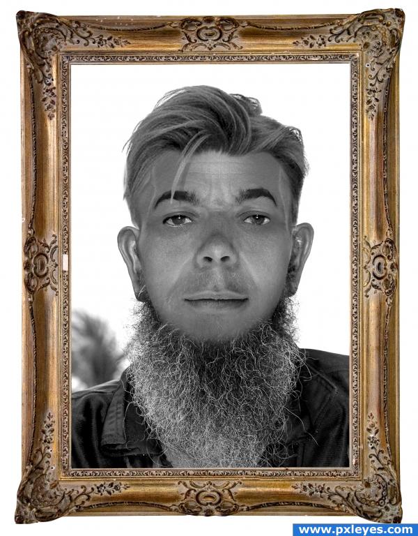
The exact remake of 40 years before with original details in the face. (5 years and 3996 days ago)
The two types of hair don't match, and the frame is distracting...
i disagree cmyk... i really disagree... the hair is a obvious different type... the hairface is different!! not like hair... but.. i put a new version to answear your question.. may be cool! Thx cmyk...
LOL thats cool
i like the full image but it´s true that the beard dt match , but it´s to match???? i dt know, i like it author good luck
Convincing. But the bottom half of his face he looks like an Amish man. And the top of his head he looks like a preppy! Good job though. : )
Great job!!!
Howdie stranger!
If you want to rate this picture or participate in this contest, just:
LOGIN HERE or REGISTER FOR FREE
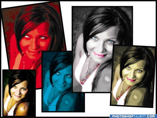
mask different tones and colorize (5 years and 4030 days ago)
Obviously, beauty is in the eye of the beholder.
color change is quite different.. odd to choose dark olive tones.. almost pea soup green.. but it's your choice I guess.. definitely different
EDIT: WOWZERS.. you jumped through the hoops didn't cha.. LOL.. good job!!!!!
thanks probably u where rigth abot the tone.
looks much better in the before version
Interesting idea good luck!
good luck
good job
which is before? which is after?
simple but pretty good

original image has got number 1 in sholder is the left dow side
Good Luck 
the original looks the best
Howdie stranger!
If you want to rate this picture or participate in this contest, just:
LOGIN HERE or REGISTER FOR FREE
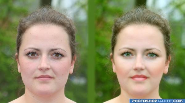
(5 years and 4031 days ago)
Where's the WILD HAIR.. the Bizarre Back Ground.. the FANGS... Just kidding..your subtle approach is very effective and well done, not as dramatic as some of the other piece's but just as powerful..if this was a wedding client you would be getting A HUGE tip for sure...hehehe.. awesome work
(Check your source link, it isn't working for me.. and I DO NOT WANT THIS ENTRY pulled on a technicality)
nice job
nice work, can avoid the blurness
simple......pretty good
Try to add a long hair, she'll look more attractive 
very subtle but clear improvement
I liked the thinner version better... the perfection is somewhere in between! )) gl author
nice 
the eyes are too green for me, but pretty nice use of liquify tool, still looks natural
Howdie stranger!
If you want to rate this picture or participate in this contest, just:
LOGIN HERE or REGISTER FOR FREE
nice image.. i like the sources used. GL
color scheme is quite beautiful
The image itself is great, but i'm not so sure about the compass, amybe it should be smaller and on the water..? Well, job anyway!
Great comments.. thanks everyone.
Howdie stranger!
If you want to rate this picture or participate in this contest, just:
LOGIN HERE or REGISTER FOR FREE