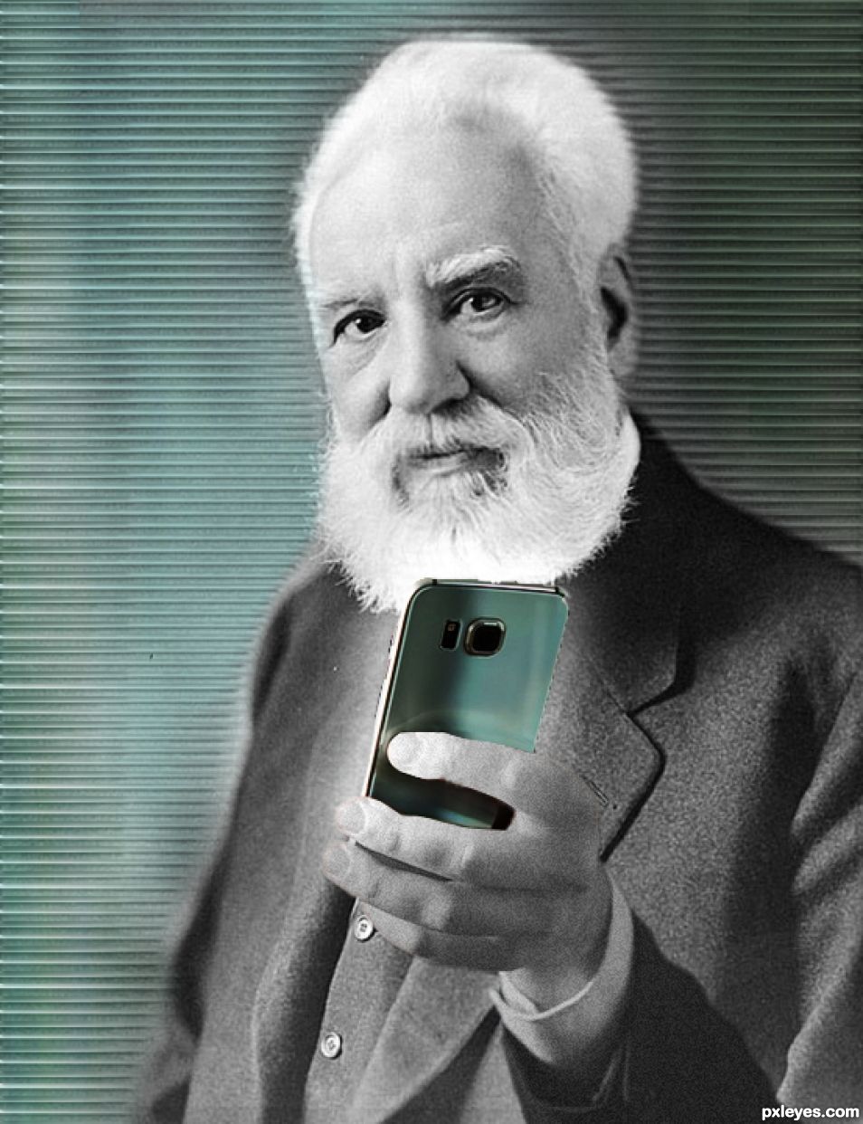
Truly wish he was here to see how phones have evolved! (5 years and 1177 days ago)
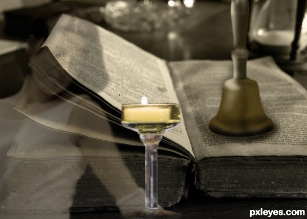
“Bell, book and candleâ€
The expression: "Bell, Book and Candle" is a reference to excommunication from the Catholic Church. The ceremony was performed by: "Ringing the bell, opening the book, and lighting the candle," and closed with "Cease the bell, close the book, and quench the candle."
The phrase is old and first appears, in Old English, circa 1300:
"Curced in kirc an sal ai be wid candil, boke, and bell."
Shakespeare used the phrase in King John, 1595:
“Bell, book, and candle shall not drive me back,
When gold and silver becks me to come onâ€.
Thanks to the following for the use of their images: Michael D. Dunn for the girl, olga for the Bible, and eastlothian for the hand bell.
(5 years and 3541 days ago)
I remember that phrase, thanks for the explanation, bell looks like it's floating a bit, maybe the shady lady is doing that! Over all nice image.
Thanks for the comment pearlie!
Howdie stranger!
If you want to rate this picture or participate in this contest, just:
LOGIN HERE or REGISTER FOR FREE
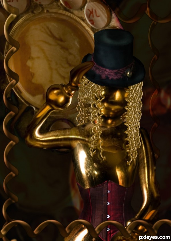
Comments, critiques, whatever, all totally welcomed.
Thanks to Mizzd-Stock @ deviant art for the pose, and costuming..and inspiration for the piece. (5 years and 3592 days ago)
Very nice, and so appropriate! Love that you left the corsett. 
very nice -- like the hair and the corsett
The hat's blurred compared to the source pic, and IMO the "hair" would look better if all the strands ended in points like those at left. Love the image, though. 
Nice work
yes, the hat did blur a bit when doing some liquify to make it fit on the head better. and then when i did burning to darken it (i didn't like the greyish "noise" from the source) it did seem to blur a bit more...i'll see if i can't fix that up a bit.
And the hair!!! oh goodness...considering how many peices of "cord" i had to use to make that hair, i'm not suprised i didn't work on the points more. again, something to work on.
if i get it done in time, i'll update it. 
Thanks for all your comments everyone! and your critiques, CMYK 
very nice construction...good luck
so sexy 
Curly hair is very cute! 
nice chop Author 
Howdie stranger!
If you want to rate this picture or participate in this contest, just:
LOGIN HERE or REGISTER FOR FREE
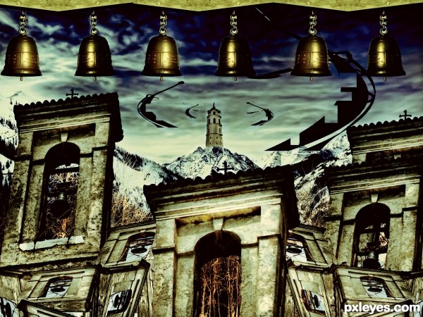
for the one who loves bell and who will love bell just like me
XD (5 years and 3624 days ago)
cool!
I like the colors...

The colors are really dramatic!... I can hear the sound of the bells... 
the wackiness of the perspectives is intriguing .. good luck author!!!
I liked the blends!
Very nice picture, Author.
Howdie stranger!
If you want to rate this picture or participate in this contest, just:
LOGIN HERE or REGISTER FOR FREE
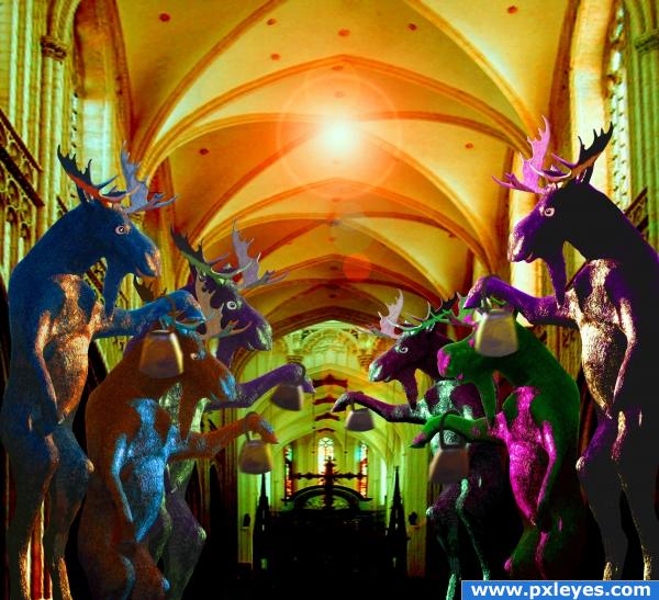
We photographed this moose statue on a trip and thought it would be fun to use in this contest. Thanks for the cathedral background to hillike at PS sources and to shebaduhkitty at morguefile for the bell. (5 years and 3907 days ago)
nice
COW BELL... WE GOT COW BELL.. wooo HOOOOOOO
Great! Love the animal in green and purple! 
nice 
Howdie stranger!
If you want to rate this picture or participate in this contest, just:
LOGIN HERE or REGISTER FOR FREE
Love the concept.. I saw that little string thing and immediately thought of earbuds... Where is the source link for the arm?? The bits on the fingers that aren't de-saturated are distracting from the image.
I agree with thefinalcut. The fingers kind of look like they are bloody and the selection on the top and left side of the phone is a bit jagged. Maybe work on it a bit more cause you have a good idea here.
Author I can see the arm is part of source 2. Please add the source for the background.
The background has no source. I made ap olka-dotted pattern, motion blurred it sideways. Then I copy pasted a portion of the phone to get its green tone, and applied a mask on both of those layers.
That's fine author, just remember always to explain how you created something either by writing it in your description or adding an SBS showing how it was created. I can accept your written explanation this time but usually when the information is this involved an SBS is the best way to show how you created your image.
The mask work isn't very clean, the background overlaps the hair, face and ear. The other edges are blurry and indistinct. It looks like you put the background over the image of Bell and erased to reveal the figure. You should have silhouetted the figure and placed the background behind him.
Howdie stranger!
If you want to rate this picture or participate in this contest, just:
LOGIN HERE or REGISTER FOR FREE