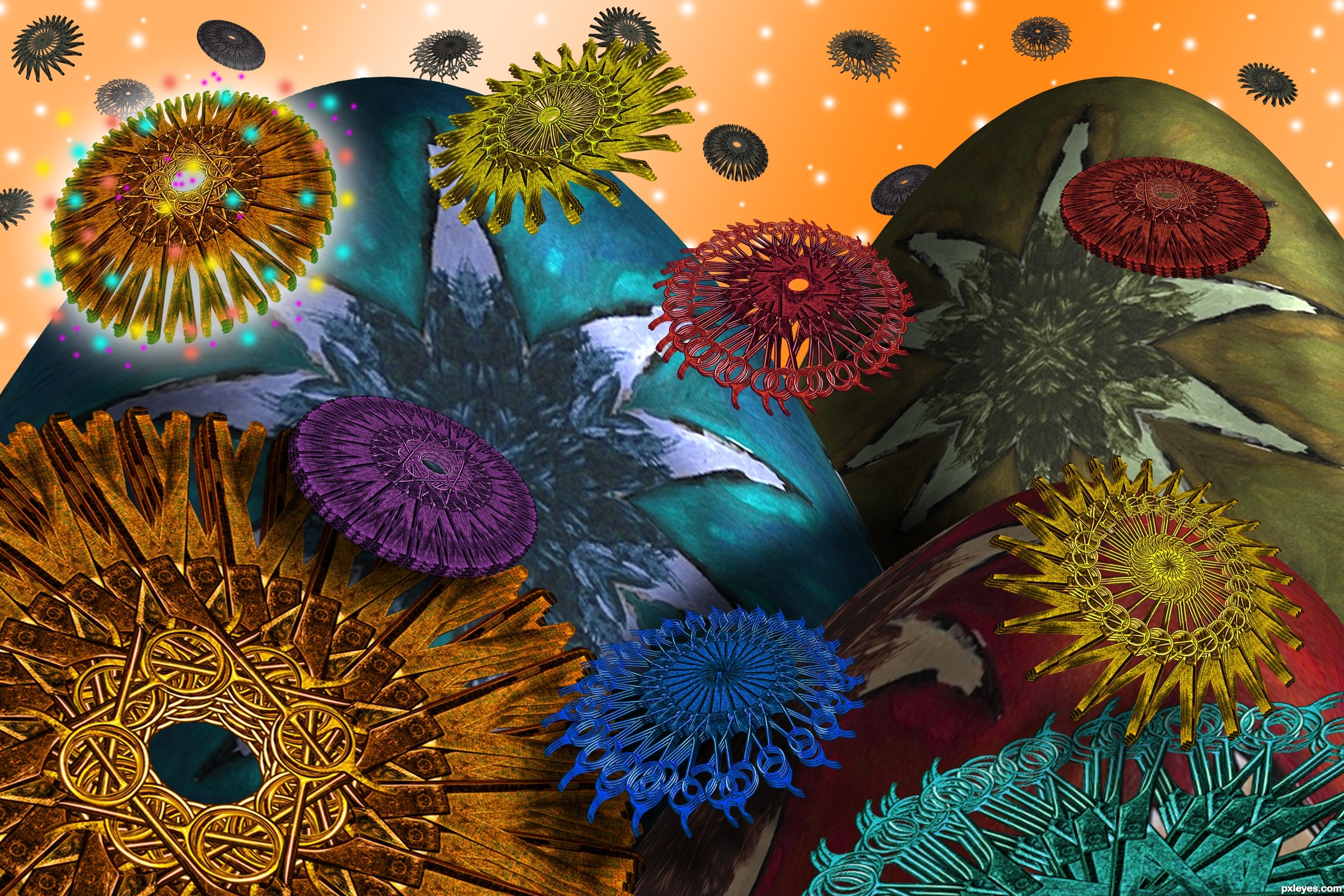
Inspired by the book
VISCOUS CIRCLE
by Piers Anthony
5th book of the Cluster series (5 years and 2884 days ago)
Tasastock-http://tasastock.deviantart.com/
tatto.be-http://www.flickr.com/photos/tatto_be/
Donald Raymond Hall-http://digitaltwist.deviantart.com/
Mao Leon-http://www.sxc.hu/profile/mleon4740
Big thanks for the images...With photographs like this chopping is pure fun...;) (5 years and 3259 days ago)
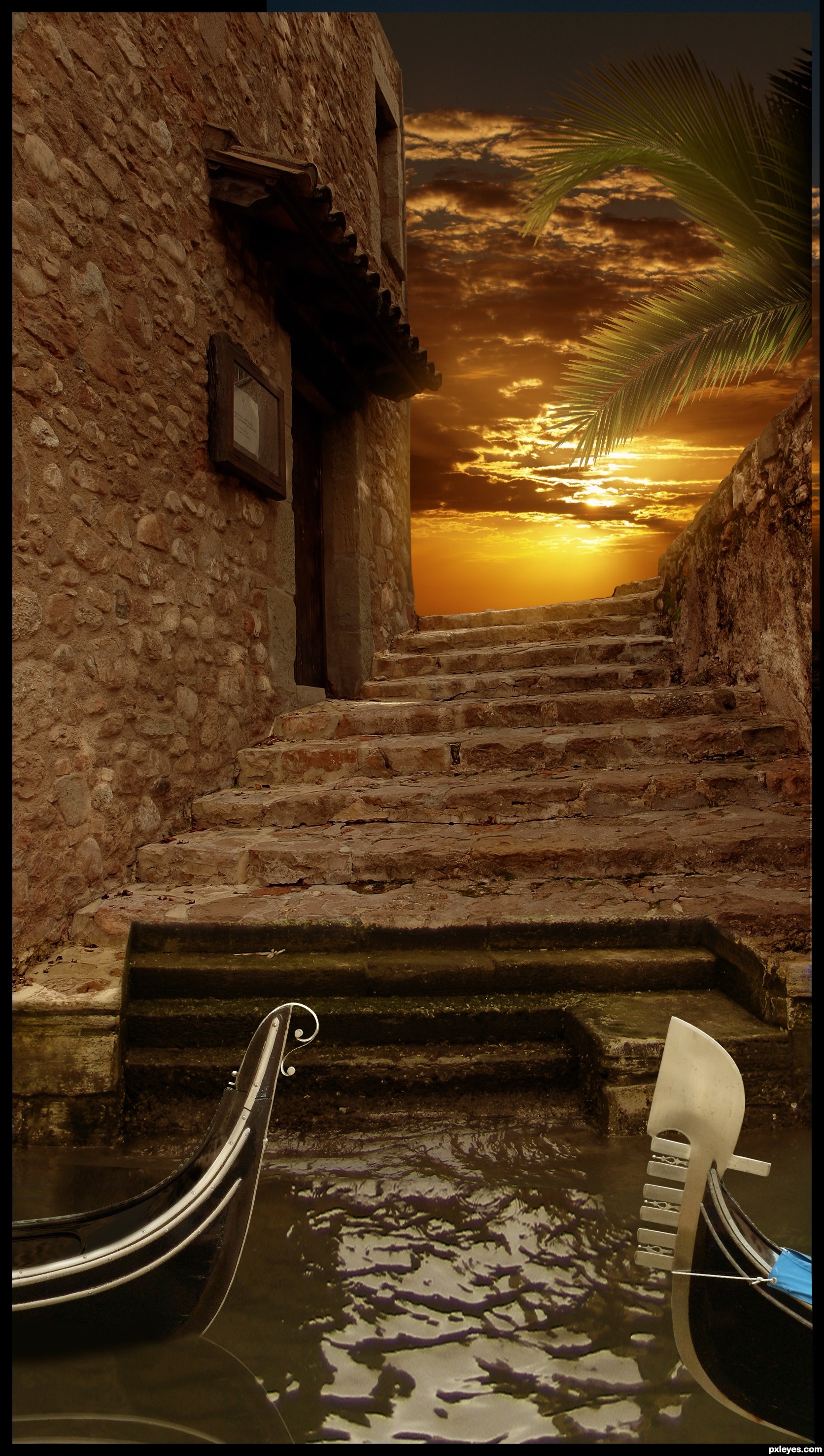
Nice job, but the far horizon wouldn't be visible from this angle. If you crop it out and just have sky up there, this will be a great image.
awesome job author, i agreed with CMYK46...BEST OF LUCK
Thanks a lot guys for the nice comments and advices...Bob i made changes by your advice and i hope its better now...
NIce
my fave, this is simply amazing..very realistic looking! best of luck
very well blended! good luck, author!!!
Lovely sky here and manipulation =)
Bellisima!  Good work, looks very realistic.
congrats on 2nd place
Congrats!!
congratulation!!!
Congrats
Congrats
Howdie stranger!
If you want to rate this picture or participate in this contest, just:
LOGIN HERE or REGISTER FOR FREE
I wanted a very retro effect as if it was a paint of the 1920 (5 years and 3553 days ago)
Très bien! (Is it right?) 
Oui parfait erikuri ! Merci  )
)
Beautiful piece = )
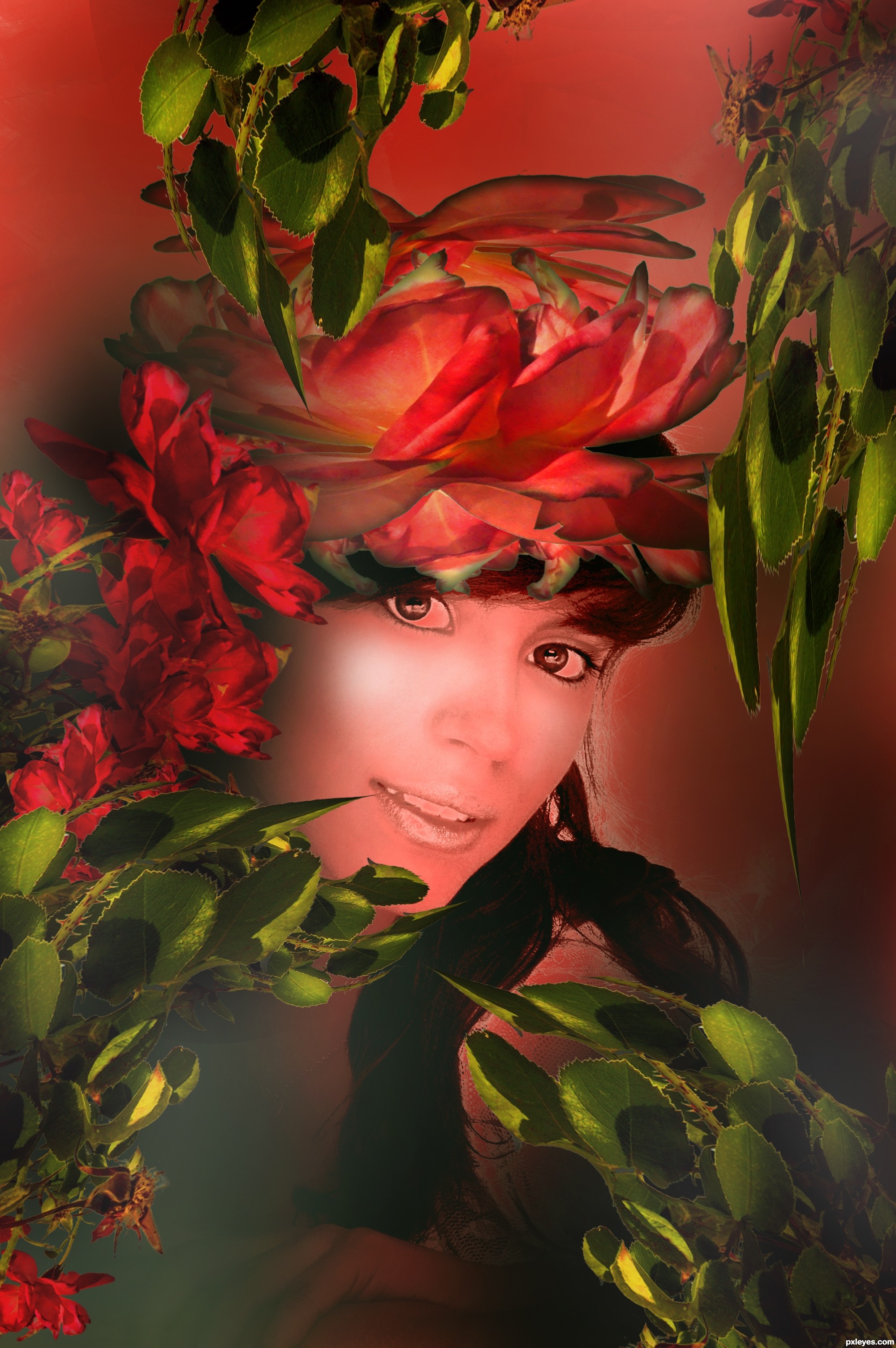
Very pleasing colors and composition. It looks like you missed cleaning background above her head, but lots of time to do it. Will vote later. GL
coolness
Howdie stranger!
If you want to rate this picture or participate in this contest, just:
LOGIN HERE or REGISTER FOR FREE
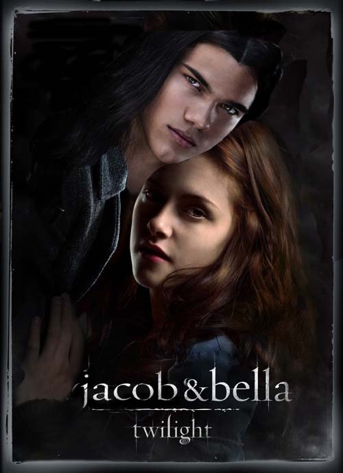
I'm not a huge Edward fan. I love Jacob more. So why not get what I want? (5 years and 3893 days ago)
their heads are a bit off.. you might want to take Jacob head and place it over hers to get the right size then move back in place (so their head sizes are the same)..and place his head behind hers (men are usually portrayed behind the heroine) it seems that jacobs head is a bit smaller then it should be, especially his head being in front of hers, but it's a good image overall
I would but I have a hard time seeing dark colors... Thanks for the tip. =)
very nice!
Thank you Tuckinator
here come the polyvore images.....
Oh and up the top you can still see that other guys hair.
Wacky light sources....
man, i hate that movie.. and i had to go see it against my will 
I hear you elficho... i would've fallen asleep had the girls not been shouting whenever that guy came on screen!
GolemAura gives you good advice..............if you have such a hard time seeing dark colors, why have you chosen to use them? I think it's a good idea that could be better executed!
I have chosen them simply because I wanted to. And I'm still somewhat new to this. And the constructive criticism is greatly apperciated to help better myself.
oh i forgot to comment the entry itself.. i can still see edwards hair, it's quite clear actually, along with that clean cut of jacob's head.. there are also some problems with the background. you could just put jacob's face, keeping everything else from edward. also, you REALLY should consider calibrating your monitor, or at least chop images in a dark room because on my samsung these mistakes are really visible
Howdie stranger!
If you want to rate this picture or participate in this contest, just:
LOGIN HERE or REGISTER FOR FREE
Photography and photoshop contests
We are a community of people with
a passion for photography, graphics and art in general.
Every day new photoshop
and photography contests are posted to compete in. We also have one weekly drawing contest
and one weekly 3D contest!
Participation is 100% free!
Just
register and get
started!
Good luck!
© 2015 Pxleyes.com. All rights reserved.


Wow....this is beautiful!
Awesome!
Fantastic kaleidoscope-like creations!
Howdie stranger!
If you want to rate this picture or participate in this contest, just:
LOGIN HERE or REGISTER FOR FREE