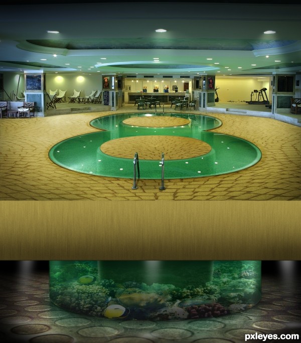
Jacques Cousteau's longest running television series "The Undersea World of Jacques Cousteau" ran from 1968 to 1976. Eight years... (5 years and 2943 days ago)

(5 years and 2955 days ago)
Thanks for Your votes.
Howdie stranger!
If you want to rate this picture or participate in this contest, just:
LOGIN HERE or REGISTER FOR FREE
(5 years and 3060 days ago)
Howdie stranger!
If you want to rate this picture or participate in this contest, just:
LOGIN HERE or REGISTER FOR FREE
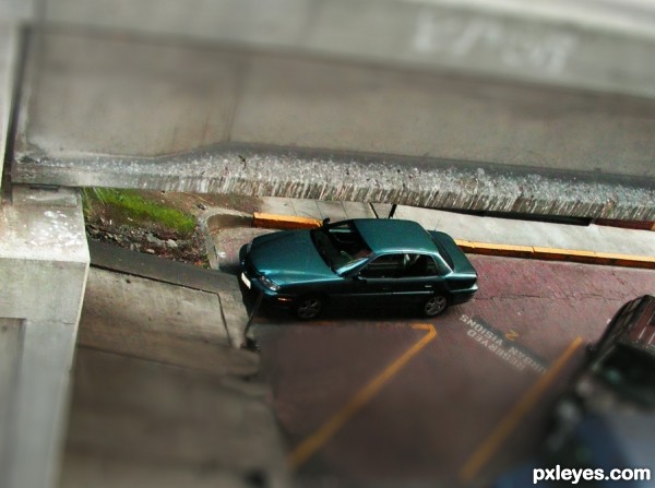
cloned out the people and followed the Tute (5 years and 3384 days ago)
great work author...car really look like a toy...GL
Howdie stranger!
If you want to rate this picture or participate in this contest, just:
LOGIN HERE or REGISTER FOR FREE
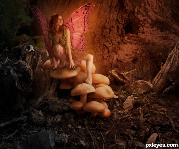
check sbs for original source image used in background
changed some shadowing and replaced the wings with a new set. i wasn't happy with the original source's wings either, and after all the comments, i decided to change it up.
(5 years and 3457 days ago)
Very well blended! Her edges look a little soft in contrast with the rest of the image.. but overall it's great! Well done and good luck 
The wing on the LH side is too dark. It looks like she is leaning against some sort of "shadow wall," and is visually confusing. The wing on the other side needs a bit of work, it looks like a curtain, rather than a wing.
Other than the wings, this has beautiful lighting and blending. Really nice work!
Spots on the wings is not corresponding with tucks 
I understand that the girl is magic creature but even magic creatures need to have a shadow. Especially under the fingers... especially her rigth hand... looks like it hang in the air but not like it leanes on a mushroom.
nice job 
****Updated image****
thank you all for the critiques. i worked with some suggestions and am happier with the image now.
Nice improvement, these wings look much better and more natural (if wings on people could look natural). Has a lovely storybook quality!
Fairytale worthy and well crafted piece. Good work!
Now this this I was surprised to see it was you but still impressed. GL!
Howdie stranger!
If you want to rate this picture or participate in this contest, just:
LOGIN HERE or REGISTER FOR FREE
This is very good entry. Its unique and well executed. Best of luck to you.
Really nice details!
Great idea! I"d blur the reflections of the ceiling lights in the water, though.
On to the next round my friend...Wonderful Entry!
I'm wondering if you changed the depth on the floor and show more of the under tank it would make for a bit more drama (It's a very THICK floor, but that could be just me) I just really would love to see more of the tank underneath because it looks a whole lot more interesting then the top Great job though, really love the idea
  gives a whole new definition of swimming a lap LOL GOOD LUCK
Hey thanks for all the comments and suggestions. @CMYK: I know what you mean...but those are the original light reflections on the pool surface. @Drivenslush: I wrestled with the thick floor...I actually made it thinner, originally but it looked strange. The thick floor makes more sense to me since it's housing an internal pool. @Stowsk: @Chalty: Those details are inspired by much of your work.
yup.. smaller floor, maby darker too. very nice
I like this, very creative = )
I loved this entry so much, I can not stop looking! I want to swim in a pool like this!!! Great job!
I knew it was you..you are so talented!
Fav and good luck!..just amazing chop.
Great work..... if next round....."Go for it" you can..... good luck!
outstanding work author! good luck!
stunning work and imagination..
Simply fabulous! Good luck!
congrats
Congratulations! It reminds me of The Despicable Me Animation! The house of Vector which has a shark just like your imagination (without the shark)!
Congrats for making it to round 3
Congratulations for making to the next round....good luck!
Congrats!!
Congrats, my friend!!! I loved this work!
Thanks so much.
congratulations!
thank you and congrats to you as well!
Howdie stranger!
If you want to rate this picture or participate in this contest, just:
LOGIN HERE or REGISTER FOR FREE