(5 years and 2509 days ago)

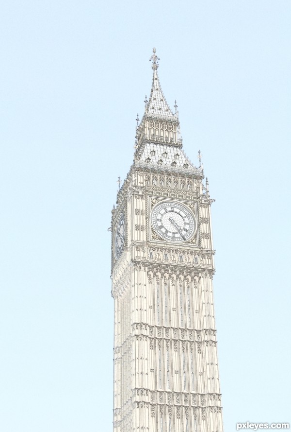
My own photo (5 years and 3163 days ago)
It seems like it's missing something. Maybe some clouds in the sky, or a bird on the left hand side. The eye just travels down and off the bottom of the page. It needs something to bring the eye back up into the composition.
Agreed... sometimes having a large blank space is not entirely desirable!
Howdie stranger!
If you want to rate this picture or participate in this contest, just:
LOGIN HERE or REGISTER FOR FREE

Credit to:
night-fate-stock
cyborgsuzystock
salsolastock
nevertakemystock
fantasystock
enframed
digitalhomicide
from DA for the stock images.
(5 years and 3915 days ago)
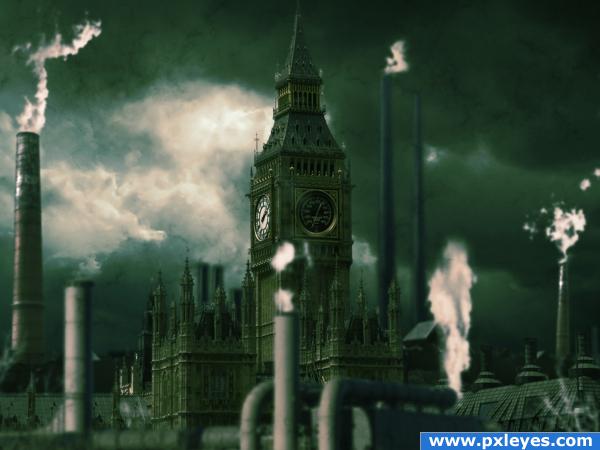
Nice mood, feels gritty and grungy. Good luck!
nice idea and good mood 
love the colours... all the best
right on theme and a great way to get the ball rolling.. good luck author
(I do have to admit this is the first time I've ever heard of Steampunk.. we used to call it industrial surrealism.. so I'm learning a whole new concept 
Don't know if its right on theme or not. But, seriously I like the Image. The whole dark feel associated with it. Good Job.................
Cool image....has a nice sense of depth my only nitpick would be to move the front smoke stack from dead center a little to the left
great job!
Great pic.
I love this, love the way you have put it all together, goodluck..... just dont forget to give links to deviant artists so they can see what you have made 
nice!
This is not bad, however, it's more post apocalyptic (sp?) than steampunk.
Looks cool and screams 'industrial revolution,' but I think steampunk is about applying technology to make life better (from a Victorian perspective and perhaps naively). Steampunk strikes me as inherently optimistic while this has the apocalyptic feel that shadowpwner noticed. Translation: not quite on theme.
You have the right mood...Now let it run wild  Maybe play around with Big Ben
  Good Luck
Howdie stranger!
If you want to rate this picture or participate in this contest, just:
LOGIN HERE or REGISTER FOR FREE
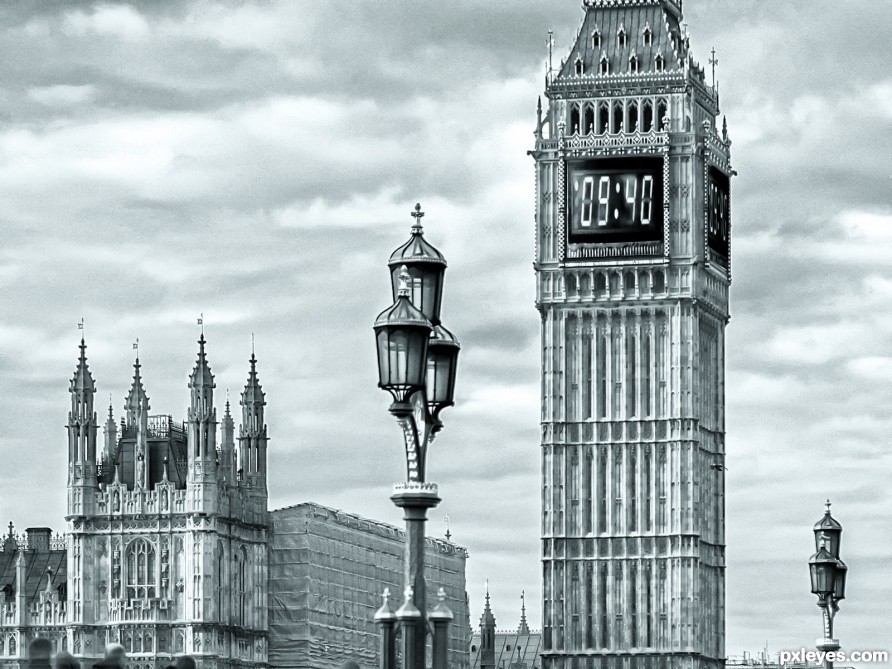
Numerals should be parallel to the tower.
A lil bit! Thanks but theres no time to edit !
Howdie stranger!
If you want to rate this picture or participate in this contest, just:
LOGIN HERE or REGISTER FOR FREE