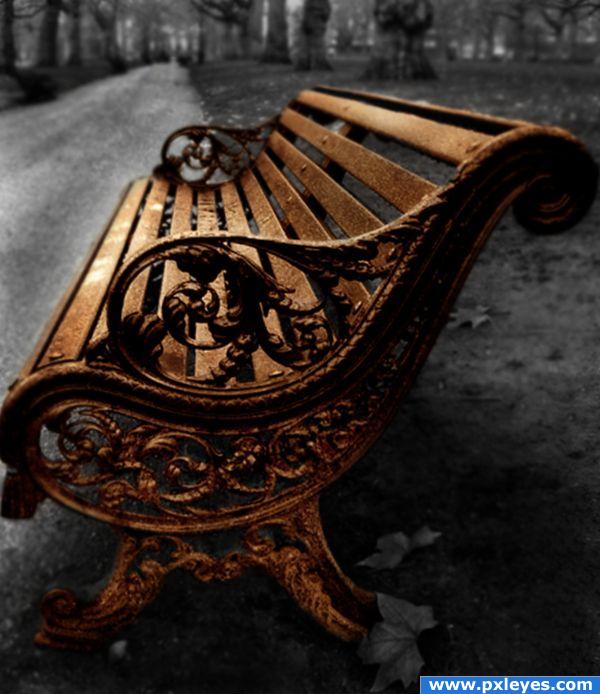
This was my entry for the first time this contest was posted on PST.
I hope you still like it!
Credits to: Superbez for the geat shot. Official account at: http://www.flickr.com/photos/biccc/. (5 years and 3923 days ago)
- 1: Bench
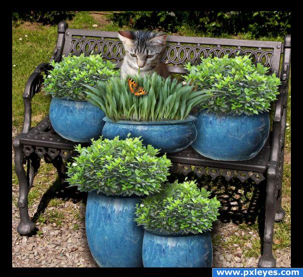
(5 years and 3932 days ago)
Very pretty.. good luck.
expression on the kitty is the best LOL
Very cute image!
Cute image. I see a problem with shadows. See how dark and hard the bench shadow is and note the direction of the shadow. There wouldn't be a shadow on the left as you show on the pots at the left side. You shouldn't see the holes from the original bench shadow any longer since you covered the seat with the pots. Shadows should lay on the ground just as the bench shadow does. The cat should cast a harder shadow on the bench back.
Very pretty. Would make a lovely greeting card.
Nice job! Try not having the shadow go around the contour of pots...give them more of a flat shadow. Look at the shadow of the bench as a clue. Darker directly underneath and perspective out behind the pots. 
No need to apologize for your English...you're doing fine!
thanks all for comment i have try the shadows but i can´t cat it right, sorry for my english
agree with spacerangerabout the shadow....and i think u should adjust the pots perspective.
awe that is so cute!
Congrats for your first place, Demi!
Congratulations for 1st
thnx you all for voting
Congrats!
Congrats!!
Howdie stranger!
If you want to rate this picture or participate in this contest, just:
LOGIN HERE or REGISTER FOR FREE
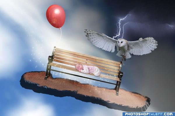
Just a random idea I came up with. Extracted bench with vector mask using pen tool. The "brick island" effect created with bevel and emboss layer style and layer mask. Add stars with a paintbrush and painted in light streams on separate layer and set to soft light. Edited to credit NefaroStock (at deviantArt), I included the link to here and their page. Thanks CYMK46, I hadn't noticed that. (5 years and 4030 days ago)
good
very Slavador Dali' esque..... I like the LACK of distortion or melting.. hehehe.. once you melt something.. Ya GOTTA MELT EVERYTHING LOL... good Luck.. Lots of fun here
great idea! the ground could be a piece of bread, then it would be even more syrreal.. :P
Nice work, really like where you went with this, its like the baby is dreaming of those things 
that looks like the owl from the labyrinth movie with david bowie !! haha miss that movie
Please credit the owl author as per request. I'm not a fan of sparkly fairy dust, but it almost works here...
neat picture.
This looks really good, but I would have used an eagle instead of an owl...for the impression :d but that's just me 
Howdie stranger!
If you want to rate this picture or participate in this contest, just:
LOGIN HERE or REGISTER FOR FREE
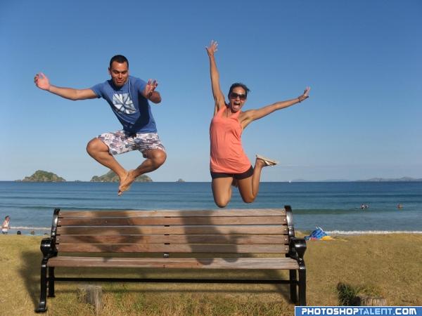
Thanks susiet (5 years and 4032 days ago)
Good job and good luck. Take a look at the shadow on the ground. There should be a shadow of the people through the bench and onto the ground.
in the shadow casted by the bench, it should not be completely black as there are gaps between the wooden planks in the bench.. One more thing is the shadows casted by the characters... the shadows of the feet of the male char and knee of female char are wrong.. these shadows fall on the horizontal seat of the bench and do not get seen as shown in this pic. there should be a small deviation between the shadows on horizontal portion and vertical portion of the bench.. just my opinions.. gl 
an eg of shadows on uneven surface - http://www.itchy-animation.co.uk/tutorials/01-blue-shadows.jpg take a look at the shadows of the branch on teh window...it maybe difficult to incorporate this fact in PS, in that case u could just raise the shadows so that they fall on the vertical portion of the bench alone..
setting the shadow discussion aside. this is a very energetic picture.. very happy and fun mood.. good luck
Nice idea good luck!
very nice
good
nice
Bench looks way too big in relation to the people.
nic, could do better with the shadow tho
Funny  . To make you more nuts about shadows and such, I think the shadow from the bench should be a bit less deep amd more to the left. And up to you, but if you like a more symmetrical image, I'd crop a bit from the right side of the image. Good luck!
Very good, looks like it could really be there, good one 
Looks pretty realistic,great job.Maybe you could make the people a bit larger,but that's up to you.
odd clean bench on the beach. What are the tree stumps?
Very fun. Nice job!
Howdie stranger!
If you want to rate this picture or participate in this contest, just:
LOGIN HERE or REGISTER FOR FREE
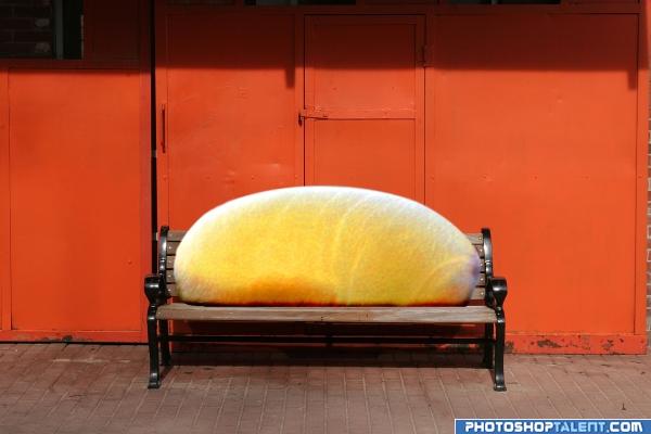
Burnt my finger and it's been bothering me all day, had to do something to get my mind off of it, now I like it :) (5 years and 4032 days ago)
Hmmm. Wow. Gross? I'm not sure if I like or I'm entirely repulsed.
Interesting...Good Luck
I like this image - it makes one question and then discover some quite intimate experience of your's behind it. Brave approach!
good
need a bit more work, good job tho
gross. i though it was a loaf of bread first.
I thoght about bread as well))) Looks pretty real though) GL
Howdie stranger!
If you want to rate this picture or participate in this contest, just:
LOGIN HERE or REGISTER FOR FREE
I freakin love this shot, very good job!
Good job! I like the extra work you have done on the bench. Good luck!
while i like the image, it seems really grainy, however you seem to have added some nice detail to the chair yourself, so points for doing more than duplicate and erase lol... goodluck
Howdie stranger!
If you want to rate this picture or participate in this contest, just:
LOGIN HERE or REGISTER FOR FREE