(5 years and 3938 days ago)
Photography and photoshop contests
We are a community of people with
a passion for photography, graphics and art in general.
Every day new photoshop
and photography contests are posted to compete in. We also have one weekly drawing contest
and one weekly 3D contest!
Participation is 100% free!
Just
register and get
started!
Good luck!
© 2015 Pxleyes.com. All rights reserved.

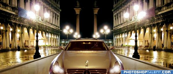
Why can i hear the theme from CRIBS playing... LOL.. good luck, GREAT interpretation

Post Script: You need to flip or blur the backwards text or get rid of the two flags completely.. I know the symmetry was on purpose but text in images not done on purpose can be very distracting.. good luck and good work
EDIT: Now you can look at the piece and say. Hey rich guy in car driving in Italy..instead of .. what does that say??? WHAT DOES THAT SAY?. hehe.. GREAT FIX
Golem I took the text on the banners out completely, thanks for the advice!
Very nice SBS. Some good techniques I plan to use when I can.
Nice work, its very realistic, I would take one of the pillars from the back out and move the other one to the centre I think that would make it look better
very nice view
nice work
you did very well
Howdie stranger!
If you want to rate this picture or participate in this contest, just:
LOGIN HERE or REGISTER FOR FREE