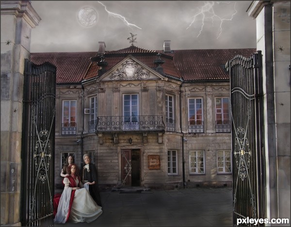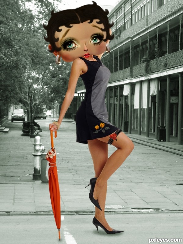
Betty's Brothel is in need of some repair and perhaps has a bit of eccentric clientele. (5 years and 3358 days ago)

Thanks to:
- T. Tulic and J. Charles Cuvelier @ Photoxpress;
- tibchris, paparutzi, The ChainMaille Lady and notahandbag @ Flickr;
- allergyfre @ Sxc.hu;
- jana koll @ RGBStock;
- CGTextures.com.
Reference: http://www.counterfeitchic.com/Images/Betty_Boop.jpg
(5 years and 3579 days ago)
really cool, well done
this is very nice,......if only the sbs is here,.......and are you sure about the BG? I mean ( just IMO ), it would be better change it by colorful BG like like night life in a metro city pic or glam party or something,........

Great work on the head! (SBS would be good...).
You could find a real face and distort it. That's better because the skin on the face now is not fitted to the real body (but the eyes, nose and mouth are good). Also, her "decorations" could be replaced by the real things, it will be much more convincing. Still a good entry and eye catching, good luck 
EDIT: I didn't know it's you 
I agree with langstrum and dewid.
Nice job on the face, if you could tweak her body a bit more would make it only better (a bit rounder here & there and perhaps also squeeze-scale it vertically a bit). I agree with the real earrings and bracelet. Good luck!
PS not sure how you made the hair but I'd make it a tiny bit lighter so you can see the shape of the strings a bit better.
SUPER duper weeee.. 
great work!
woow.. good that it is just photoshop.. :3 it will be very scary to see a real betty
Overall, very nice work.... Two thumbs up!
Great use of sources... SBS is also very good!
superb!! great job dude...... just fabulous .. wow
love the eyes..beautiful !!! love the cute lips too 
Thanks, everybody! 
I think her waist thinner and changed the accessories. I hope it's better now... 
I think you could have put a lot more effort into acheiving a more detailed and believable face, right now I think the difference between the head and the body are apparent in terms of realism... facial parts could easily be constructed from your source images to give it more definition and marry up better with the rest of your scene... just my opinion
I really like this one ...not really a suggestion just a thought ... it would be interesting to see her more monochromatic ... the original Betty Boop was mostly Black and White ... she was barely even grayscale. In this case I am not sure how that would work but it would be fun to see it that way and compare the two.
Really great job though and perfect model for her! 
I really really loved this work!
Congratulation!
Cute ! Very well done, good luck author 
Great work author...very nice idea and cool execution...good luck
congratulation!
Nicely done - congrats!
Congrats . . . . That was beautiful . . . . 
congrats !
I knew it,...it must be one of the best,....congrats on the 3nd....
Congrats! for your great chop. Very well done 

Congrats!!
Congrats for third place ! i really love it.
congrates  wished u topped
Thanks for all the favs, support and comments; it's because all of you I got this place! 
Congrats Erica 
Congratulations!
Howdie stranger!
If you want to rate this picture or participate in this contest, just:
LOGIN HERE or REGISTER FOR FREE

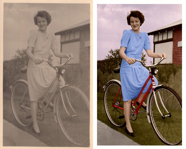
This is a photo of my great aunt Betty. I think it was taken in the late 30's.
I entered this photo in a similar contest before the crash, but I have completely reworked all the colouring for
this contest. My old entry is included in the SBS for comparison. (5 years and 3843 days ago)
wow..........skin tones are great, wall colors are superb...........the front wheel of the bike seems to be off the ground, and also a little sharper than the rest of the bike, but this is good, real good...
Pink sky looks strange, all else is well done...
I painted the sky with a blue colour, but I didn't want it too bright because I wanted the dress to stand out.
Well done, GL.
Great colours, very realistic tones, i especially like that brick wall! Good luck
In high res, it seems a little grainy but yet the original is not so much.
super easy fix... all you ad to do was fix the border.
great 
Congrats for your third place, Falkor!
Congrats,
Congrats 
congrats =)
Congrats!
Howdie stranger!
If you want to rate this picture or participate in this contest, just:
LOGIN HERE or REGISTER FOR FREE
Sara Barth and Lies Meirlaen have both been notified of their image being used, by note thru Stock.xchng.
I like the overall colours of this image, it suits the elements in the image so well. Good work!
I like it overall however I think it could have been straightened up to make it look level.
I thought of straightening the right entry post, but decided it added to the state of decay. Therefore, I left it as it is, to be fitting of the theme.
This is nice entry author and with few tweaks this can be even better...Sky image and the overall mood don't go with each other...U have day light for the house and people but rainy dark sky...U have to made image darker or to find some other sky for this image...I think that some other sky would be better in this case...Also IMHO spiders are to big..For better blending u can use some color layers in different blend modes..There is slight difference in resolution of provided source image and images that u used so some color layers would fix that difference...sorry for this nit picks...
Erathion, all the changes you requested have been made, with the addition of a nicer weathervane and lightening.
Cool concept. The fairly uniform lighting makes it all rather blah, however. A lot more shadows would make it a lot more dramatic. Some green (for example) interior lights might convey both "open for business" and "eccentric."
it looks loke a painting, very nice good luck!
It's sort of scary, really like it!
Howdie stranger!
If you want to rate this picture or participate in this contest, just:
LOGIN HERE or REGISTER FOR FREE