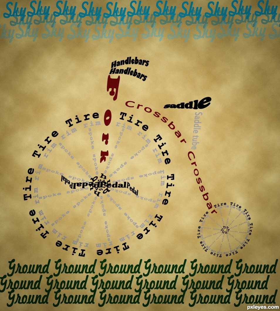
5 font type used for this one (5 years and 2434 days ago)
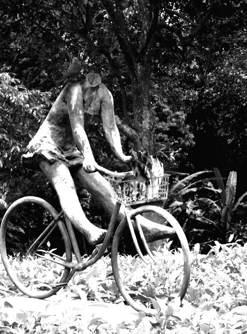
created using clone, path, brush, and hue-saturation/brightness-contrast. (5 years and 3198 days ago)
The basket is too sharp edged in comparison to the rounded edges of the rest of the sculpture.
By comparison, the "neck" of the sculpture where the head was removed is too soft and rounded, making it look lumpy and somewhat "melted." A bit sharper "break" edge would better convey the headlessness. You may also want to clone in some of the leaf pattern behind the neck to better blend the space with the background.
To get rid of the sharp edged basket, try to use a little bit Gaussian Blur. Or just use the Blur Tool. A little lighting to the "neck" should make an illusion to the headless stone. Btw, where's the so called Crow? It's too dark to see the crow standing by the "neck". Try to add a little highlights to the Crow's feathers that reflect the lights/sun rays.
Hope it helps. Awesome idea, Author.
Thanks for the tips!
The neck looks much better, but now you've increased the overall contrast too much, making the brights look "blown out" to almost pure white, which really makes the ground look bad, almost like a poor infra-red effect...
Also, although you've now softened the basket, it shows NO highlights to correspond to the rest of the statue. You may have to hand paint those in with either the Paintbrush, or the Dodge tool.
Perhaps you should add a bit of the green color of the foliage back into the image?
Howdie stranger!
If you want to rate this picture or participate in this contest, just:
LOGIN HERE or REGISTER FOR FREE
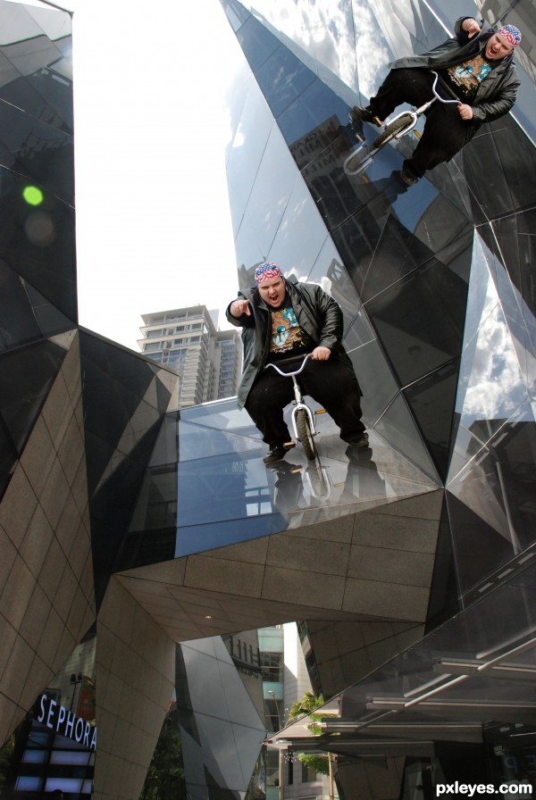
(5 years and 3224 days ago)
GRAVITY LAW BE DAMNED!!! hehehehehe good luck author
Note from author: background image is own source.
Howdie stranger!
If you want to rate this picture or participate in this contest, just:
LOGIN HERE or REGISTER FOR FREE
(5 years and 3854 days ago)
Great creation... very well done!
Great job, very nice work 
if you use PERSPECTIVE on the base pattern.. you could make it look more flat (then shadow according to the angle) just put the layer with the pattern into perspective and then pull it wide on the bottom it will help it look like the ground is flat (the sbs is wonderful)
Good idea but the perspective is all over the place
cute idea but the outlines are odd and the blanket would be showing through some of the wheels
Howdie stranger!
If you want to rate this picture or participate in this contest, just:
LOGIN HERE or REGISTER FOR FREE
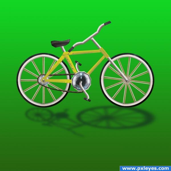
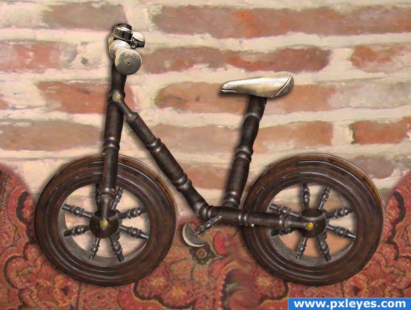
My first entry: I used only the original image. The tires are from the front knob, rims from the scale pans, spokes from the right scale hanging wires, the seat from a rubber foot, the chain from thread on the foot, the gears from the large knob in front, chrome parts from main stand, and the frame from the scale arm with gradiant fill. I used the transform and warp tools a lot. (5 years and 3932 days ago)
good first entry. Add a step by step guide.
good work
very good work for first entry. 
great idea , just spend more time on it 
must have sbs (step by step guide)
Nice idea of your first Entry Author...G/L.
i don't see the source and you don't have an sbs
Clever use of stock! Maybe try adding a background, just like a sidewalk or something.. nothing major. Good luck!
Good job, author! Not sure why the back tire shadow is so much smaller than the front. Nice use of source and good job! 
Wasn't sure HOW to do the SBS, when I figure it out, it will be here.
the chain is too flaccid!  cool!
cool! 
Howdie stranger!
If you want to rate this picture or participate in this contest, just:
LOGIN HERE or REGISTER FOR FREE
Very fun! A "Cloud" in the sky might be amusing. I would note that tires that aren't perfect circles are going to make for a wobbly ride.
Great work, I like the smooth curves and the background makes the words stand out.
congrats!
Congrats on 2nd!
congrats Mario
congrats
Congrats
congrats
Howdie stranger!
If you want to rate this picture or participate in this contest, just:
LOGIN HERE or REGISTER FOR FREE