(5 years and 3005 days ago)
- 1: desert

Made with Photoshop 7.0. (5 years and 3682 days ago)
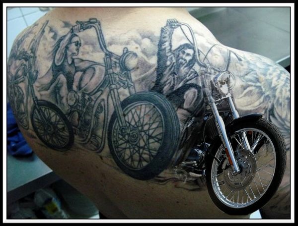
Might be better just to use the front bike...
I was thinking the same thing but this way it looks more lively I guess.
Suggestions for improvement have been implemented. Thanks.
not bad at all...my thoughts ,like Nators are possibly skew on the bike a little bit to refine it's alignment
I DID skew the bike. Look at the SBS how it was originally.
Thanks again Nator and CMYK. I was going to do something like this to start with but I guess the image of the two images seems to look more lively with the original background. I was trying to go in a new direction with the theme, but after using your suggestions, it does look better this way too. 
Love this, great idea. Small bit of white leftovers on the bottom of hte front wheel tho, little bit distracting.
Amazing work.....
Good job! 
Nice work  GL
GL
barnacle, trust me on this, I did that already and it didn't look right. I was trying to create the blend from tattoo to reality and well, I think I have achieved that just about as close as possible. Thanks again for everybody's comments. Much appreciated. 
nice job there, good luck to you... 
You did acheive it very well  well done
It'll always be hard to get the perspective right as the tat was not drawn to scale or with a perfect perspective. I think youve done a very good job getting it as close as you have (and nice job cutting it away from the overly cluttered image you had in before). Great work.
great job.gl
Howdie stranger!
If you want to rate this picture or participate in this contest, just:
LOGIN HERE or REGISTER FOR FREE
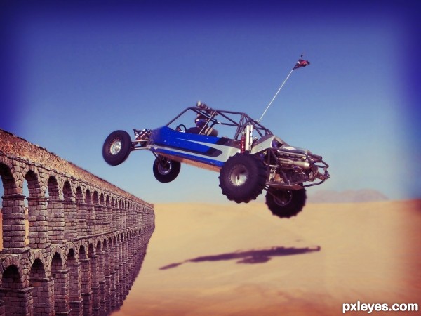
You might try blurring the aquaduct a bit. The buggy and sand are noticeably less focused.
+1 on what mossyB says, otherwise some nice blending
Pretty gigantic buggy compared to the scale of the aqueduct...
looks a little out of proportion
Howdie stranger!
If you want to rate this picture or participate in this contest, just:
LOGIN HERE or REGISTER FOR FREE