Photoshop Pictures: Bikini


results 1 - 5 of 6

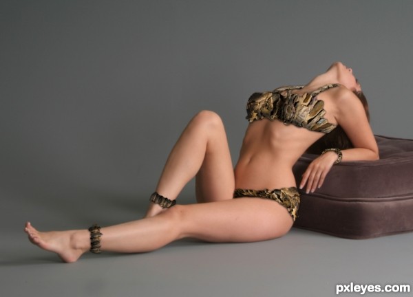
Double Rock Frame Bikini - created by etherwarrior


Double Rock Frame Bikini
Favs: 0SBS: 1Hi-resRank: 5/7Score: 59.9% (0)11355 views

New Double Rock Frame Bikinis out now for 2012, all sizes available!
80% rock 20% Carbon Fibre, rocks attached with our special patented bonding system!
Tough, Durable and Unusual.
Warning may be uncomfortable at first!!
Thanks to mjranum-stock for jpeg! (5 years and 2602 days ago)

1 Source:

No comments yet... Be the first!Double, Rock, Frame, Bikini

Howdie stranger!
If you want to rate this picture or participate in this contest, just:

LOGIN HERE or REGISTER FOR FREE


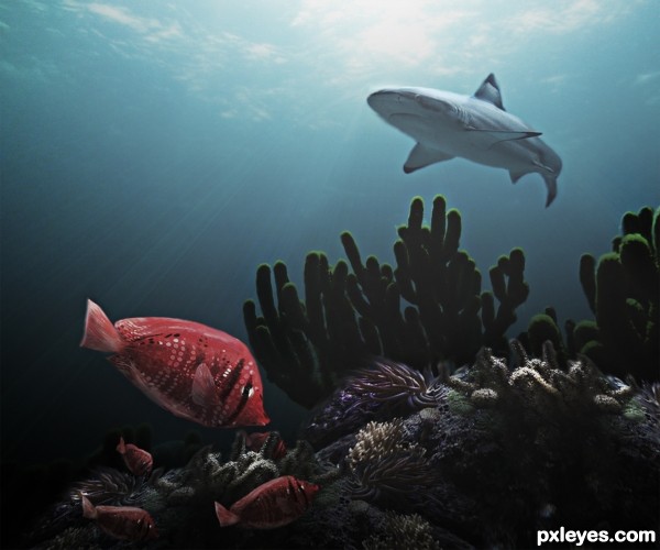
Bikini Fish - created by Majkman


Bikini Fish
Favs: 3SBS: 13Hi-resRank: 1/7Score: 66.7% (37)9472 views

A rare exotic species
(5 years and 2866 days ago)

4 Sources:

avatar CMYK46
CMYK46 says:

Nice job, author...very believable.

avatar Eladine
Eladine says:

very realistic image great blending

avatar amn
amn says:

nice wrk author....

avatar Drivenslush

well done!!!

avatar jordyponce

Funny tittle!..cool idea..my fav!.GL

avatar Glockman
Glockman says:

Ilike the feel of movement in this, gl

avatar jordyponce

Congrats!!..

avatar sande1001
sande1001 says:

congrats

avatar oziipop
oziipop says:

Good job buddy!

avatar CMYK46
CMYK46 says:

Congrats...Nice work!

author says:

thank you all...I have learned a lot here in my 280 days

Howdie stranger!
If you want to rate this picture or participate in this contest, just:

LOGIN HERE or REGISTER FOR FREE


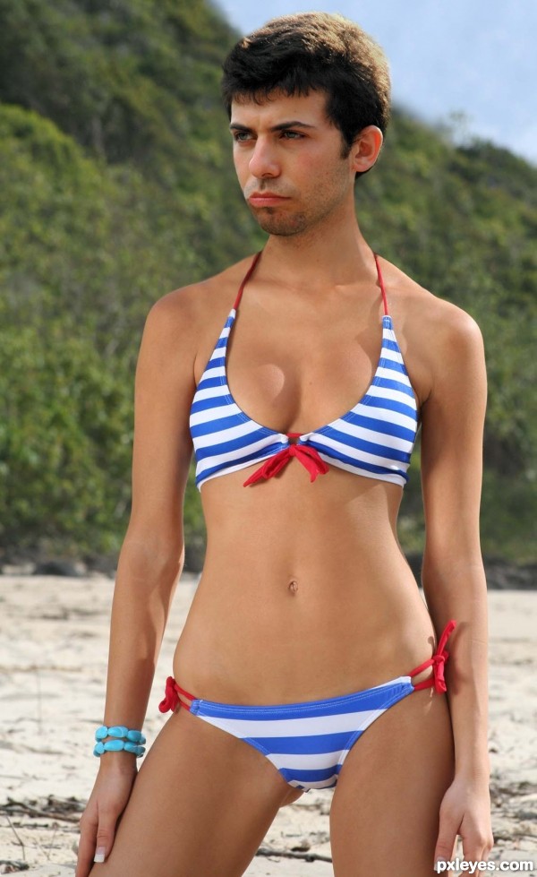
bikini beauty - created by Neese


bikini beauty
Favs: 1SBS: n/aHi-resRank: 7/7Score: 55.1% (0)12648 views

version 2 ...... I made the head a little bit smaller. (5 years and 3163 days ago)

2 Sources:

avatar Androla
Androla says:

awesome blending!

avatar Androla
Androla says:

AMAZING BLENDING!!!

avatar Drivenslush

oh man.. this is so hard to look at.. very well done.. but still hard to look at LOL

avatar ibmaxed
ibmaxed says:

That old saying comes to mind "nice bod shame about the face". Great job.LMAO

avatar CMYK46
CMYK46 says:

Light on head is opposite light source on the body.

avatar CMYK46
CMYK46 says:

Light on head is opposite light source on body.

avatar pixelkid
pixelkid says:

Author...if you make the head slightly smaller it would help. You've done a great job with color match and blend...just the head size is all I see to change. Just a thought! Nice work, author!

avatar erathion
erathion says:

super cool work author...u could put some hairs on his/hers chest for more hilarious result...GL

avatar CMYK46
CMYK46 says:

Needs chest hair to be convincing.

avatar Glockman
Glockman says:

Very well done

avatar pearlie
pearlie says:

Good blending on this, and nice fix on the lips.

Howdie stranger!
If you want to rate this picture or participate in this contest, just:

LOGIN HERE or REGISTER FOR FREE


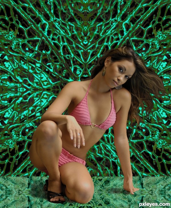
Bikini Batik - created by MossyB


Bikini Batik
Favs: 0SBS: 8Hi-resRank: 7/7Score: 50.3% (0)12788 views

Mirrored source image horizontally & vertically, removed center section to make "floor."
Adjusted hue and saturation, used "Filter>Stylize>Diffuse>Anisotropic" on background to smooth edges.
Added extracted Bikini Model, and painted in missing hair and shadow. (5 years and 3333 days ago)

1 Source:

avatar secretsather

Hey, you're just trying to win by...

author says:

secretsather said:
"Hey, you're just trying to win by..."

TALENT, it's okay to say it...
The bikini model is just to get you to look at my talented manipulation...LOL!

avatar cabldawg71

lol got me to look Author. Good luck

avatar jojeda
jojeda says:

I think every guy is looking lol good job

author says:

The thumbs down on my reply comment to secretsather are hilarious. NO sense of humor with some people...Even though I put a smiley face after it...It was a JOKE, people!

avatar Nickk
Nickk says:

damn I it's difficult to see what you've done with the source image because for some strange reason my eyes are distracted to a certain model whole the time
GL auth

avatar velkanx
velkanx says:

I must agree, you lost the attention for the source image

author says:

The source image merely has to be used. It doesn't have to command your attention as the main focal point... lol!

avatar Geexman
Geexman says:

The author is right, the source only needs to be present, in accordance with the rules....however most members will appreciate "source use" when voting. Best of luck to you author.

author says:

Considering it's the Source and the model, and the Source occupies the majority of the image, and except for extraction and slight darkening on the model, all other chop work was done on the Source, one would consider "Source Use" to be the majority of the image, no???

Howdie stranger!
If you want to rate this picture or participate in this contest, just:

LOGIN HERE or REGISTER FOR FREE


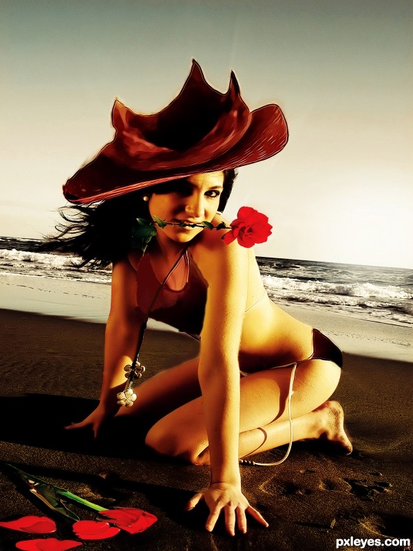
sunset at the beach - created by bingbong088


sunset at the beach
Favs: 0SBS: 3Hi-resRank: 7/7Score: 49.6% (0)8667 views

episode1 :bulbs bikini beach (5 years and 3393 days ago)

3 Sources:

avatar erikuri
erikuri says:

The "hat" seems blurry and stretched, try to make it smaller; I'd also remove the overcolor from bikini, it doesn't look natural (I thought she was naked until seeing sbs!), if you want to keep the color, try to cover exactly on bikini's dimension, and use multiply, color or overlay blending.

author says:

thanks i just edited it

author says:

besides i lvoe the color of bikini
it fits the mood of the entry

author says:

http://www.youtube.com/watch?v=mwLgCOplPp8&feature=related
i just found out this song ( accidentaly) omg it fits perfectedly for my entries
hopefully u guys enjoy it

avatar Tuckinator

cool!

Howdie stranger!
If you want to rate this picture or participate in this contest, just:

LOGIN HERE or REGISTER FOR FREE