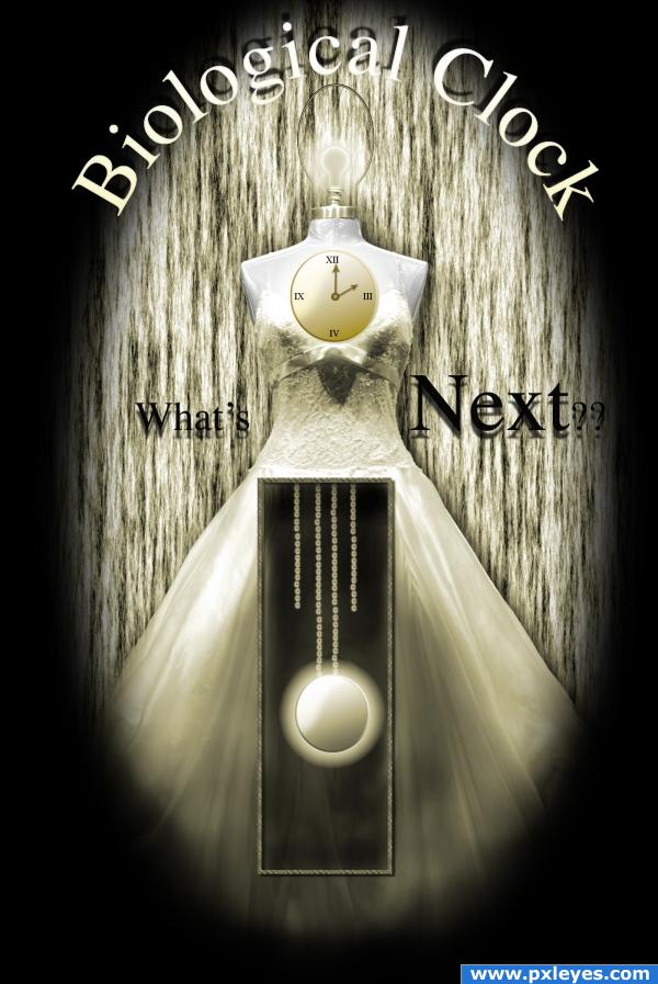
Biological clock, what's next? (5 years and 3916 days ago)
Photography and photoshop contests
We are a community of people with
a passion for photography, graphics and art in general.
Every day new photoshop
and photography contests are posted to compete in. We also have one weekly drawing contest
and one weekly 3D contest!
Participation is 100% free!
Just
register and get
started!
Good luck!
© 2015 Pxleyes.com. All rights reserved.

what made youthink of this... cool
Nice ; The Shadow for 'Whats next' may be little more transparent., and the Pendulum kind of thing could be aligned center horizontally, and may be by adding some depth to the box, would give a look as it is hollowed in the dress., I like the head region most., Nice job
male+ female.............good work
Great idea. Would have left out the drop shadow on the "What's Next?" since it muddies the text, but excellent idea well executed.
the clocks just look like they are on the image. I would blend them more. The one of the base of dress would look better is it appeared 'in' the dress goodluck.
Howdie stranger!
If you want to rate this picture or participate in this contest, just:
LOGIN HERE or REGISTER FOR FREE