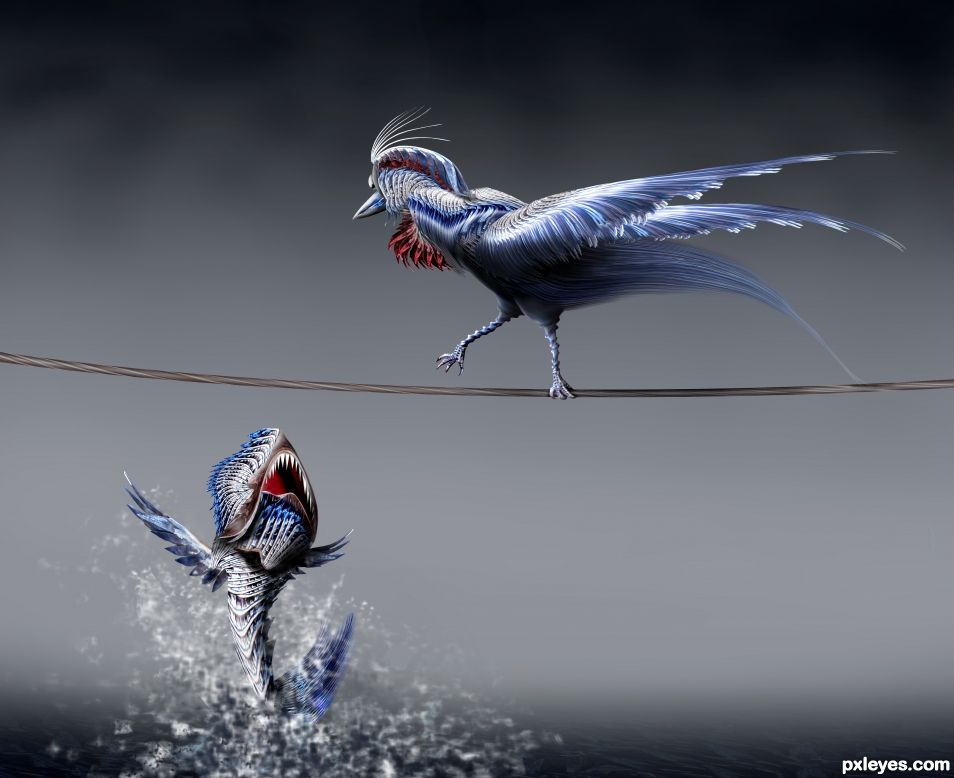
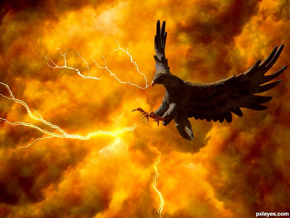
You better fly .... if you got wings (5 years and 1630 days ago)
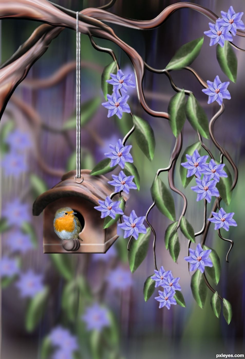
The image shown here, is from the source image. Pieces were taken... see SBS before voting. The background is a duplicate of the source, added some blur, and color. (5 years and 1672 days ago)
Delightful
Thanks for your nice comment...
beautiful job author 
Hey my friend... thanks for comment.
Great SBS too
Thanks again.
cute image
Thanks....
Little birdie go tweet tweet!
and tweet and more tweets chirping in the garden. Thanks Driven.
Beautiful work and cute little bird.
Thanks for your comment.
Congrats George! 
Thanks Rein...
Congrats
Hey my friend.... jaba jaba dooooooo!!!!! Thanks.
Congrats George
Congrats George for your 3rd place.
Congrats on third place!
Thanks for your comments and congrats guys... it was fun....!
Howdie stranger!
If you want to rate this picture or participate in this contest, just:
LOGIN HERE or REGISTER FOR FREE
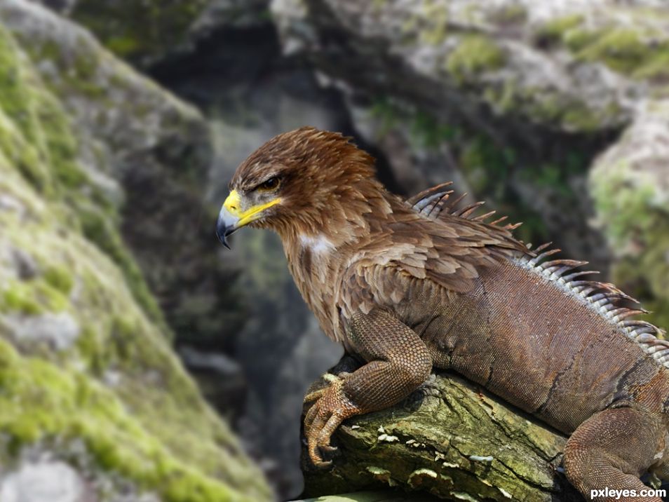
A combination of two different animals for a new breed in the mountains of California. This is the result of an experiment and EAGLUANA. (5 years and 1683 days ago)
Very awesome! the blend looks very possible in reality as well 
Thanks my friend there is a world of possibilities. Blending is good I think... (lol)
Love the image.. Good job 
Thanks my friend.
Nice blending with good bokeh effect.
Thanks for your comment.
great blending..love that the colours of the head flow nicely into the body.. believable outcome. nice entry author
Thanks a lot, I am learning from all of you.
Great work!
Thanks elemare. I think we needed Pxleyes back to continue our learning.
Nice work, the coloring makes it almost believable!
Thanks Pearlie... comment appreciated.
Great blending job, author! Looks very convincing, even though I think I wouldn't want to meet one of these! 
Good luck 
Thanks for comment...
Howdie stranger!
If you want to rate this picture or participate in this contest, just:
LOGIN HERE or REGISTER FOR FREE
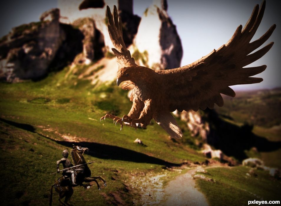
A scene created of a Knight guardian himself against the giant Bird. Hope you like! (5 years and 2356 days ago)
Pretty cool, but you might want to make the shadows on the knight match the shadows on the bird
Color values on bird & background are the same...your image would be much better with a contrasting background.
Love this one. Great balance and mood.
My opinion - the bird is just a touch too large.....making it appear that it's intended flight path is closer to us, and will thereby miss the knight all together. Reduce the size of the bird for increased scale and perspective.
Congrats Sebastian 
Howdie stranger!
If you want to rate this picture or participate in this contest, just:
LOGIN HERE or REGISTER FOR FREE
(5 years and 2356 days ago)
Nice image. Well done on the mask and the recolor. Did you apply some "feather texture' to the bird as well? Looks good.
An idea to increase the dynamics a touch - I would apply a small Gaussian blur to the background causing the bird to pop out some. Just a suggestion. Nice piece here, author.
Howdie stranger!
If you want to rate this picture or participate in this contest, just:
LOGIN HERE or REGISTER FOR FREE
Excellent work, author! My only suggestion would be to give the teeth on the fish some dimension and fix the blurry side of his head. The lighting is superb.
You are right CMYK I will try to fix it. Thank you for your advice !
Beautiful!
Thank you Wysiwyg
Very nicely done! I agree with CMYK46 but it's a minor tweak and doesn't affect the good score this deserves.
Thank you Spaceranger!
Beautiful work. Very good and dynamic figures
Thank you Hereisanoop!
I like the texture given to the bird and fish. Good job!
Thank you George
Great job using the source! Very creative! Good luck author!
Congrats!
Congrats!
Congrats!!
Thank you all for comments favs and votes
congrats for second place. great work!
Howdie stranger!
If you want to rate this picture or participate in this contest, just:
LOGIN HERE or REGISTER FOR FREE