(5 years and 3990 days ago)
- 1: source1
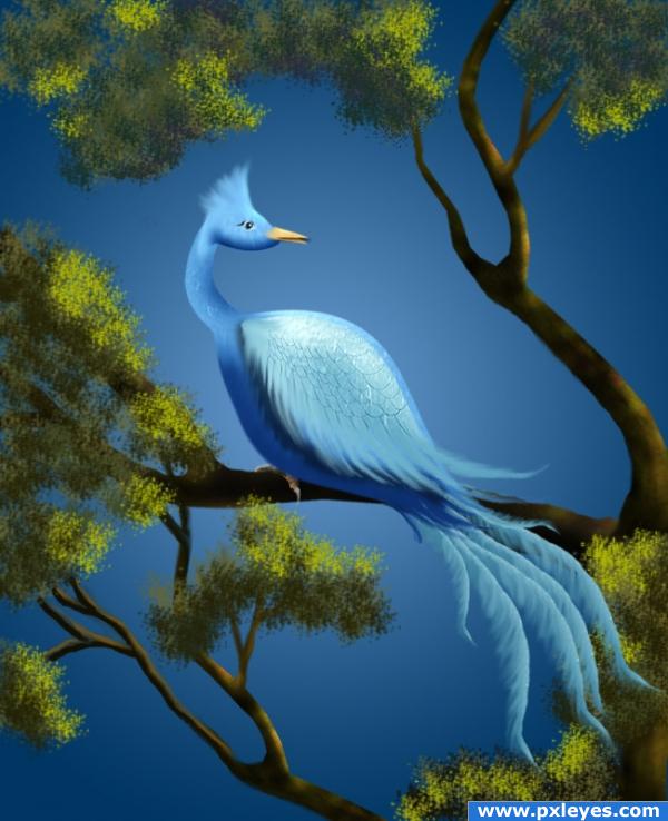
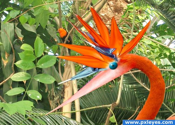
Using that silvery shiny surface game the idea of creating this imaginary bird. No other sources were used in its making, just the image provided by pxleyes for the contest....everything is PS (5 years and 3994 days ago)
Wow! Great use of source! I love entries like these!! Good luck 
great entry! i love this image its very cool!
I think we have a winner !!!!  ...grate job author
Wonderful creation I love the bird and I know it was hard work, but I had to look at your sbs to see where you put the source to use. Other than that wonderful image.
Thank you for comments, yes, it was a hard time to get the bird all together.
Very nice work. 
this is what i call true art... very nice...
very artistic. love the blue hues and lighting in this creation. well done
my problem is: could you have made this with ANY other source? I think the answer is yes and therefor the use of the source is weak. If you've set the brush to scatter there wouldn't be that repetative pattern in the leaves. In other words: not my piece of cake 
Sorry...
well done
Thanks for comments again.... Robvdn don't be sorry.... it is the way it is, the source image does not have many objects to work with. Could I have done this work using other sources? Yes! I could. But the main thing here is that I used the image source in part. As many of us do. I just got this idea, we are here to learn, to appreciate constructive and non-constructive commnents and suggestions.... It is like Art, some like Picasso...some don't.... I am happy with what I have done here at the contests, and again, thank all of you for critics and comments. Good luck to everyone!!!! 
Author let me be clear: I wasn't judging your image, just the use of source. You are right about we're here to learn and we all have different tasts. If something like this would have been posted in a theme contest you would have gotten a complete different comment by me  Just my personal view, hope you're not offended. Didn't mean to.
I like the way u made the tree :P really nice 
Although the image is well done, I believe the use of source is very poor. This could have been made with anything and the source is not recognizable in any way. These type of entries belong in theme contests, not source contests.
Excellent! i love this one 
Comments appreciated. Robvdn: Not offended at all. I just accept your comment. Solkee, I will pay attention to Theme contests in the future, you are right, I should have used more of the image source, although I did not have much to choose from it!
very nice
love the entry and the result but you could of done this with any source as far as i thought the original source needs to be vissible... its not in my opinion..
Congratulations on the top-three place! 
Congrats for your second place, George!
Thank you Cornelia, Lelaina. It was a nice challenge and good entries all!
congrats
Cngratulations 
Congrats!!
congrats!
congrats!!
Congrats!!
Congratulations for 2nd
Howdie stranger!
If you want to rate this picture or participate in this contest, just:
LOGIN HERE or REGISTER FOR FREE
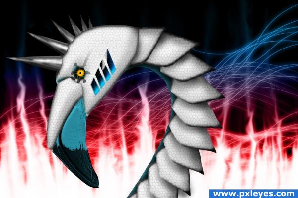
Source & Layer Styles as only source.
View in High Resolution! :) (5 years and 4010 days ago)
Wah??? Deja Vu???.. comment still stands on the use of the stain glass.. great usage without getting cheesy.. wonder why you had to resubmit? good luck
really cool!
to golem: Because they deleted my entry. I wrote a comment to my SBS and they told me something about it made it not-anonymous. I dont really understand but i edited it and it should HOPEFULLY be right now. I don't hope they delete it again 
creative
Nice work, really nice work. keep doing your work, because o do it good  see you later
Thank you Nikebot!!
very nice 
Thank you Chakra
Omg.... 11th place.
Howdie stranger!
If you want to rate this picture or participate in this contest, just:
LOGIN HERE or REGISTER FOR FREE
(5 years and 4011 days ago)
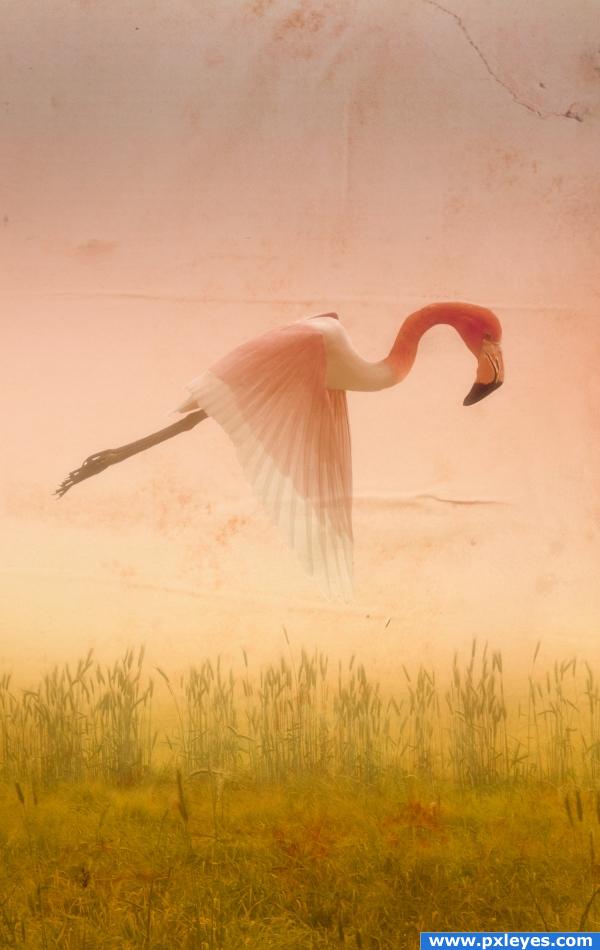
Really nice feel to this. IMHO would be better if the bird was all one color, but still a good image. 
I agree with CMYK, either change the colour of the flamingo head or the body, or even add some gradual feather brushes that slowly change colour into each other. That's just my opinion, it;s a very nice imaginative and atmospheric image either way, so good luck!
Love the paper texture..good luck on this author.. very different 
his head is sooo big , he must be smart lol good one 
I like this picture. Looks like a painting in some kind of way. Too bad the bird has two colors but that's just me. Gud Lawk 
Mistical or....mutilated? XD
hold your votes, I'll do some colouring this evening. Thank for the comments so far! 
cool this image has a nice feel to it
added some colour on the wings, hope you like it!
looks good, the wings are great! maaaaybe extend the orange part all the way to his body so his neck is not half orange half white but it it's not a big deal  thought it might look better
Very nice image top job!
very soft feel; i like it
this is very nice
very nice 
Howdie stranger!
If you want to rate this picture or participate in this contest, just:
LOGIN HERE or REGISTER FOR FREE
thank you geber (5 years and 4011 days ago)
Good blend. 

awesome use of your own image.. good luck
Nice idea!
this image is definately a cool one good work
freaky! i like it 
Looks very weird . What is it? Plant or bird or... ? Well nice picture!
very nice 
Howdie stranger!
If you want to rate this picture or participate in this contest, just:
LOGIN HERE or REGISTER FOR FREE
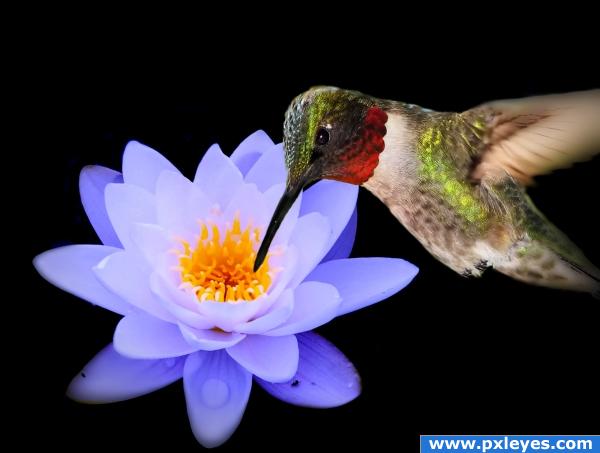
Nice idea, i think the hummingbird is a bit too big. Maybe add a backdrop. Good luck!
The black background makes the lily pop.
pretty
nice concept. like the lilly colour
great image author its just that the humming bird is a bit to big imo and it out does the flower which isnt good but i love the humming bird!
this is the kind of image that would look great as an OOB it would take the eye away from the empty background
Howdie stranger!
If you want to rate this picture or participate in this contest, just:
LOGIN HERE or REGISTER FOR FREE