(5 years and 3883 days ago)

I have not used any external source.I have worked on different layers using the gradient toul, image adjustments,blend mode, opacity and the photoshop filters.
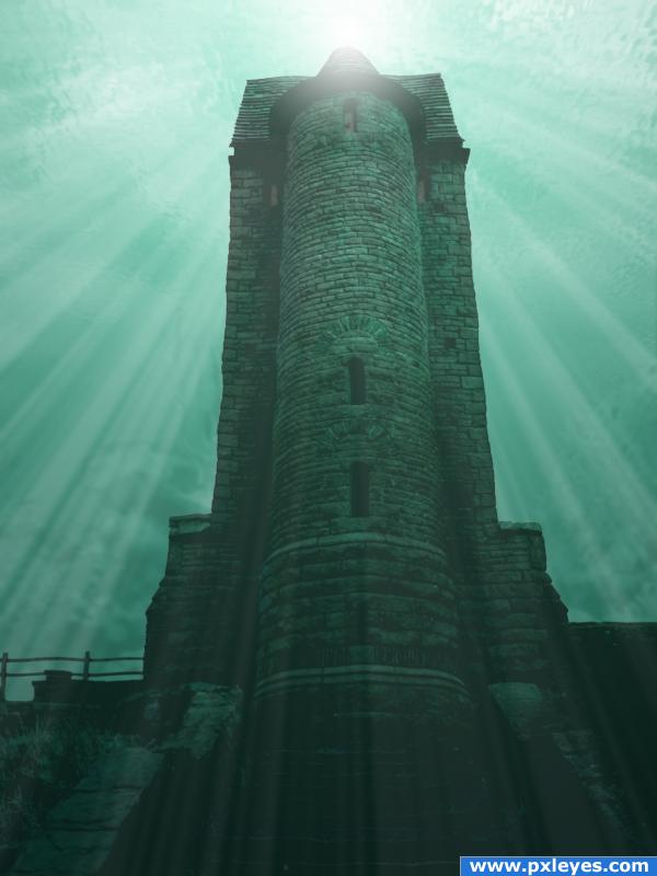
Correction:Add noise to the seabed with the external source.Corrects hue and saturation. Apply gaussian blur, blend mode to Luminosity, low opacity and High brightness and contrast.
Correction: Apply filter distort wave to the birdhouse water ripple.Maybe not a good idea with these parameters.
(5 years and 3884 days ago)
Maybe a little simple, it's very nice, but you should try changing its location or doing something a bit more complicated. Good luck!
This kinda reminds me of the story of the fish and the bird who fell in love but the fish could not live in the air and the bird could not live under water. So they were eternally sad. But I think the location is perfect. And the light source and the beams are well done. I would, however add some other underwater elements. Really excellent job on the surface, too. I will hold off on my vote in case you decide to add more underwater stuff to it.
wow awesome!
You could add a water ripple to the entire building to give it a more under water effect... just be careful not to over do it.. sound Idea all round though 
This is very well done but I feel it's missing something. Add some more atmoshpere. Maybe find some sources of fish, shipwrecks and/or underwater plants. This entry really has the potential to go that little bit further.
You say you have used no external sources but you have linked one anyway. Explain?
neat colors
Howdie stranger!
If you want to rate this picture or participate in this contest, just:
LOGIN HERE or REGISTER FOR FREE
Hehe! Great use of source, a lot of creativity!!
text isn't really that important it seems ... the light by it's self is quite well done.. good luck
i love this! but the text ruins it for me! love it!
Excellent job!
great idea!
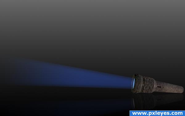
This is great; the beam, the reflection, the perspective is all great but the text and background do put a dampener on things.
I agree with the comments, maybe you could still place the flashlight in a different surrounding. A forrest would be perfect...
fine thinking
removed the text...
Better they talked you into it. Good job Author
  liked it before too
Howdie stranger!
If you want to rate this picture or participate in this contest, just:
LOGIN HERE or REGISTER FOR FREE