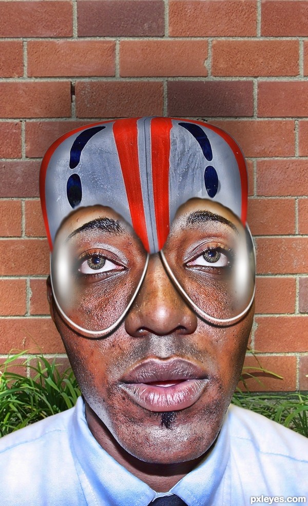
(5 years and 3020 days ago)
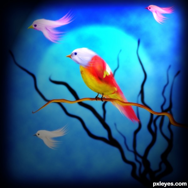
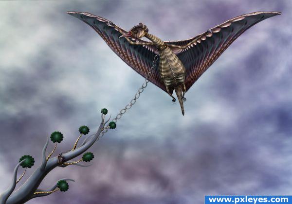
right after reading the amazing tut by George55 at http://www.pxleyes.com/tutorial/photoshop/1965/How-To-Create-Beautiful-Birds-And-Flowers.html, I was tempted to put it into practice,...but it was too bad to me that the smudge tool on my comp. didnt work well so I tried to find another way, was that I used the motion blur to get the effect of feather-look,...and I was surprised by the result...it is perfectly messy ugly!!!!LOL....but now here it is,....you just name it....and I call it Birdie... (5 years and 3575 days ago)
Best use of motion blur i've seen 
Great job.
thanks you, .....I am following you too on your stunning tut,...much contribution on lighting and defining the light source on which I always get confused of...

wao.. this is what i call art.... awesome work here author...fav
simply awesome.....
Great work author,job on feather's is amazing...u use source to the max...well done
Nice work and good use of motion blur 
Nice work.. Great detail
Super creativity and work love the vivid colours in this image…..top job!
Wonderful and cute! 
>ankit,..thanks for favoring this,....
>all,..thanks for your comments....very supporting....
>nasirkhan,...it is an honor you visit this entry, am a fan of your works...
>erikuri,..you are always that generously kind....thanks for the fav...

>master ponti, it is very encouraging that you have favored my entry....thanks, sir...

cool

What a beauty! 
>lamantine,....thanks for the fav...again,....I like that
>Cornelia,....thanks for visiting this entry and...oh you have favored this,...very encouraging to me...
Congrats for your second place, Dekwid!
Congrats Dek on your next second prize 
Dekwid, congratulations! Now your entry will shine more in my favs gallery... 
Congratulations for 2nd place 

congrats
Congratulation...
congrats
Congrats
Howdie stranger!
If you want to rate this picture or participate in this contest, just:
LOGIN HERE or REGISTER FOR FREE
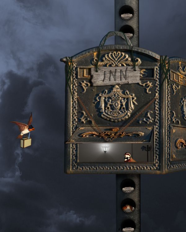
Sources Used:
"Birds Scans Set 02" by ~illiteratekniferack at deviantart.com: http://illiteratekniferack.deviantart.com/art/Birds-Scans-Set-02-106111824
"Bird's Nest" by ~killcaiti-stock at deviantart.com: http://killcaiti-stock.deviantart.com/art/Bird-s-Nest-87312426
"Travel 14" by *Anakmoon-Stockage at deviantart.com: http://anakmoon-stockage.deviantart.com/art/Travel-14-93608478
"top hat 6" by ~Lisajen-stock at deviantart.com: http://lisajen-stock.deviantart.com/art/top-hat-6-94450244
"white tie 7" by ~jealousy1314 at deviantart.com: http://jealousy1314.deviantart.com/art/white-tie-7-35385357
"bowtie" by hotblack at everystockphoto.com: http://everystockphoto.com/photo.php?imageId=130674
"Hanging Lamp" by ~empty-paper-stock at deviantart.com: http://empty-paper-stock.deviantart.com/art/Hanging-Lamp-63341285
"Chain brushes" by ~Crystall92 at deviantart.com: http://crystall92.deviantart.com/art/Chain-brushes-65924253
"WoodRough0021 (Texture: #4801)" from cgtextures.com: http://www.cgtextures.com/texview.php?id=4801&PHPSESSID=339e293408d8dc0ffac5666df13494e0
(5 years and 3732 days ago)
Good idea. Give the door flap and edges of the holes some thickness.
Great idea...maybe to add more birds to look like busy station...good luck
Nice....
very nice 
Howdie stranger!
If you want to rate this picture or participate in this contest, just:
LOGIN HERE or REGISTER FOR FREE
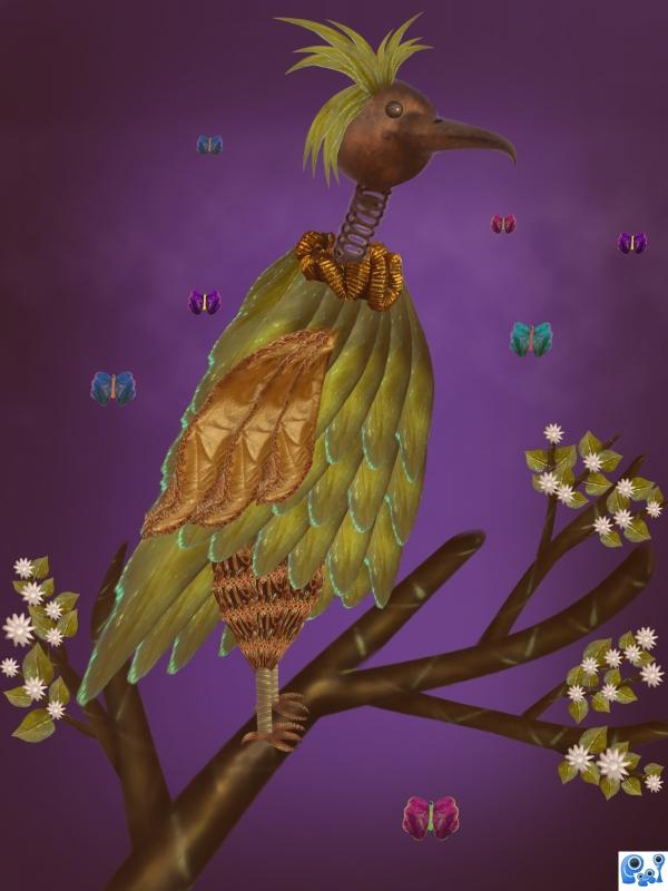
source only. i am waiting for your suggestions. (5 years and 3814 days ago)
gud work
nice work
Awesome!
I like it, but i think that if you worked more on shadows and highlights it could really improve this image, for example the branches lookm a bit flat. Good luck.
great work!
Lovely 
fun creative image. I like the bird and the little white flowers. The butterfies give a nice depth of field to your work. WD.
That's a funny looking bird. Nice work on the flowers. Some suggestions for improvement: move some of the feathers to before the legs. Also look a the feet: at the point of the feet the branch looks flat.
agrees with dustfinger
thank you all for comm  . i moved the feathers in front of legs, i worked on the highlights and shadows for the branches.
Great job on the idea of breaking things apart to create something so original. Good Luck!
It's better now.
very nice 
Howdie stranger!
If you want to rate this picture or participate in this contest, just:
LOGIN HERE or REGISTER FOR FREE
Only source image is used (5 years and 3859 days ago)
awesome
This looks very familiar, super work here, agree with Nisha.
nice..
HIGH RESOLUTION MUST BE VIEWED people!!! or you truly will miss out on some fantastic detail..GREAT JOB!!!!
Beautiful
High resolution is awesome. Great job. gl
work on the bird and plant is simply exquisite! would have liked to see a more dramatic background tho.
you Rock! fantastic imagination. I am curios.......do you know what its gonna be when you start?
Yes 
poor birdie... lovely work 
Very nicely done!

Aww... poor bird  Just fantastic. As always
  The body looks very very good, just like the wings and well... everything else
  Good luck!
Well done! GL
i came back to tell you every time i look at this i like it better
Nice image.
Thanks to all for the nice comments and favs 
Magnificent as always. Congratulations!
Congrats for your first place, Cornelia! 
Congratulations for 1st Cornelia, nice one.
Congrats Cornelia, beautiful work 
wow congrats Cornelia
congrats on first place. well deserved. your imagination astounds me.
Congrats 
Congrats!! Beautiful work as always!!
Congrats Cornelia!! 

Howdie stranger!
If you want to rate this picture or participate in this contest, just:
LOGIN HERE or REGISTER FOR FREE
Howdie stranger!
If you want to rate this picture or participate in this contest, just:
LOGIN HERE or REGISTER FOR FREE