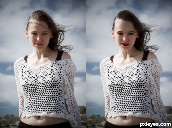
(5 years and 2687 days ago)
- 1: source1
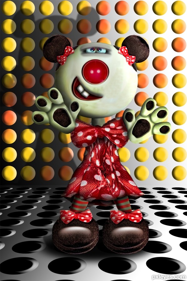
source and Photo Shop (5 years and 2905 days ago)
cute, well done
Very fun! Great use of the bows. The floor and wall discs are cool and nicely amplify the primary design element: the circle. I do wish she stood out a bit more from the backgournd and didn't seem to be floating above the floor, however.
i like her IMO if look even better if you create a cute belt for her belly so that you can easily hide that lill mess over there .....good luck pal good job
nice
good job
Very nice, it was pretty hard to manage!
So cute, well done, author. Love the close eyes, tilted mouth - and those socks rock! 
awesome job here! You have an excellent imagination! 
fantastic
Congrats for your first place!
Congrats  very cute
Congrats!!
Howdie stranger!
If you want to rate this picture or participate in this contest, just:
LOGIN HERE or REGISTER FOR FREE
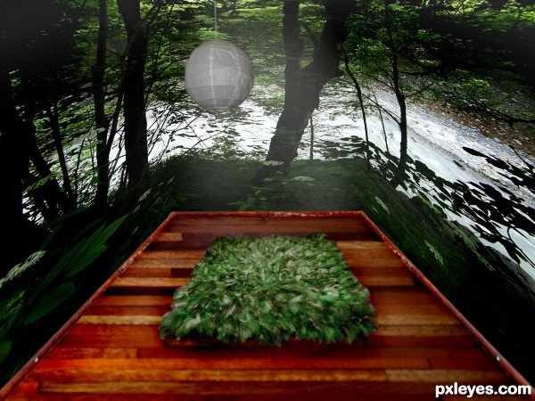
All sources are my own photos-will post unaltered sources in SBS. (5 years and 3201 days ago)
The wood floor has the wrong perspective. Where the wood planks meet they should be parallel to the wall. Just select the floor and transform it with the perspective option. Good luck.
The side walls are too stretched out and distorted. You may want to make your room a bit shorter, or find a wider landscape photo to use.
Howdie stranger!
If you want to rate this picture or participate in this contest, just:
LOGIN HERE or REGISTER FOR FREE
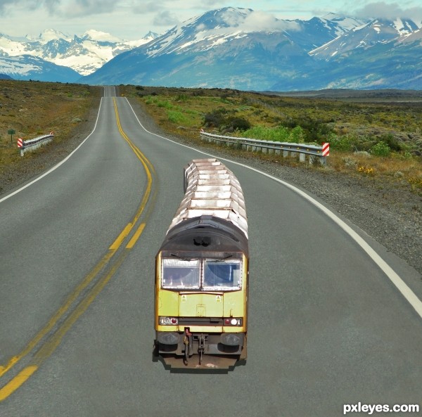
Thanks to chidsey for the train
Flipped and then masked out a portion of the train and applied a brightness filter to tone it down to match the scene
Used a combination of Content aware fill and good old cloning to extend the road forward (5 years and 3247 days ago)
the size of the train seems to be a little off---looks like it takes less then half the road (in width)--while most trains/trucks/large vehicles would take at least three quarters
the train is way to small compared to the road.
That is why the title is Little Lost
Nice chop..IMO i would reduce the highlights on the train to blend it well wit the road...and depending on the light source, i would darken the front of the train to define the shadows...Goodluck
Howdie stranger!
If you want to rate this picture or participate in this contest, just:
LOGIN HERE or REGISTER FOR FREE
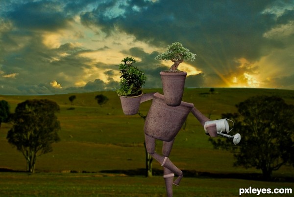
Comments highly appreciated..! Thanks for watching.:-) (5 years and 3314 days ago)
very very nice work author...gl
bit I'm doing am I! LOL cute work 
Very cute!! Nicely done!
Howdie stranger!
If you want to rate this picture or participate in this contest, just:
LOGIN HERE or REGISTER FOR FREE
Howdie stranger!
If you want to rate this picture or participate in this contest, just:
LOGIN HERE or REGISTER FOR FREE