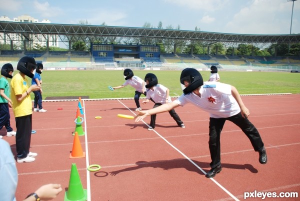
(5 years and 3126 days ago)
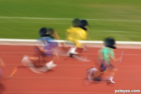
(5 years and 3126 days ago)
Perhaps hard to recognize, but nicely integrated helmet in the external image, well done. Good luck!
LOL, funny entry, good luck!
Nice concept and funny too...
Funny!..and thumbs up!!!.
thanks you guys very much happy & support my idea!
Howdie stranger!
If you want to rate this picture or participate in this contest, just:
LOGIN HERE or REGISTER FOR FREE
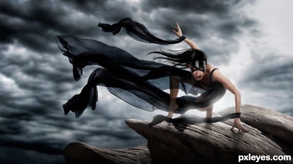
I loved how dynamic this pose was! So I figured some sort of super heroin (or perhaps villain) was in order :) (5 years and 3129 days ago)
The back light glow is a bit too intense around the butt and left leg, while non-existent anywhere else, which makes it somewhat distracting. The lighting on the top front of the face (see the reflection on the mask), and the top right of the arms is also inconsistent and confusing with such a strong back light...
Excellent Work..you're right, it was a dynamic pose, but u did an excellent job transforming her and placing her in a simple but very fitting background..GL 
Thanks for the feed back! and I appreciate the constructive criticism Mossy. I see now what you were saying. I finished it very late at night and after seeing it with fresh eyes in the morning you were right about the back light being over done. Also, I agree about the glare in the middle of the mask, but I removed it and it just seemed to take away from the image, so I just toned it down a bit.
I'm with Nator ...you should have kept the glare
I put the glare half way back  thanks for your input everyone!!!
very dramatic feel, good work.
awsm!!
If I were the model, I would have this hanging on my wall. This is terrific!

Thanks!!! I sent it to her maybe she will 
Congrats for 1st place, super pic
Congrats Robert  excellent work
Thank you thank you!
congrats!! cool n amazing 
Howdie stranger!
If you want to rate this picture or participate in this contest, just:
LOGIN HERE or REGISTER FOR FREE
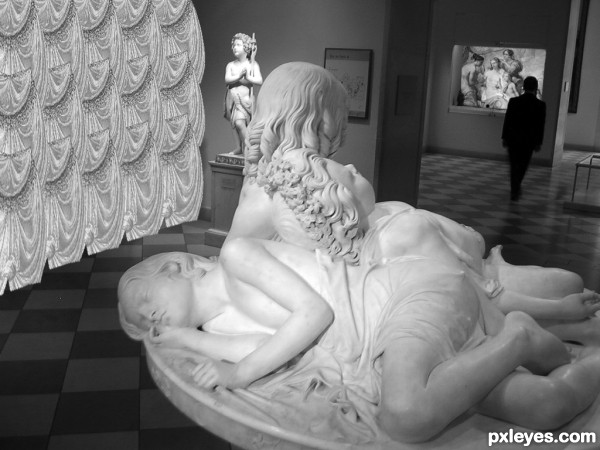
Layer Masks
Desaturate
Free transform
etc.
Used the curtain, middle picture, and blue square design. See if you can find them all :) (5 years and 3132 days ago)
Good idea -- Curtain on the left needs some adjustment to the lighting as it now has equal brightness across its width so it seem too flat --some dodge and burn would give it some depth
Also the bottom edge IMHO would look better if it was not cut off straight across
Howdie stranger!
If you want to rate this picture or participate in this contest, just:
LOGIN HERE or REGISTER FOR FREE
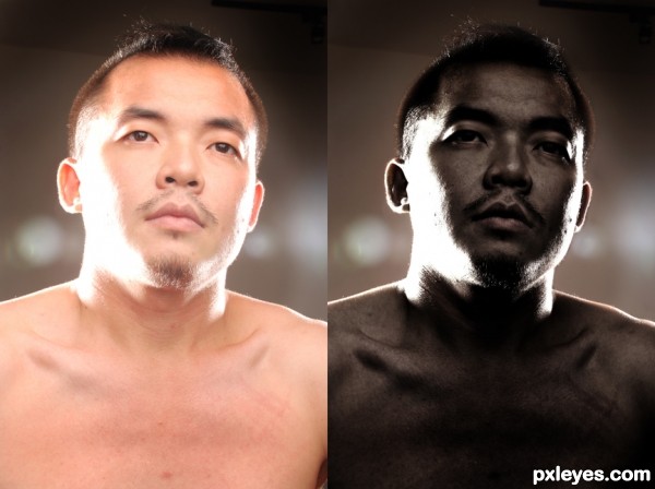
(5 years and 3160 days ago)
looks like the same ethnicity only less lightinng. would be more realistic if the background changed too
I agree this is interesting final result, cool looking image but ethnicity look the same...maybe u could remove the whiskers and do some things with eyes and hair to achieve needed result...
Lovely work, best of luck author!
looks like u just did a b/w, and glow effect with a little sepia in it. but thats just what i see. good luck author
Howdie stranger!
If you want to rate this picture or participate in this contest, just:
LOGIN HERE or REGISTER FOR FREE
With helmet you made this look like some national sport, haha. Funny entry. Good luck!
Nice idea, it really seems to fit lol........nitpik: the shadows need helmets too

Good job author
Yep, it's a dangerous sport lol, good luck!
Howdie stranger!
If you want to rate this picture or participate in this contest, just:
LOGIN HERE or REGISTER FOR FREE