(5 years and 3388 days ago)

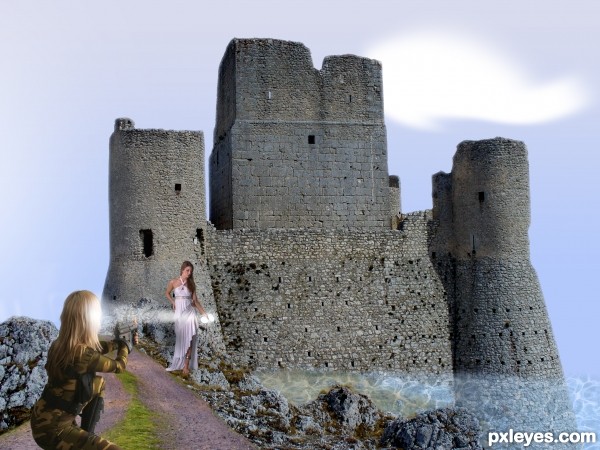
When I thought of doing this It looked a lot better in my head. I couldn't find the right type of pictures to do what I wanted but I thought I'd enter it anyway. (5 years and 3689 days ago)
I like the idea. It seems to require a brighter/sunnier environment, however: brighter sky, castle, and foreground with strong shadows cast by the towers and figures. I would use the shading on the assassin to determine the light direction and how to shade the rest of the elements. I think if Ms. Macgyver were using a belt buckle or had her compact out while powdering her nose, this would portray a moment of greater creative spontaneity on her part.
Seeing as your not impressed by it yourself... maybe you should keep at it till you get it how it is in your head...
all the best ............. not bad ............. 
Howdie stranger!
If you want to rate this picture or participate in this contest, just:
LOGIN HERE or REGISTER FOR FREE

(5 years and 3758 days ago)
Very cool... My friend, for your capacity, you better post sbs! 
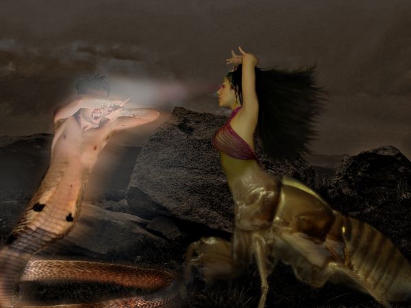
The eye beam thing isn't convincing. If the eyes are red, the beam should be red. Otherwise the eyes should be white. The rest isn't bad.
Congrats! 
Howdie stranger!
If you want to rate this picture or participate in this contest, just:
LOGIN HERE or REGISTER FOR FREE
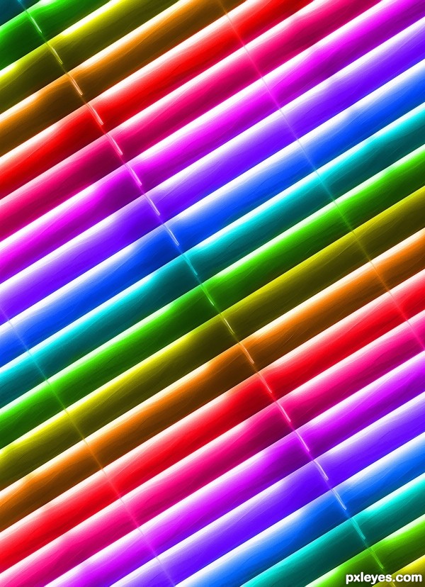
Fun title and colorful image (albeit mandated by the contest theme) which always grab my attention, but this may ultimately be viewed as too simplistic by the voters. Perhaps less is not always more.
I agree with you. I really liked the way this looked especially because each color goes from dark to light with all the shading and lighting on the blinds. And thanks, I'm proud of my title. Usually I have a horrible time with titles, sometimes I cheat and look at other titles and hope that something clicks, lol. Thanks for the comment = )
DanLundberg makes a good point...but I like this just the way it is. Less is more in more cases than not. Great job...with a nice source find.
Thank for the support = )
the texture is marvelous.. great image
Thank you Drivenslush
Howdie stranger!
If you want to rate this picture or participate in this contest, just:
LOGIN HERE or REGISTER FOR FREE