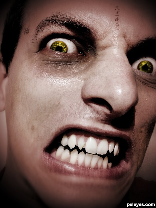
The writings on his skin are not images but just done with a brush.
Thanks you Ale_Paiva for the Person! (5 years and 3531 days ago)
- 1: Person
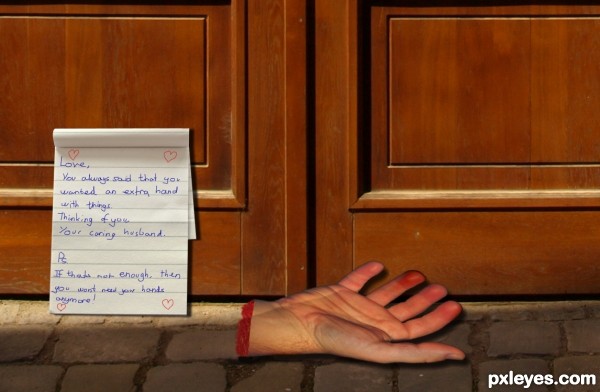
Heh, I spent most of the time actually thinking of the idea rather than on the work itself.. Although I did have fun making this one.. Enjoy :) (5 years and 3562 days ago)
Not bad at all, but according to the text not threatening enough, imo. What if you change it a little bit that i.e. the wife (I guess) demands from her hubby to be more a helping hand at home instead of help his friends to get rid of money that has been spent on beer and such? And then the hand is from one of his friends. Just an idea  . Good luck!
Hand is a bit distorted... 
Howdie stranger!
If you want to rate this picture or participate in this contest, just:
LOGIN HERE or REGISTER FOR FREE
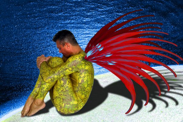
a fairy named blood wing (patterned after a Seraphim... one wing in Heaven the other wing dipped in blood) (5 years and 3670 days ago)
Here in Brazil that flower (tree) is named "pata-de-vaca" that means cow's paw, because of the leaves shape. The flowers are very beautiful, and from the tree which has white flowers, we make a leaf tea for diabetes. 
Howdie stranger!
If you want to rate this picture or participate in this contest, just:
LOGIN HERE or REGISTER FOR FREE
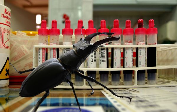
Thanks to datarec (Blood) and egyedg (Stag Beetle) Just a flip and mask (5 years and 3709 days ago)
What Nator said.
The cutting out and merging the two images is very good, but the depth of field in the blood photo doesnt match the bug and would mean that the bug would be way out of focus.
I would agree with the DOF that it would be a little blur in either of the cases...bug or the blood samples....But overall great work....
nice work,gl
Cool
If you can, move the bug 'closer' to the vials so he can remain in focus. Nice masking work though
Howdie stranger!
If you want to rate this picture or participate in this contest, just:
LOGIN HERE or REGISTER FOR FREE
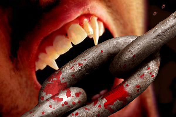
teeth whitening :) (5 years and 3718 days ago)
realistic... well done
Thank you... I love horror movies 
Hooooo... SCraryy.. ( well done)
great 

thank you all... 
Howdie stranger!
If you want to rate this picture or participate in this contest, just:
LOGIN HERE or REGISTER FOR FREE
Interesting chop. Maybe desaturate the skin a little to make it appear paler ? Good luck !
He's spooky, Cherish is right about the skin tone.
Thx I made it more pale..
Looks better. Just a suggestion though, Vampires don't have wrinkles and some skin imperfections, they just have the perfect type of skin, I would suggest removing all little imperfections with the clone tool, but that's just IMO.
Eyes and teeth are good and i like the Imperfections but that is more personally preference. The writing on the skin looks to be floating just above it, maybe try a simple overlay and then duplicate the layer to improve contrast, also adjust the orientation a very small amount mainly the writing on the forehead.
Thanks for the advice I'm working on it...
i really like the eye color
Very threatening. The skin tone could be a more ashen (less red). The tiny tatoos don't add anything IMO.
The eyes are about the only thing that make this a vamp..The teeth are just in bad need of a dentist more than anything. Although the in your face" effect you've created can be frightening and of a resemblance to a vamp, it just doesn't quite make it for me, IMO.
Howdie stranger!
If you want to rate this picture or participate in this contest, just:
LOGIN HERE or REGISTER FOR FREE