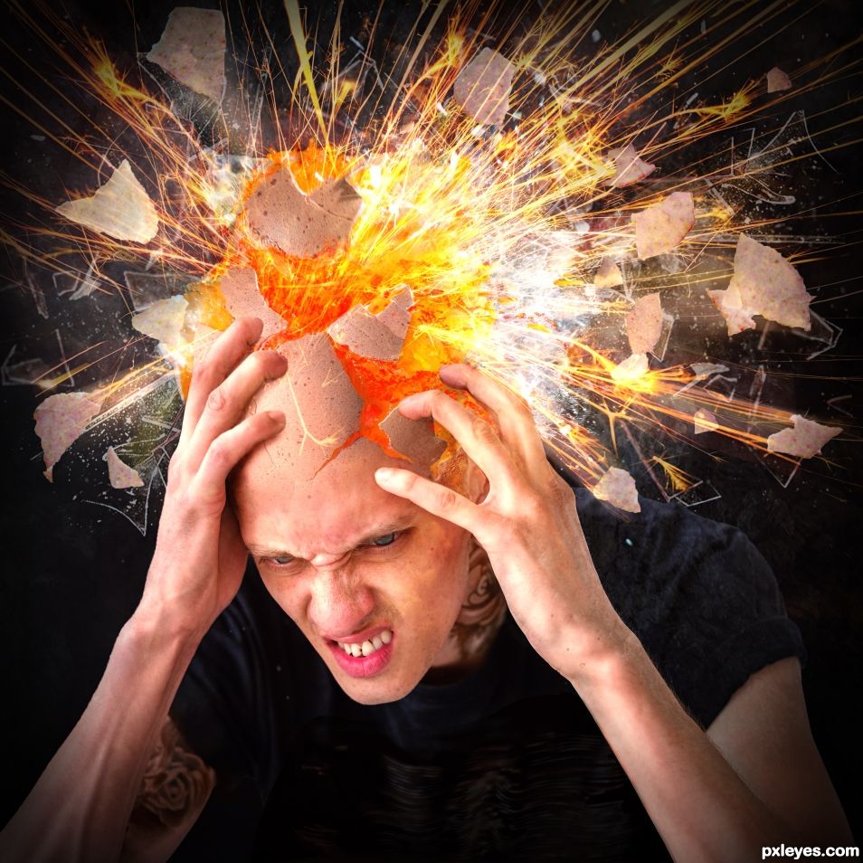
If you ever had one, you will know what it feels like. (5 years and 776 days ago)
- 1: model
- 2: cracked egg
- 3: exploded egg
- 4: broken glass
- 5: lava flow
- 6: sparks
- 7: crab nebula
- 8: sunset

If you ever had one, you will know what it feels like. (5 years and 776 days ago)
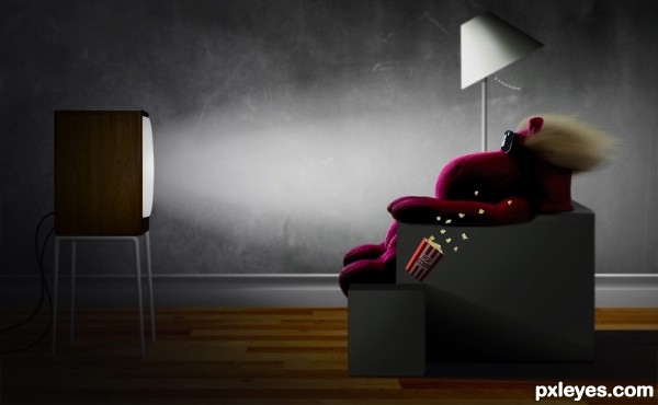
I saw the image and had to do it, I loved this ad when I was a kid.
This image is based on a Maxell ad called blown away I just used it for reference. I used a free set of brushes/textures
http://www.highresolutiontextures.com/free-wood-fence-3d-textures-pack-with-transparent-backgrounds (5 years and 2746 days ago)
really good work...
i remember this add -- great work
Fun memory/entry... but wasn't it for speakers?
A great parody of a classic commercial! Very well done! Good to see your work again author!
In case anyone doesn't know the ad we're talking about:
http://www.youtube.com/watch?v=B2WcBi9mu6A
supercool love it 
Nice to see you back.... and good to see your work again. Nice image..... good luck!
pretty fun and welcome back 
Thanks guys, The ad was for audio tapes but in 89 they used it for video tapes also. 
http://www.adclassix.com/images/89maxellvideotape.jpg
a fun image
Nicely done!
Congratulations.....!
Sweet thanks guys
Congrats!! Really great to see you back!
Congrats - great image! 
as i said its supercool congrats  very well deserving entry
halerious! i love love love it!
Congrats !
Howdie stranger!
If you want to rate this picture or participate in this contest, just:
LOGIN HERE or REGISTER FOR FREE
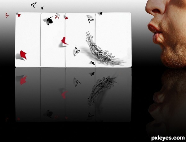
Don't play poker with this guy!
Credit to januszek from SXC for the man. (5 years and 3565 days ago)
WOW!!!! THIS IS AWESOME!!!! You wouldn't happen to have maybe a step by step? Pretty please 
@MnMCarta. Thank you!!  Please bear with me and keep your eye on this entry. I will recreate the SBS in FULL soon. This is a really, really old entry from PST. (I rarely keep my SBS's beyond a few months as I have a smallish HDD and it gets clogged) I posted a few steps to keep in-line with the contest theme requirements. As it's you
  I'll do the image again with the full SBS.
OH TY!!!!!! and can you detail the "how-to" as if I never used PS before? I remember a lot of buttons just the terminology kills me! I'm just a southern gal with a little vocab. LOL 
super idea, bravo!
this is great image. brilliant idea and well done its going in my faves
great concept author.....keep it up
GL
Wonderful. Love the sense of movement you have captured! Definitely a fav!
fav fav fav.... as it should be
Very creative and interesting. 
crap, that is so cool  can't wait to see sbs author, i wouldn't know where to start
brilliant idea
i like it ,good luck
loved this before... love it again... 
Awesome! I'm not the old PST member but I this is the second time I see that work. Really love how you distorted the characters and make the realistic shadows, the idea is exceptional. One tiny thing is the white stroke around his mouth in the reflection seems shouldn't be there 
really cool n brilliant concept
fabulous just fabulous
superb
Great idea  Congrats in advance
Very good.
Fantastic work author...Idea is amazing and execution is perfect...well done
Love this, and great sbs, easily made into a good tutorial.
congrats!!! woo HOOO
Congratulations! 
Bravo for a job exceptionally well done! Hugs!
Congratr . . . . 
congrats
Congrats! great work!
Congrats!!
congz 
Howdie stranger!
If you want to rate this picture or participate in this contest, just:
LOGIN HERE or REGISTER FOR FREE
(5 years and 3897 days ago)
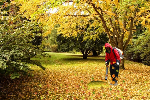
Transform some of the leaves so they're blowing at different angles...
Good work!
lol, nice idea author.
CMYK46 Thanks for advice is that any better?....and thanks all
Ummm...no.
Please upload next time in high res so we can see the details of your chop. Thanks
Humorous idea...and boy does he have his work cut out for him. If you transform some of the leaves in the height only...it will help. 
nice creation author. GL
very nice 
Howdie stranger!
If you want to rate this picture or participate in this contest, just:
LOGIN HERE or REGISTER FOR FREE
(5 years and 4041 days ago)
Very nice effect, and well composed 
Very nice
Great Image...Would be nice to see a high res and SBS
Looks good
Wow, really nice effect. I would love to say that you've got a sure winner here, but looking through the other submissions, you have a few others to contend with. Personally, I'd say if this doesn't win, it'll at least be in the top three. Great concept and just as great entry. High marks from me, good luck.
be original, please don't imitate or duplicate
I like this alot. Would recommend doing something with the rendered clouds in the bottom left. Kinda detracts from the overall coolness of the peice.
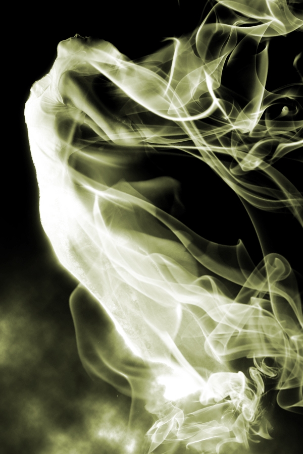
wow......very cool effect + awesome use of brushes....Love this entry....but wats Gopan saying "be original" ??
Hi LKY, please go through all entries, you will understand why I said like that.
while it is a great image, i have to agree that its not original... there are atleast 2 others that did similar image with smoke bruches. still get a vote though as it is good work 
nice job author!! 
wow fantastic
Very good blending...nicely done  sbs? and high res wud b gr8 .............
Beautiful
Beautiful 

i like the way she looks like smoke

Good overall effects. Masking is a bit uneven, but nice outcome in general.
you did very well
beautiful creation! I'd love to see a tutorial about it.
Howdie stranger!
If you want to rate this picture or participate in this contest, just:
LOGIN HERE or REGISTER FOR FREE
I'd remove the drop shadows on the pieces above his left hand. Otherwise well done.
Thanks CMYK. I added a gradient mask to the shadows instead which lightened the shadows above his left hand because removing the shadows completely just did not look right to me.
The sparks are a light source. There couldn't be cast shadows on them.
OK, I understand that but if I take the shadows away the bits no longer look like they are flying through the air. How do I make them appear to be flying through air without shadows?
Any tips will be greatly appreciated.
ouch ouch ouch ouch ouch (great chop) ouch ouch ouch ouch
Thanks Driven.
Motion blur comes to mind.
Of course. I should have thought of that. Thanks CMYK. I will try it and see how it looks.
IMHO step 3 is better then end result. Personally I do not like the added egg shells.
Thank you Rob. It's nice to hear from you. I will try the motion blur first as CMYK suggested and maybe add less egg shells but I like the added egg shells flying through the air. To me, step 3 looks like the egg head is exploding into glass instead of egg shell bits. The glass is just supposed to represent the sharp stabbing pain of the migraine.
I removed all shadows, repositioned some pieces and added zoom blur to some pieces. The zoom blur layers were blended on screen mode.
Hey Rob, now it looks more like step 3 except with added egg shells flying off the head.
Thanks for your help guys.
Well I read all your comments and to me this looks like it has a point to it, and looks well done. I like the fire the explosion effect and it marries well with that face.
Thanks Olga.
Congratulations
Congerts SA. Really nice use of the source model and blending it in with the exploding egg.
Congrats!
Congratulations....
Congrats Skyangel, it looks so real
Thank you very much everyone.
Howdie stranger!
If you want to rate this picture or participate in this contest, just:
LOGIN HERE or REGISTER FOR FREE