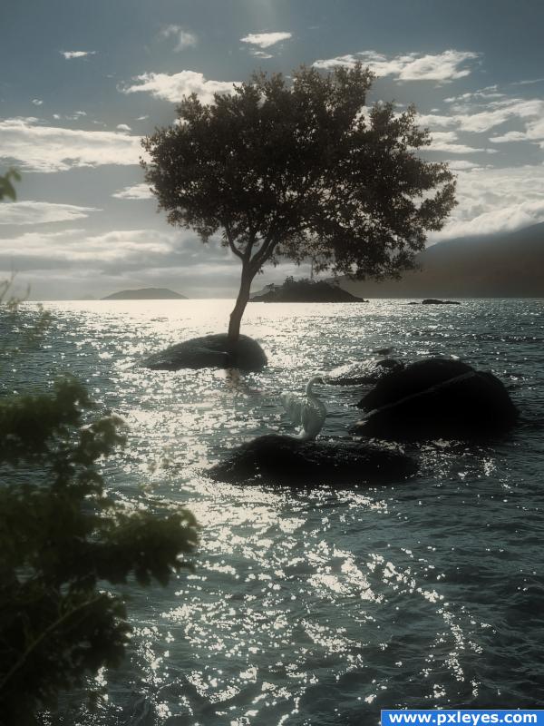
Credit to costi from sxc for the image of the swan. (5 years and 3973 days ago)
- 1: Tree on island
- 2: Tree in foreground
- 3: Swan

Credit to costi from sxc for the image of the swan. (5 years and 3973 days ago)
(5 years and 3974 days ago)
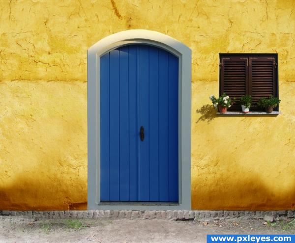
Nice light & color! 

perspective seems slightly off
You should flip the door or the window to make the same lightsource to both
Oops...ditto on the light sources...missed that one somehow, but it's an easy fix.
Reminds me of some South American houses with the bright colors. Argentina? Brazil?
Thanks mqtrf.Totally missed that. Done
looks just like a screen saver my co worker had at work.. only her's was pink... just beautiful!!!
when is a door not a door . . . . . when it's ajar. (is the light on the door from the left - and the flowers cast shadows to the right? Or is it just me . . . . . .?)
nice colour choice
nice
Looks GREAT!
Howdie stranger!
If you want to rate this picture or participate in this contest, just:
LOGIN HERE or REGISTER FOR FREE
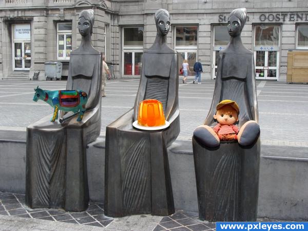
I made their eyes. Then couldn't think of anything else to do with them with their new eyes. So I figured, maybe they could hold something. Looked like they were holding something. So I looked through my own catalogue of images and found my folder of Pxleyes downloads and decided to give them cool stuff from the website.
PLEASE CHECK OUT HIGH RES TO CHECK OUT THE EYES!
All sources are from Pxleyes. (5 years and 3978 days ago)
you forgot to tweak the cow's shadow. i hope.  and why would you flatten the image at the end?
Nice
the shadow from the doll is wrong and the shadow from the cow doesnt match the others, i like how you did the eyes on the statues and the idea is cool...
Merge layers? Flatten layers? Someone want to tell me the difference? I tried different ways to make that cows shadow. I did it and redid it. It was kicking my butt. If anyone has any suggestions they would be greatly appreciated. There's one thing that I know I didn't try, but I'd forgotten how to do it and where I saw it before.
flattening the image IS merging all layers.. you should put the shadow layer below the cow layer, put some blur, play with blending options to see which one fits best. i don't see why you don't use the same technique you used with the other shadows
I didn't use the same technique with the cow as I did with the others because when I used the drop shadow on the cow it affected the others. I know that there's a way to stop that from happening, but I couldn't figure it out. I need to redo the whole cow because I accidently put the cow and the shadow in the same layer. Thanks a lot ELFICHO for the tips. I will try them out. Thanks to Eladine for pointing out the problem with the doll's shadow. I think that I had it right at first. I know what to do. Thanks everyone for the comments. They're appreciated. 
Please take a closer look now! I have fixed my cow shadow and the doll's shadow! Thanks to everyone for your feedback!
Cool  :*)
:*)
he he
Howdie stranger!
If you want to rate this picture or participate in this contest, just:
LOGIN HERE or REGISTER FOR FREE
(5 years and 3979 days ago)
Woah! Great use of source!!
Lovely!
I think you achieved an artistic result! nice job
cool
it is somewhat artsy 
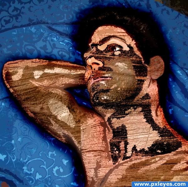
Mike is super.Blue cloth seems to be silk and look too cold comparing to the warm wood of Mike. And please dont laugh cause an amateur like me dare to make critics on your entries, LOL. good luck.
Howdie stranger!
If you want to rate this picture or participate in this contest, just:
LOGIN HERE or REGISTER FOR FREE
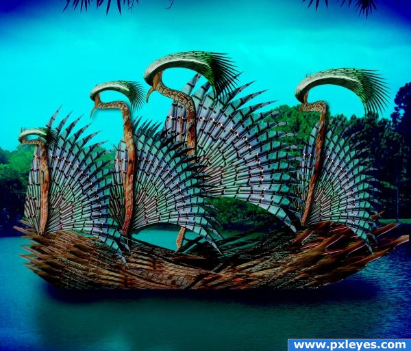
source and my pic for background (5 years and 3982 days ago)
beautiful
load of wrk can be seen here................nicely done..........gl.
Very nice use of source, the reflection looks a little too saturated, so maybe pull the colours back a little bit, other than that.. great job!!
Good change, the reflection was just a bit distracting.. looks good now! 
lol the title says it all! lol
Very nice work. I think the bright blue vignette is detracting from your final result. Anyone else agree?
awesome...
rcscruff is onto something.........vignette is a bit strong. Try fading gently from one color to the other. That wil help focus the eye into the center of your work. I love the colors used....good luck.
Congrats for your second place, Ernest! 
congrats
Congratulations for 2nd
Congrats!
Howdie stranger!
If you want to rate this picture or participate in this contest, just:
LOGIN HERE or REGISTER FOR FREE
Very nice! Good job with the trees, looks great! Good luck
great image!! one thing, the tree trunk is blurry and doesn't quite blend in with the rock that well..
Stunning image.. well thought out and beautifully put together.. good luck
wowaawow nice man.winner I think..
very good work blending thr trees overall beautiful picture
Top pic!
besides the tree growing out of the rock, this is an awesome image!
How lovely! It makes me wanna sit there and just look at this scene for hours. Good luck
....also for your second place, Missy! Great work!
Congratulations for 2nd too, well done
Howdie stranger!
If you want to rate this picture or participate in this contest, just:
LOGIN HERE or REGISTER FOR FREE