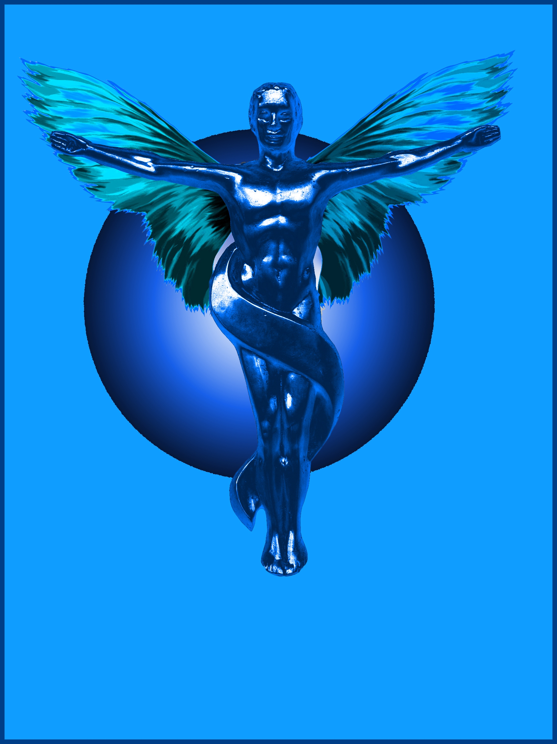
transform paste curves and hue saturation (5 years and 4044 days ago)

Created using brushes and hue/saturation adjustments. (5 years and 4044 days ago)
surreal? when i was last there, it was precisely like this!  good luck!
Never seen the moon in front of clouds before...
another piece that should be renamed PEEK A BOO..hehehe.. great play on the theme.. a nifty impossible effect .. and it works perfectly.. good job.. clap clap clap
There's a first time for everything CMYK46...
good
Like these typs of images
nice job 
Howdie stranger!
If you want to rate this picture or participate in this contest, just:
LOGIN HERE or REGISTER FOR FREE
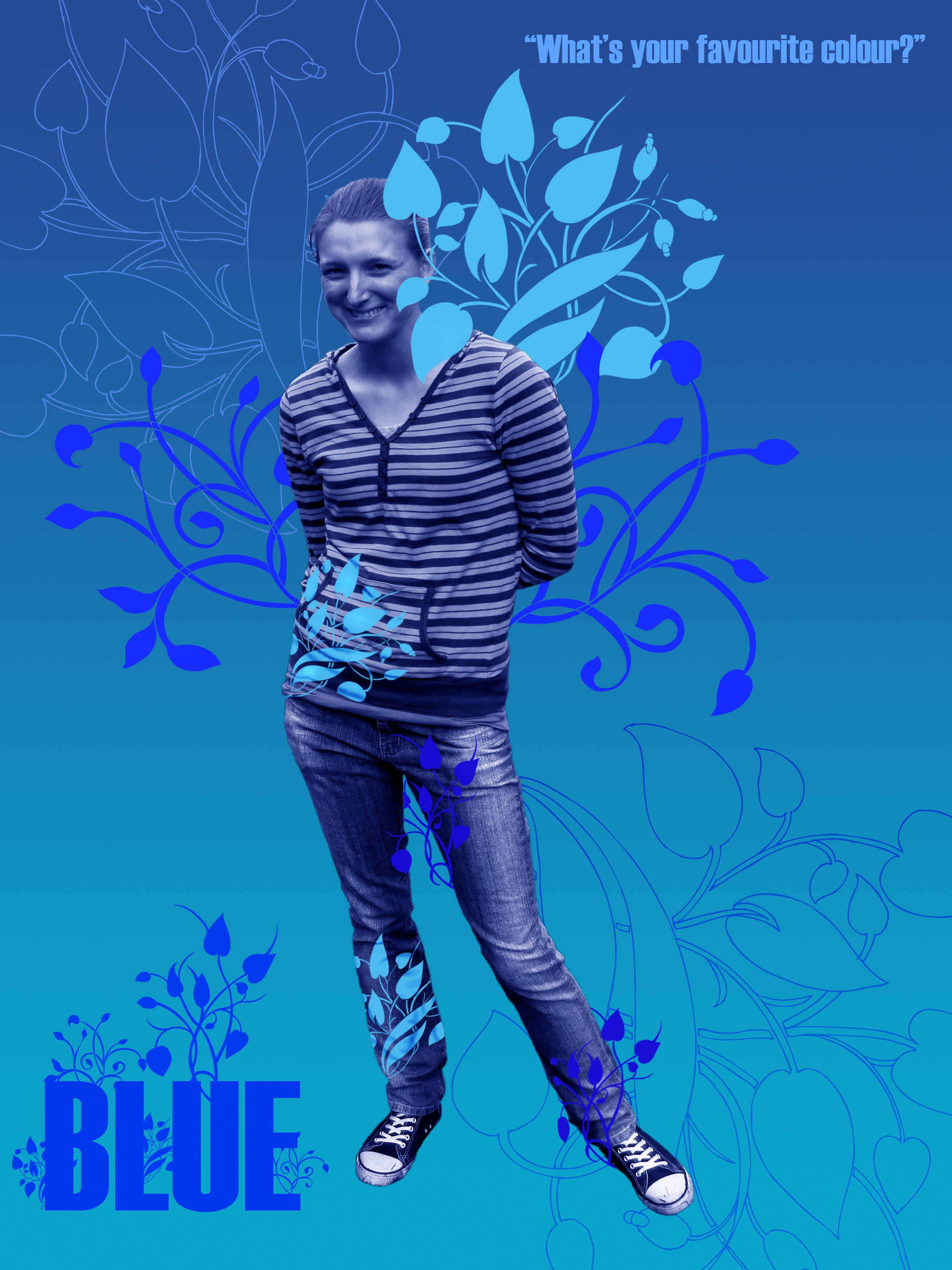
Cut image - feather edges - desaturated it - color balance to blue - used plant/flower brush - Dodge and Burn on 2 of the patterns for shadows etc. oh yea and gradient background. (5 years and 4044 days ago)
very nice and definately blue
Too much red...
To keep it more according to the contest goal, you should reduce the red in the blue, yes. Good luck!
awesome ill get onto that! thanks for the comments - keep em coming - pick the hec out of it so i can learn from it please
heheheheheheheheheheheheheheheheheheheheheee... just... heheheheheheheheheheheheee  high!
high!
would be a great ad... for something LOL.. good luck
I agree that this could be an interesting ad. The lavender 'wings' are not blue, however. And as an ad, I think it would work better if (at a minimum) her skin and hair were their natural color -- which would be counter to the requirements of this contest.
need to remove the pink sorry.
good
You definitely should be designing ads for products. Really nice!
nice job
I don't really like the blue skin on people  but the ornaments look great!
Howdie stranger!
If you want to rate this picture or participate in this contest, just:
LOGIN HERE or REGISTER FOR FREE
Blue, to me, has different meanings that depend on the shade.
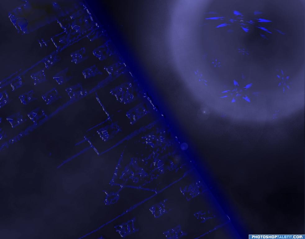
A photo i took was used with a threshold layer over it and a filter to make bumpy effect. (5 years and 4044 days ago)
didnt realize how dark it is...suggestions??
you can try the dodge tool.. just make sure you save the original in a separate file... when I save something and it goes dark I usually save the SCREEN that the picture is in with print screen and change it into a TIF or Jpeg and I can recover it in that form.. good luck.. I can see where you were going with this, and it would be a shame to lose it to darkness
experiment with the dodge tool.but like I said.. retain the original image.. if you use dodge too much you will lose alot of the resolution.. good luck
wait a minit! there is city! good luck!
Tweak the levels if you want to lighten the image.
thanks- i can lighten it but its late for that.
Nothing wrong that it'sa bit dark, but in case you want to lighten up the whole image and you still have your file in layers (I hope), just add an Levels Adjustmentlayer on top of the other layers are play a bit with that. Perhaps in combination with a brightness/contrast adjustment layer, up to you. Good luck!
good
nice job
Howdie stranger!
If you want to rate this picture or participate in this contest, just:
LOGIN HERE or REGISTER FOR FREE
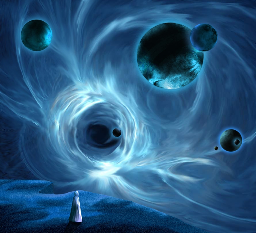
I like spacial scenes, I thought, maybe this "blue" contest would be good to use one of my space works...
Changes made, foreground a little stronger... and the smaller planet over the bigger has the highlight diminished. About the big planet/moon it looks ok to me, I think it looks rounded and spherical...As a matter of fact I used the Filter - Spherize to get this effect.
(5 years and 4044 days ago)
Very spacey...good luck! 
Nice flow.. good luck on this author
i don't know... but how i can to know - i've never been in space... good luck!
Nice textures and mood! Good luck! Looks great!
intriguing? the blue suits the mood. like it
Interesting image, I like the light. Perhaps the big planet in the right corner would receive a bit more light (compared to the smaller planet in front of the big one). Good luck!
interesting image, i like it alot goodluck.
Thank you for comments... Waz..I will reduce the light over the smaller planet that is over the bigger...
Cool idea. The edge of the foreground surface, and the notch in it especially, should be stronger. The biggest moon/planet seems more like a disc than a sphere.
welldone. nice feel
gr8 job....
I love spacial scenes as well
Changes were made....... Thanks for comments and suggestions
nice job
Nice Image!! Good Luck
awesome!!
AMAZING
Congratulations on the top-7 and thanks for the congrats
Howdie stranger!
If you want to rate this picture or participate in this contest, just:
LOGIN HERE or REGISTER FOR FREE
Photography and photoshop contests
We are a community of people with
a passion for photography, graphics and art in general.
Every day new photoshop
and photography contests are posted to compete in. We also have one weekly drawing contest
and one weekly 3D contest!
Participation is 100% free!
Just
register and get
started!
Good luck!
© 2015 Pxleyes.com. All rights reserved.


the sphere is off center..if that was your intent.. that's okay.. just it causes one to look at the sphere instead of the main subject..very beautiful piece though.. GOOD LUCK
EDIT: Well HIGH FIVE then for the explanation.. hehe.. good luck!!
looks better off center nice work author
By placing the sphere off center the balance is thrown off. From a purely technical point, the sphere must be optically centered behind the angel. As GolemAura said, this position causes the viewer to look away from the main area of focus. I also see two gray areas on the inside of the wings near the body. They look like they should have been cut out so the sphere could show through. I do like your concept and the work is nicely done!
good work
I like this good concept
nice job
Howdie stranger!
If you want to rate this picture or participate in this contest, just:
LOGIN HERE or REGISTER FOR FREE