
(5 years and 2676 days ago)
(5 years and 2781 days ago)
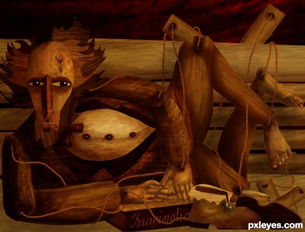
Love this, very creative use of source, it has a Picasso feel. 
Except for lots of raw edges, it's a well made image. GL author. 
Just putting the pieces together to form the puppet is a work well done. Good use of the source. Gl author.
Great use of source 
Congrats for your second place!
Congrats on 2nd, nicely done. 
Congrats! 
Congrats! This is a great image and very well done. 
Congrats!!
Howdie stranger!
If you want to rate this picture or participate in this contest, just:
LOGIN HERE or REGISTER FOR FREE
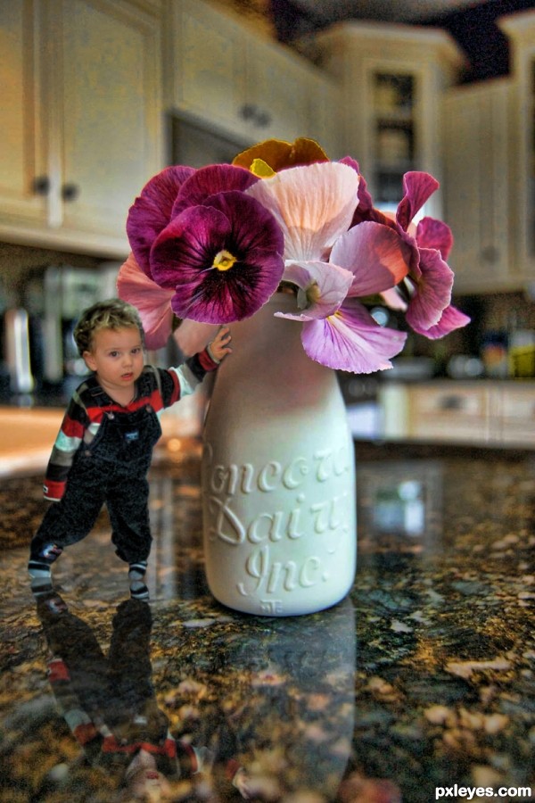
My new nephew, a super bundle of energy :)
SBS photo has blacken out eyes for privacy reasons (5 years and 2898 days ago)
I think you've gone too far with the effects, the poor child looks like he has leprosy and you've lost the rich color of the flowers.
Removed the neutralizing filter (was going for that moody thing other people do, guess I missed the mark)
Intriguing concept. His reflection in the countertop is stronger than that of the vase, however. And his hand on the vase is disturbingly vampirish and weakly shadowed IMO.
Howdie stranger!
If you want to rate this picture or participate in this contest, just:
LOGIN HERE or REGISTER FOR FREE

(5 years and 2989 days ago)
2 color design is really fun when done right. play with the brightness/contrast until you can get the objects to look how you want. in this image the taller flower loses some distinction due to it not having defined edges. a good mask using the pen tool can also help with stubborn edges when they are similar in color to the background. keep practicing!
Howdie stranger!
If you want to rate this picture or participate in this contest, just:
LOGIN HERE or REGISTER FOR FREE
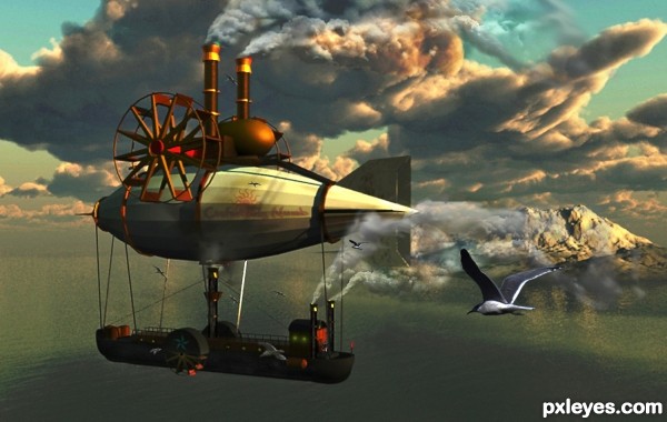
Created using Photoshop, VUE XStream and 3D Max (5 years and 3055 days ago)
very nice
I think the smoke from the closer back pipe should go over the front of the back fin of the blimp.. it's just looks a bit wonky.. but the overall piece is FANTASTIC and fun  good luck!!!
EDIT: Much improved, great job
'prociate that slush, I agree. Made an edit. Thanks!
Great 3D work on this, considerable amount of time for a very cool effect in one of my favorite genres/styles! Good find on the steampunk captain! 
Nice work. The composition suffers from the foreground seagull being too close to the blimp. Bring it to the right about a body length or a bit more, and down just a bit & this will be great. GL author. 
Thanks CMYK46, I agree about that bird being too close to the zeppelin. I have moved it away but upwards instead. I appreciate the suggestion and the nice remark.
Amazing steam punk style image 
great idea and cool image
Nice job! 
Howdie stranger!
If you want to rate this picture or participate in this contest, just:
LOGIN HERE or REGISTER FOR FREE
Interesting idea! Best of lucks author!
nice work author
Howdie stranger!
If you want to rate this picture or participate in this contest, just:
LOGIN HERE or REGISTER FOR FREE