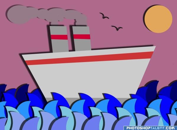
I just wanted to add some shadow to each level.. and just make it look constuction paper(y) (5 years and 3959 days ago)
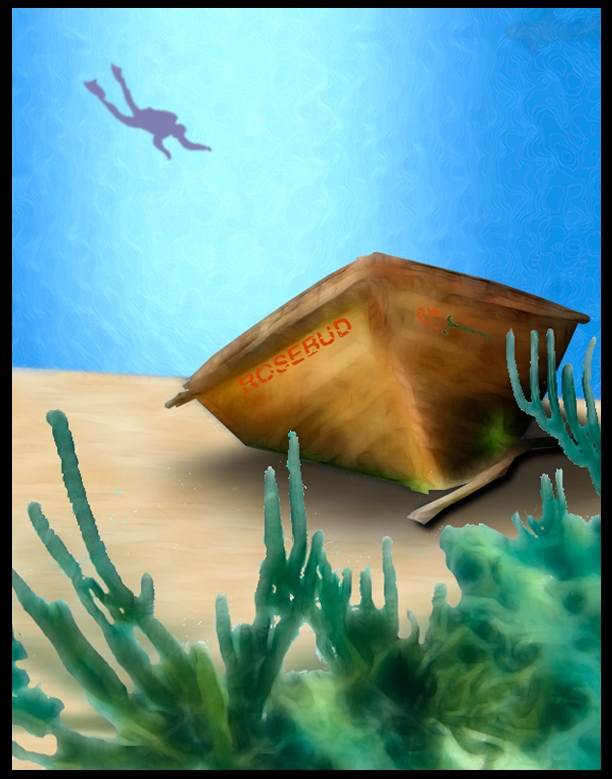
I played with Photoshop's painting and drawing tools. I created a brush for the water, adjusted the transparency and saturation, blurred the diver, seaweed, and shark, adjusting the saturation levels to help create depth. I used the transform tools to play with the text and rosebud and then eroded them to add aging and the results of being under water. I used a drop shadow and played with feathering and transparency for the dinghy on the sand. I applied texture to the sand, adjusting the transparency until I achieved the subtle look I wanted. I used a seaweed photo and a clipart diver for references from my Microsoft clip organizer. (5 years and 3965 days ago)
Yeahh, the other day Citizen Kane was on tv, but fell asleep  . Looks quite ok, but you have to show how you made your entry, author. Also, better remove the sign right under since all entries have to remain anonymous. Good luck!
need to improve
I really like the colors. Small suggestion...Give some shadings and variation to the water and scuba diver. Right now, the diver looks a bit flat. perhaps shade the sides a bit darker and the middle (belly) a bit lighter. This will give it some shape. Just a thought...nice work!!
Howdie stranger!
If you want to rate this picture or participate in this contest, just:
LOGIN HERE or REGISTER FOR FREE
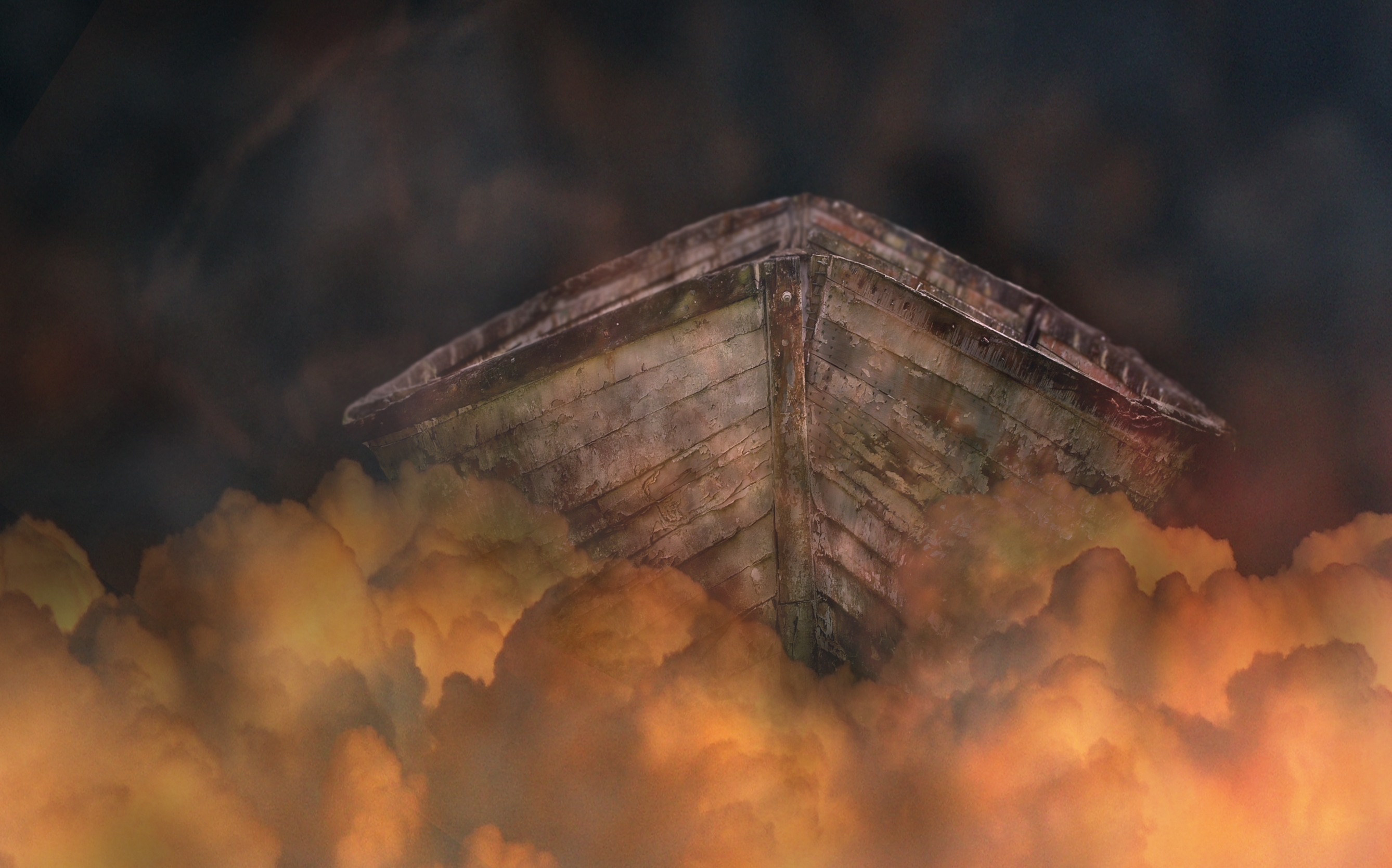
This poor boat is floating on the clouds of hell...
Edit:Thanks for the suggestion. I have made the clouds more opaque to make it feel like the boat is pushing through the clouds like water. (5 years and 3966 days ago)
Nice work, try blending the top of the clouds infront of the boat a little more so they they are slightly opaque and it will give a feel more like the boat is comming through them 
good work
WOW! creative idea! 
Howdie stranger!
If you want to rate this picture or participate in this contest, just:
LOGIN HERE or REGISTER FOR FREE
Ok first is a cool effect
second is very simple
I hope you like it!!
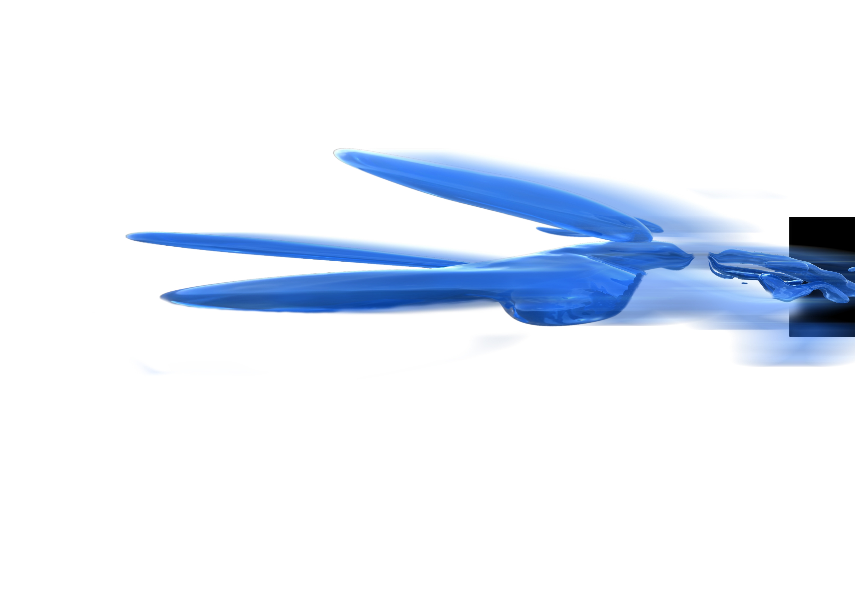
No external source used! (5 years and 3968 days ago)
it will be good, but reflection need some work more, if you care... but it probably does not fit in to your concepts...  good luck!
centering might be helpful, its very heavy on the right side because of the black rectangle... IMO.. good luck, nice image
Good luck.
nice
What is this?
What is this?
Howdie stranger!
If you want to rate this picture or participate in this contest, just:
LOGIN HERE or REGISTER FOR FREE
Photography and photoshop contests
We are a community of people with
a passion for photography, graphics and art in general.
Every day new photoshop
and photography contests are posted to compete in. We also have one weekly drawing contest
and one weekly 3D contest!
Participation is 100% free!
Just
register and get
started!
Good luck!
© 2015 Pxleyes.com. All rights reserved.


Looks very construction papery LOL.. good luck
i really like the shadows it makes the image pop out
shadow color should be the same, but it is a good job
Howdie stranger!
If you want to rate this picture or participate in this contest, just:
LOGIN HERE or REGISTER FOR FREE