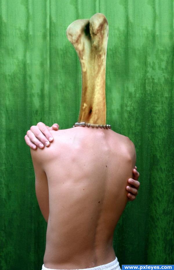
thanks to ~fiori-di-ofelia for boy XI (5 years and 3901 days ago)
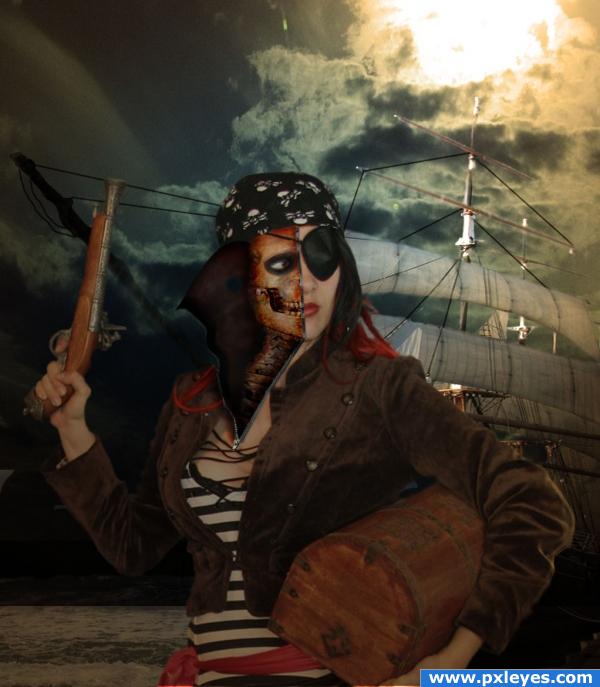
Credits and thankyou for stock photos to the following:
Thank you to Falln_Stock for Skeleton
http://www.falln-stock.deviantart.com/
Thanks to LongStock for Pirate
http://longstock.deviantart.com/
Stockz4U for pirate ship
http://stockz4u.deviantart.com/
Trish the stocker. for the sky
http://trish-the-stocker.deviantart.com/ (5 years and 3977 days ago)
LOL...haven't seen too many zipperhead pirates lately, especially ones with conflicting light sources. 
thanks, working on the light source. Not sure how to do that yet... OH WELL> new skill coming up.
thanks for the hint..
i thought the pirtate was a little bright for the forground and lighting direction from the sky. these were the things i was exploring to fix.
Hint: if you can, just flip the pirate ship, and good luck!
ok FEED BACK on lighting please. i kept a copy of lighter pirate if this is wrong.
Err what sup wit the lighty edge on the ziping part? o.o
This is nice! But there's one thing I noticed: since there are no eyelids or any skin whatsoever on the left side, we would see the whole eyeball inside the eye socket. See if you can create that. And if not, just leave it as it is  It's stil a nice image
And also, you should make a hole in the unzipped skin (where the eye is supposed to be) 
Pretty nice work, especially liking how the skull is in sync with the real head
Oh I love the title!  Very nice work and composition, with the ship in the background. Good luck!
thanks for the feed back. hope the changes are better.
Beauty is literally skin deep hey! lol... great job author!!
love it!
Howdie stranger!
If you want to rate this picture or participate in this contest, just:
LOGIN HERE or REGISTER FOR FREE
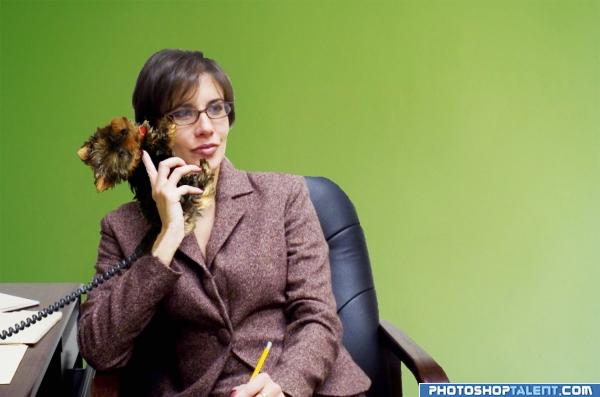
Cockney slang for telephone is "Dog and Bone"
Thanks to planetka, graphiteBP, and sykicktb - all from sxc.hu (5 years and 4017 days ago)
OMG.. RIGHT ON TARGET..back ground sucks.. but most backgrounds at office buildings suck anyway.. so even MORE on target LOL.. good luck on this
Perfectly fitting theme. Might want to draw some hair strands at the top and or soften mask there. 
humorous...good
Lucky its not a pay phone - i would hate to think where you might have to stick the coins.. 
funny 
nice
Where's the bone?! lol Well done! Good luck
Howdie stranger!
If you want to rate this picture or participate in this contest, just:
LOGIN HERE or REGISTER FOR FREE
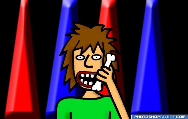
dog and bone- phone
all photoshop, i know the drawing isnt exactly good but it was fun 2 make (5 years and 4018 days ago)
where's the dog?
I guess dog and bone means talking on the phone.. ya gotta put that in the descriptions for all us NON cockneys LOL and I think your drawing is just lovely
Fun is the name of the game! Don't be so self critical your entry shows thought and humor and is very colorful.
good work, treatment of the background is not ok, may be you can use the same style of the charector.
nice
nice
Howdie stranger!
If you want to rate this picture or participate in this contest, just:
LOGIN HERE or REGISTER FOR FREE
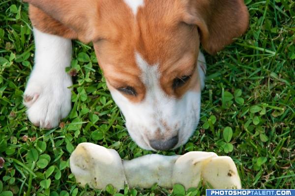
All my dogs love their bones and guard them from the others..lol..
Many thanks to sxc and formach for use of the picture (5 years and 4018 days ago)
lol very simple idea but nice 
AH.. my favorite dog bone.. I can feel all the dog spit as we speak..hehehe.. GOOD LUCK and very nice image
not like bone
sipmle work, but good
i like that you put the effort of making the grass overlap the bone. nice
Its a different source of light for the bone, maybe try and match it to your source some more?
very nice 
good job, source light for the bone is difference from the one for the puppy, maybe make the bone more vertical and place it between its front leg and head as its hugging it, good luck
Good Luck 
fits in well
Howdie stranger!
If you want to rate this picture or participate in this contest, just:
LOGIN HERE or REGISTER FOR FREE
Light source on body is from left. Flip the bone to match, and maybe make it lighter (less green) to pop from the background more. Great idea, good luck!

nice picture of the guy lol
i use this term regularly with the staff i work with lmao......
the bone definitely needs its color adjusted. more of white and cream color and less green. will hold my vote for now.
nice
Howdie stranger!
If you want to rate this picture or participate in this contest, just:
LOGIN HERE or REGISTER FOR FREE