additional source: record by deovonlenti http://www.flickr.com/photos/klif/2113049786/ (5 years and 3512 days ago)

Your destiny's book is open; it's plenty of surprises... it's up to you following its teachings and making good use of them.
Thanks to:
- David Niblack @ Imagebase.davidniblack.com;
- lusi, saavem and vivekchugh @ RGBStock. (5 years and 3513 days ago)
Nice concept. I think i would move the person closer to the key, making the image easier to 'read'.
very nice work author...U did really really good job with the rainbow...very well done
Great work author, GL
very nice composition.. with an OOB touch! .. love the mood
Good idea... 
My favorite part is the rainbow, it takes your eyes on a journey from the top of the image to the bottom. Well done = )
niced one the key and lock add a nice touch
very nice work, great concept for this, love the birds outside the picture. 
Howdie stranger!
If you want to rate this picture or participate in this contest, just:
LOGIN HERE or REGISTER FOR FREE
(5 years and 3544 days ago)
ahahahahahahahahhahah awesome!
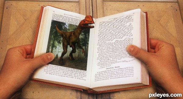
Dyslexia? 
Maybe its a 3D book and he is wearing 3D glasses xD
dyno is my nick !!!! kkkkk.... great job !!!
Pretty funny. Unless it's also a hallucination, you may wanna check the curve from the thumb to wrist. It's a bit transparent (you see the book through it), on both sides. Good luck!
Thanks Wazowski, fixed.
What a book! 

Howdie stranger!
If you want to rate this picture or participate in this contest, just:
LOGIN HERE or REGISTER FOR FREE
(5 years and 3553 days ago)
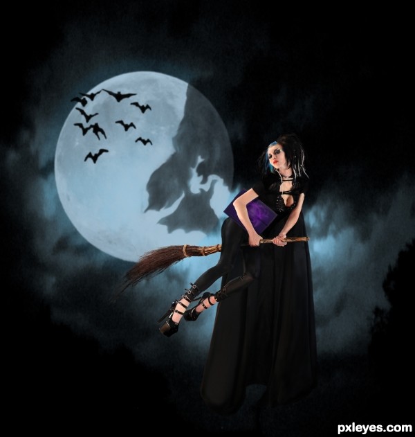
Since this silly thing wouldn't upload the first 8 times i tried, here are the links that go with the image. Thanks to Razor Candi @ deviant art for the "witch" image!
http://ischarm-stock.deviantart.com/art/Ischarm-Moon-Brushes-001-25678773 moon brushes
http://razorcandi.deviantart.com/art/May-2009g-152143852 "witch" girl
http://midnightstouch.deviantart.com/art/To-The-Bat-Cave-40266508 "bat brushes"
Is that a cape? Shouldn't it be flowing behind her?
it is a cape. and on a still night, if she's hovering, it wouldn't be flowing behind her, but hanging. notice, there is a slight flow to the cape making it so its not completely "still" and hanging straight down.
Nice shoes! Bit late now maybe for future reference. Keep an eye on your edges white outlines, smudges and blurs can be very distracting
i really wish i could have spent more time on it, warlock... thank you for the suggestion. but at 2am, i was more blurry eyed than i could stand, so i just hoped for the best. i do realize i could use some help on the edges....any suggestions are helpful! 
Howdie stranger!
If you want to rate this picture or participate in this contest, just:
LOGIN HERE or REGISTER FOR FREE
Hope you all like it! (5 years and 3554 days ago)
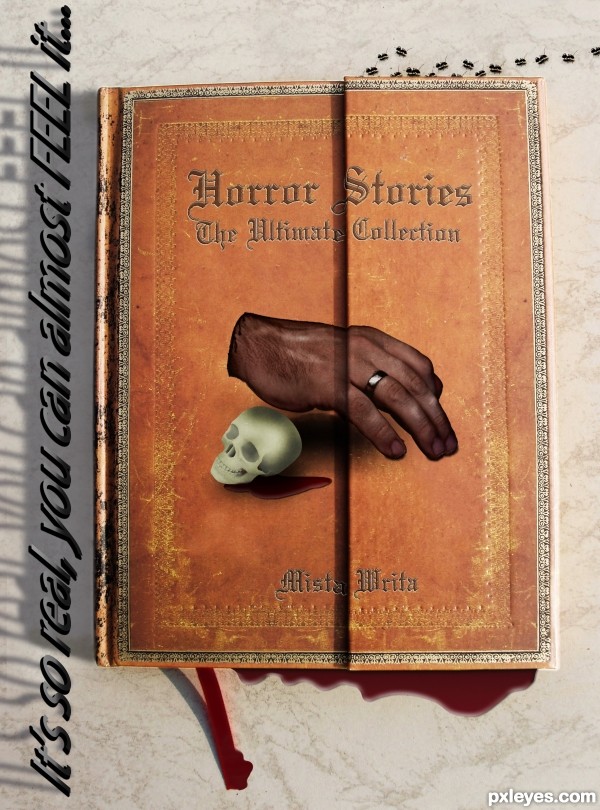
IMO, I'd like printing of the cover had more grungy, oldish like the cover itself. It's quite vivid... 
have to agree, if you look at the texture of the book and the aged look and then look at the skull and hand.... the skull and hand look rather neat, new and very smooth... hope that makes sense  I do like your idea though author so will hold my vote
I like the ants crawling at the top  gl
gl
Howdie stranger!
If you want to rate this picture or participate in this contest, just:
LOGIN HERE or REGISTER FOR FREE
excellent blending!
Creative...very, very creative.
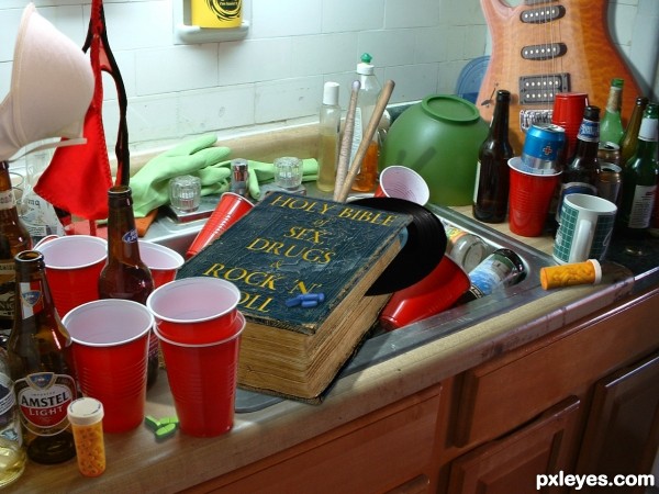
Check the scale or size of the guitar, it looks a little small to me.
I agree with lchappel about the size of the guitar, it was the first thing that attracted attention. And looking at the book, a part of it must appear beside the beer bottle.
Haha... good creation! Fix the small things lchappell and erikuri mentioned and it will be perfect!
very very cool work,guitar is just a bit small if u look other objects.Also,shadow that cast drum sticks should be positioned higher on the bowl...and that's it,idea is fantastic,overall mood great and final product fantastic...best of luck author
I made the guitar bigger. Erikuri was right about how the book should also be visible by the beer bottle. I raised the drum-stick shadows higher on the bowl.
Very good idea. Made me laugh out loud in my office. Well done!
Congrats!
Congratulations, Dan! Nice...
Congrats ..........
Congrats Den,this was my favorite...
Congrats!!
Congrats!!
Howdie stranger!
If you want to rate this picture or participate in this contest, just:
LOGIN HERE or REGISTER FOR FREE