(5 years and 3700 days ago)
- 1: source1
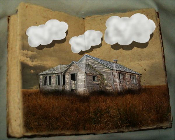
For the clouds I just did a seperate white layer and cut them out, used burn tool, duplicated and made shadow, then blur'd
thanks to fallen stock@DA for the photograph of the book. (5 years and 3721 days ago)
nice image choices, but it doesn't really have the pop-up feel to it. well, except for the clouds
agrees with elficho
agrees with elficho
get a brain....... and be constructive... how did either of you help me?
Howdie stranger!
If you want to rate this picture or participate in this contest, just:
LOGIN HERE or REGISTER FOR FREE
(5 years and 3722 days ago)
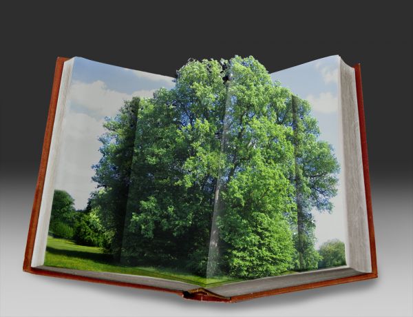
Now this is a perfect example of a realistic looking pop up book! - an example to everyone that went the wrong direction with this theme. EXCELLENT! you have made me a very happy person indeed! my only criticism is you can see the repetative use of the clone tool on the left hand side on the bg trees... fix that and it's well on the way IMHO. 


ok i will fix that when i will wake up , its 4 am here XP
LOL James, relax, dont do it. Nice job author 
Doesn't show much dimension, but certainly on theme... Bottom part of tree fold should show a triangular upward element corresponding to the top of the tree.
simple looking image, but absolutely perfect in this contest............ well done, you have my vote 
great job!!!
FINALLY!!!!! An entry on theme! I think your dimentions are well done. GL!
perfectly on theme, but you should adjust some details: the pop up shadows are too big - and creates a flying effect to pop-up. then you have to pay more attention on the tree masking on the upper side. good luck!
Good work!
ok i fixed the clone tool effect , thank you all for the suggestions
thats better GL
Beautiful job......G/L Author.
some thing on theme.very well done,good luck
Congrats for your third place, Sophia!
Congrats on your placement! 
congratulations on your 3rd place sophia... well deserved!!
Congrats 
Howdie stranger!
If you want to rate this picture or participate in this contest, just:
LOGIN HERE or REGISTER FOR FREE
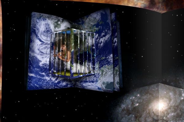
... of a bigger book (5 years and 3726 days ago)
Nicely done...good thinking! 
good work author, unique, interesting and well thought out 
Like the unique perspective, and well put together too!
SBS would be nice... very good job...
unique idea...
the only on theme entry well done!!!... even looks as though it would work..... if im looking at it right 
thank you for the comments! Now I have a sbs too...
GoOD wORK!
good work. on theme entry.very nice . GL
im surprised that this didnt make the top 3 
Howdie stranger!
If you want to rate this picture or participate in this contest, just:
LOGIN HERE or REGISTER FOR FREE
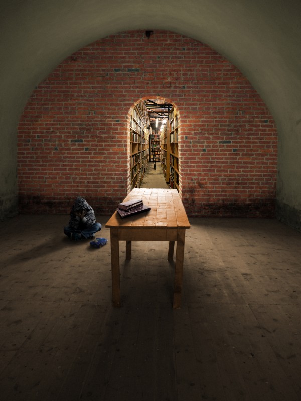
To explain the title, I picture this boy withdrawn in the dark room from some unknown sad event. That's just the situation I imagine from the scene.
I just tried to focus on believability and atmosphere. The brick wall photo is mine.Thanks for the other source photos from homero nuñez chapa (toy car), Lydiat (bookstore), Pamporoff (old Books), and Vincent Crivello (boy) (5 years and 3746 days ago)
Why what? It's a nicely done image, but I don't get the relevance of the title. The shadows of the boy & toy should rotate about 5 degrees counterclockwise.
very nice blend of sources, and excellent shadows. Great job!
I would adjust the shadows on the kid and car. Only noticable in high res but they kind of seem like the are floating. The books are a better match as far as correct shadow. I was confused by the title too. Perhaps you could include that in your description. 
EDIT: It appears like you made the shadow adjustment.  I didn't mention before but you did go a good job on the perception and felt I must give you props.
So far my favorite in this contest. The use of a vanishing point is outstanding. Few things are more satisfying than finding a nice quiet place to read, play with a car, or just be alone. I really like the feel of this peice.
very nice g.l
Very good work 
the doorway is off center
Thanks for the contructive comments. Yes I did adjust the shadows per CMYK46 about 2.5 degrees & tried to clarify the title. I also adjusted the shadow under the car(thanks jawshoewhaw) and trimmed the edges of the shadow because it had a bit of a curve to it. RickLaMesa, The source window was off center too. I just put the door where the window was, lol.
looks real nice...gl
nice blending of sources author... well done... 
Nice work.
Personally I think it quite good, nice image and well done
I like this, great work
Howdie stranger!
If you want to rate this picture or participate in this contest, just:
LOGIN HERE or REGISTER FOR FREE
Cool
Nice....
Where's the source?
wheres the source??
great idea and shadow cast, my only observation is that the environment has much too straighter and rigid lines...
Howdie stranger!
If you want to rate this picture or participate in this contest, just:
LOGIN HERE or REGISTER FOR FREE