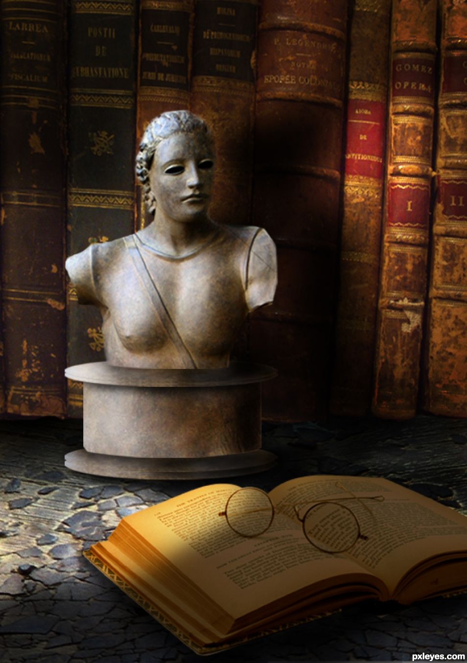
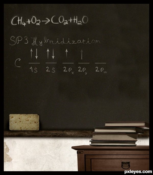
No description, the image shows the meaning.... (5 years and 1594 days ago)
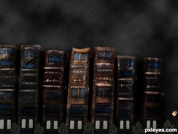
(5 years and 2945 days ago)
I love it!!
Thank you Sofie! 
Howdie stranger!
If you want to rate this picture or participate in this contest, just:
LOGIN HERE or REGISTER FOR FREE
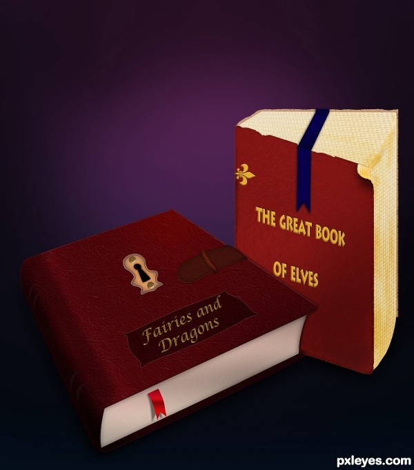
Photoshop (5 years and 3007 days ago)
Howdie stranger!
If you want to rate this picture or participate in this contest, just:
LOGIN HERE or REGISTER FOR FREE
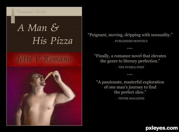
Increased the figure's brightness by 19, contrast by 7. In order to begin colorizing him, I created three color layers over the figure: one beige (layer set to Soft Light), one salmon (layer set to Color), one blue (layer set to Soft Light). I went in with the brush tool (Soft Mechanical, various sizes) to add detail to the color. Burned and dodged here and there, mostly to keep the emphasis on the face and pizza. Used a grunge paper texture for the background, adding a violet gradient. Feathered and faded the figure to let some of the background seep in. Also brushed some of his skin tone into the background here and there to further integrate him. Kept some shadows surrounding the figure in the background, just erasing them lightly. This added variety and more sense of weight. The lighter red bar with the "author's" name is the grunge paper background without a gradient or darkening. I added a faint outer glow to the name because it seemed it might get lost in the red bar. (5 years and 3144 days ago)
Excellent colorization, hilarious reviews!
Truly a fun and imaginative chop. Very well done!
Thank you so much, MossyB!
Very creative use of the most challenging portion of the contest image excellently colorized as MossyB noted. Great type fonts and layout. The 'Thyme Magazine' blurb is inspired.
the brown color band on the title should have the same "textured" look 
Howdie stranger!
If you want to rate this picture or participate in this contest, just:
LOGIN HERE or REGISTER FOR FREE
sanja gjenero-http://www.sxc.hu/profile/lusi
Justie-http://justiej.deviantart.com/
Keith Syvinski-http://www.sxc.hu/profile/LeoSynapse
Mateusz-http://arcatrip.deviantart.com/
www.bashcorpo.com-http://bashcorpo.deviantart.com/
Thanks guys for the great resources...
(5 years and 3598 days ago)
COVALENT BONDS!!!!
EEEEEEEEEEEEEEEEEEEEEEEEEEEKKKKKKKKKK!!!!
RUN FOR YOUR LIVES!!!! (thanks for the return of a nightmare...hehehe) very clever Idea!!! Good Luck


nice work ......... gud luck ............... 
very nice
Howdie stranger!
If you want to rate this picture or participate in this contest, just:
LOGIN HERE or REGISTER FOR FREE
Fun Idea author, but I think your attempt at a drop shadow under the bust and the pedestal pieces pops it apart and it becomes floating chunks. You can see it happen in steps 4 and 5 in your SBS. BOINK. Repeat the top of the pedestal under the original to give it a 3D effect. Apply slight darkness (very similar to bevel emboss). This will give the top of the pedestal thickness and ground it. Look at your ORIGINAL pedestal bust creation, you had it quite right there. Careful with your under shadows, they can cause a floating effect as well. Yikes... You know what to do and I'm beginning to sound like the hum of a refrigerator. hehehe Great Job
Hi, I tried to be so precise.... and see what happened? Thanks a lot, I always think that drop shadows look nice... and you are right, they make the object float.... you are becoming a good teacher my friend. Thanks.
Good advice above, you don't want a shadow between the bust & the surface it's on...and his right edge (our left) is pretty blurry.
Thanks Bob, did a little patching....
Howdie stranger!
If you want to rate this picture or participate in this contest, just:
LOGIN HERE or REGISTER FOR FREE