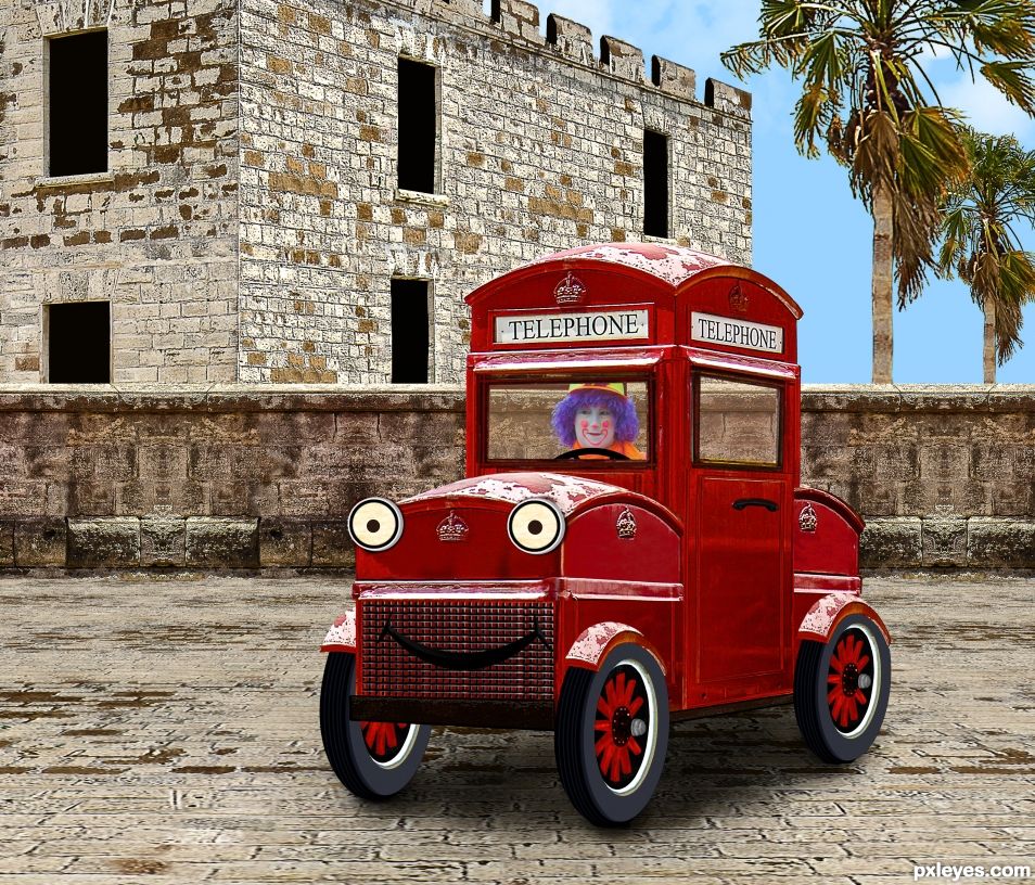
All source, except clown. (5 years and 1047 days ago)

thanks to http://www.sxc.hu for the additions
Used given source to make my drawing come to life
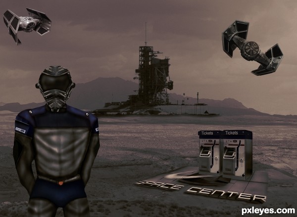
Thanks to Pxleye for the given photo for the booths. (5 years and 3515 days ago)
Is this an SBS record? Very well done!
whoah monster sbs !!!!!!!!!
Cool idea. Assymmetry of guy's torso is a little disturbing, however, at least to me. I wish the guy stood out more given that he's where you put all your work. Moving him to the right a tad to bring him in accordance with the Rule of Thirds might help. Placement of the elements seems random. The ticket dispensers are stranded with no apparent path to them from the guy and then no way to go anywhere once a ticket is purchased. I find it hard to evaluate the relative size and position of the medium-sized fighters since this is just 2D, plus they're not casting any ground shadows. I think either bigger (clearly closer) or smaller (clearly farther away) would be more effective. The very bright highlights on the left fighter do not seem justified by anything else in the image.
Wow! A lot of work it's seen here... The mood and the coloring give the special touch to the image, and nice drawing, author. GL! 
very cool work author...good luck
Like your idea.... good luck
Best of luck on an awesome creation!!
Howdie stranger!
If you want to rate this picture or participate in this contest, just:
LOGIN HERE or REGISTER FOR FREE

Resources + Images-http://euphoricdesire-stock.deviantart.com/
My hero has real wings.-http://wingsofahero.deviantart.com/
Youri-http://meandmymachine.deviantart.com/
Nicolas Raymond-http://www.sxc.hu/profile/somadjinn
Michal Zacharzewski-http://www.sxc.hu/profile/mzacha
Jose-http://zeta32-stock.deviantart.com/
Lavica-http://lavica-photoshop.deviantart.com/
Mila Vasileva-http://milavasileva.deviantart.com/
Thanks guys for the fantastic resources... (5 years and 3705 days ago)
Pretty ....
nice concept...n awesome colors composition...........
Shadows?
shadows would add depth.
Sorry about the shadow guys...i just add some...thanks for the suggestion i was forget for that...thanks again.
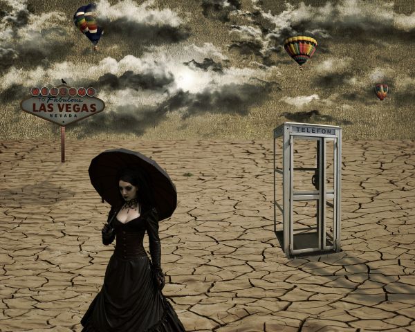
shadows fall two different directions... great image though! GL!
bjaockx sun is between 2 objects,so shadow will go in opposite directions.And something else,this is surreal contest...here the natural order is not in line... ...still thanks for your comment.
Nice image.
Shadows are in different directions but a nice image....Nice work...
Now I'm new here but what I don't understand is why usually everyone yells when there isn't a step by step how I did it. Then other times not a peep from the same people who usually toot the horn loudly??? Newbie wondering??
Shadows are fine. The light radiates from an obvious central object. And @ Martrex: read the FAQ. An entry doesn't need to have a SBS unless it is created solely from the PXL source with no outside sources. An entry with a decent SBS will usually get better votes, though...
Howdie stranger!
If you want to rate this picture or participate in this contest, just:
LOGIN HERE or REGISTER FOR FREE
Congrats, very well done and a terrific sbs
Thanks madamemonty. I feel so lonely with just one comment. But we got you, me, and the clown in the car, which sounds like a damned good party.
Congrats BWR!
Congrats BWR!!
Howdie stranger!
If you want to rate this picture or participate in this contest, just:
LOGIN HERE or REGISTER FOR FREE