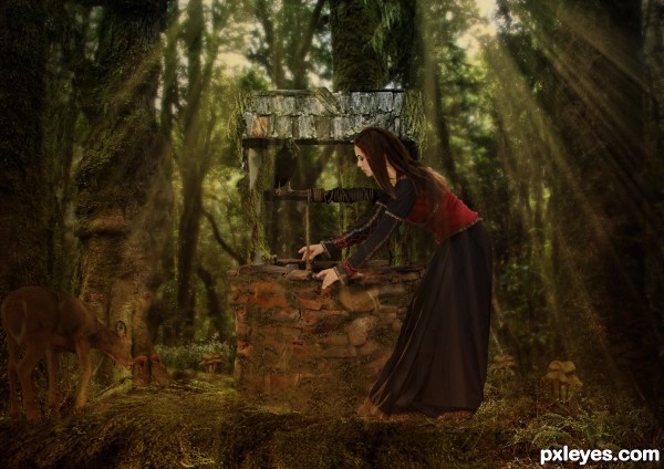
I used two outside sources from artists off of deviant art. With the exception of the source images all other pictures were my stock. (5 years and 2946 days ago)
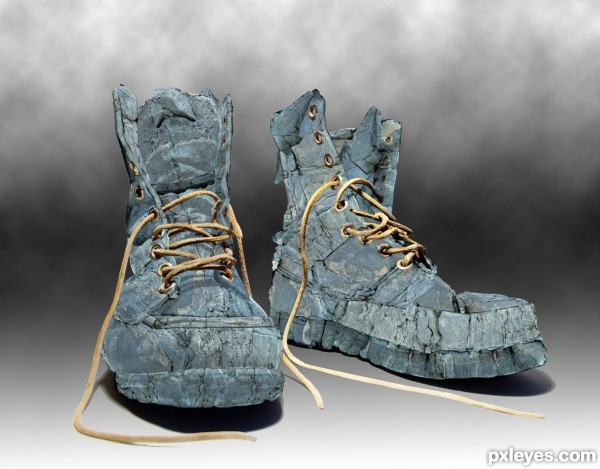
A bit uncomfortable, but tough!! (5 years and 3308 days ago)
cool interesting work...best of luck author
love this, good luck!!
Can somebody walk with these heavy boots? Nice creation....GL author.
You just have to be careful with the blisters!!!
Thanks for your comments! 
very cool, good luck
Cool rocky boots, they might hurt 
Howdie stranger!
If you want to rate this picture or participate in this contest, just:
LOGIN HERE or REGISTER FOR FREE
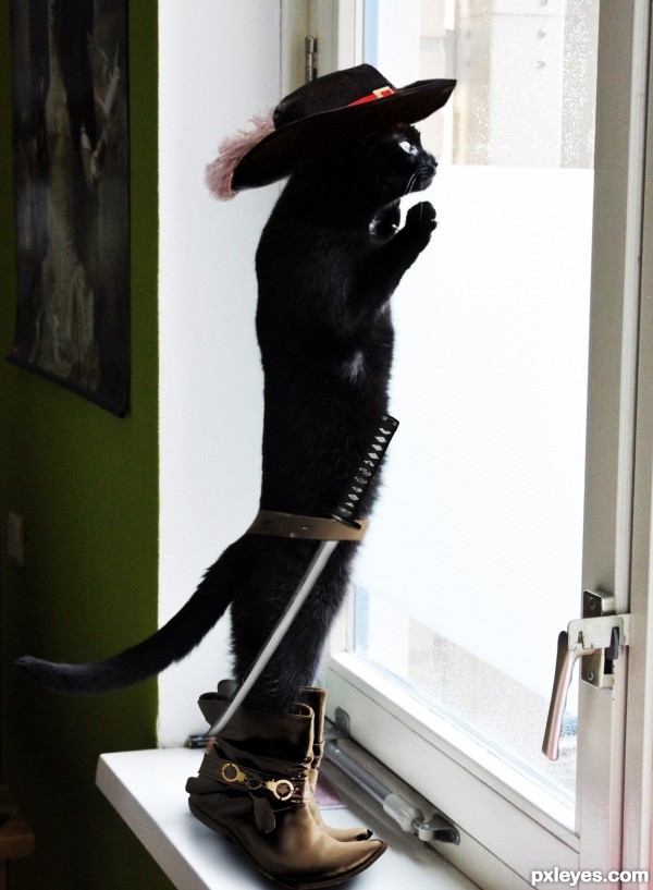
thanks to bberburb, HSmade and th3ph17 for the stocks. (5 years and 3536 days ago)
Hehe, very nice idea! My suggestion would be to reduce the saturation of the yellows and reds on the boots, the colour cast clashes with that of the background image. Good luck! 
Pretty clever.. I know the boots aren't meant to fit, but they're still a bit TOO large for my taste. A bit more work with the colours and stuff and it'll be very good.
Haha good idea 
I changed the color of the boots. I hope it is better now. I would like to hear your opinion. Also I have added some shadows over the belt and the sword (may be more visible in high res). Anyway, I like the size of the boots and decided not to change it for now. Thanks for your comments and suggestions.
How about increasing a bit the contrast of the cat's image? I think its colors are a little "rinsed out", comparing to the boots and hat. But it's a very cute entry. 
ahahahah very cool
Thanks for the suggestion erikuri. I have changed the contrast a bit and I think it really is better now.
 fantastic author, can i have him
Much better now. I still disagree about the boots, but I won't punish you for having your artistic freedom with that. The fur looks better with higher contrast and the shadows too. You could give a very slight burn tool or something for the belt edges and if you could make the sword blade just a bit more sharp and clean looking, it would help too. Good job with the improvements..
so cool...
Very cute and great use of the source!
Congrats for 2nd
Congrats! 
Congrats for your second place!
Thank you!
Howdie stranger!
If you want to rate this picture or participate in this contest, just:
LOGIN HERE or REGISTER FOR FREE
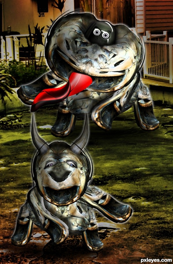
source and my pictures (5 years and 3562 days ago)
Another crazy entry 
crazy is as crazy does 


Superb
Haha awesome stuff author!
which one is Wee Boots? 
Catherine is the big one in back.. she's going to get Wee Boots cause he just tagged her IT... hehehe
 You are genial!
strange but very nice
Howdie stranger!
If you want to rate this picture or participate in this contest, just:
LOGIN HERE or REGISTER FOR FREE
source only (5 years and 3624 days ago)
great work ! 
Great job, as always ! 
Fantastic work......lol
*jawdrop* its not fair. how do you do it??? *mental note... i needs a better imagination*


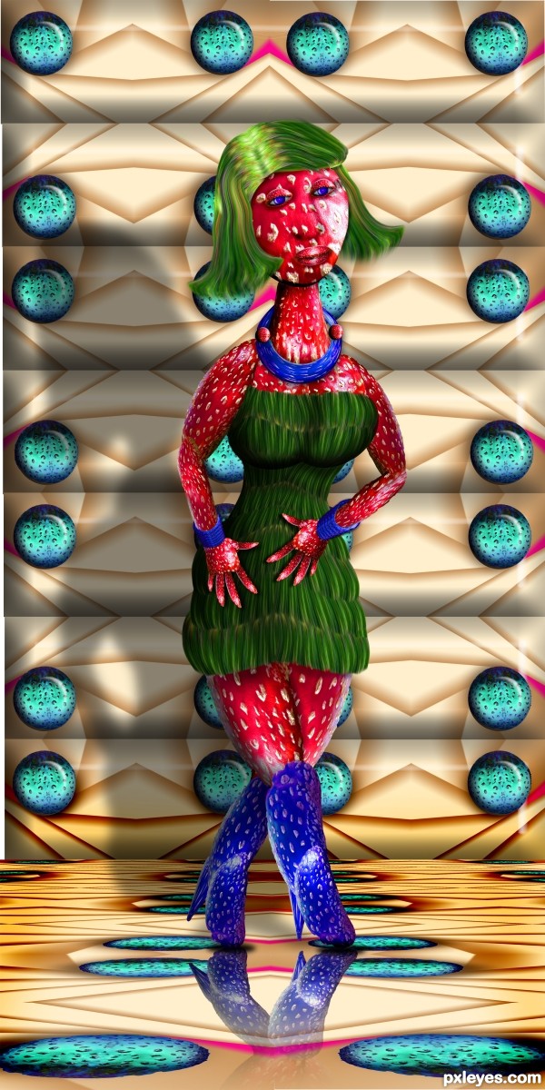
nice work author but she have a sad face

@Sophia: I don't think she looks sad... For me she has a "blasée" look - I don't know the expression in English... 
nice................
nice and nice and nice............ 
Nice work author 

@Sophia and Erikuri.. I was actually aiming for Melancholy.. but blase' works as well... unconcerned melancholy would be a happy medium.. LOL
Good work author.Nice entry.
 .
.
nice
Does she ever have a skin problem!!!! Love it as always. GL
Nicely Done!!!
Howdie stranger!
If you want to rate this picture or participate in this contest, just:
LOGIN HERE or REGISTER FOR FREE
I really like the composition, author...just wish the woman fit into environment better. Perhaps the lighting on her doesn't match the lighting in the forest. If you adjust this, it might place her there better.
Howdie stranger!
If you want to rate this picture or participate in this contest, just:
LOGIN HERE or REGISTER FOR FREE