(5 years and 3638 days ago)
(5 years and 3711 days ago)
Nice work, GL 
Nice work.....Good blend actually........
Thank You 
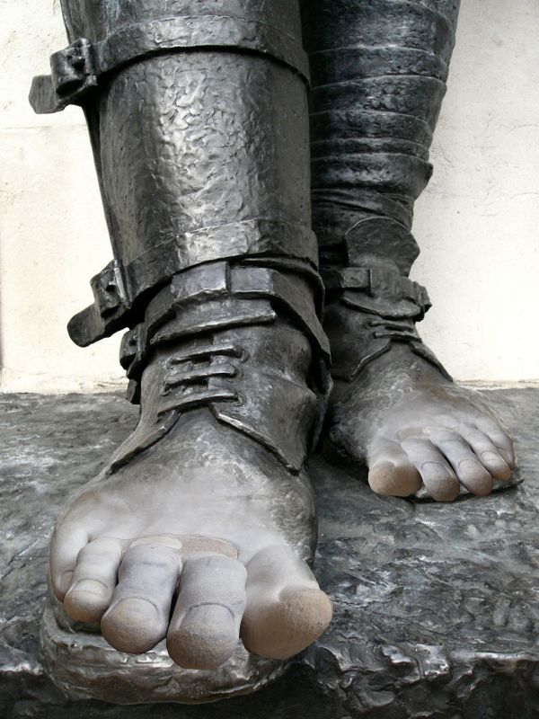
I would say turn the feet so they are more over the sandal bottom... but after living in Florida for so long.. that's usually how sandals feet end up looking like down hear LOL.. great idea
Try fixing the right foot , he looks flat footed ..lol ...GL
Idea is great,bur left foot is too distorted....
Howdie stranger!
If you want to rate this picture or participate in this contest, just:
LOGIN HERE or REGISTER FOR FREE
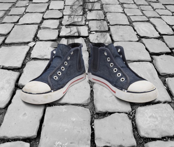
I changed the perspective of the paving so it more matched the angle of the boots (thank you vierdrie aka Jean Scheijen for the pic of the boots), masked out the white in the boots and added some smoke (thank you celeborn_p for the great pic of the smoke) to the insides of the boots by making the smoke a multiply layer to hide the white background (5 years and 3749 days ago)
It's simple but clever. However I would blur the source image a little to better match the shoe resolution. It kind of stands out right now with the shoes being slightly blurry and the cobble stone so clear. Can you please provide an SBS so it will not get removed.
Funny, but jawshoewhah has a point. That is, the shoes are very sharp at the nose and more blurry (out of focus) at the backside. A same certain thing would happen with the paving too (that is, somewhat halfway the image). Also the smoke, since that's also coming from the backside of the shoes. Would be nice if you could experiment a bit more with it. Good luck!
haha thats a good idea except the vapor looks more like smoke
lol,,,,,great sense of humor
Howdie stranger!
If you want to rate this picture or participate in this contest, just:
LOGIN HERE or REGISTER FOR FREE
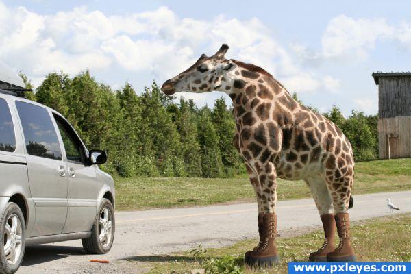
When you're height challenged, platform boots are the way to go. Source link noted. (5 years and 3843 days ago)
i think he could use some high heels XD and a ladder lol
Nice job shrinking him & making the boots!  I think he'd have a slightly bigger shadow, though...
Eladine: Might give this poor thing more class than he can handle...CMYK: Thank you for the observation...I made the shadow slightly larger. Thanks 
I like this entry! Very nicely done.
wow this looks so real LOL
*lol* That's cute and scary at the same time. You did a great job with creating the boots! They look very good, just like that whole poor giraffe  Good luck!
Wooooooooooooooooooooooh...just weird...but executed very well
Very nice.. great job with the boots.
lol If you wouldn't have explained it in your description, I wouldn't have been able how this went on theme -- cute- it almost looks like a horse now 
Congratulations for 3rd
Congrats for your third place! 
congrats for 3rd! very good!
Congrats!
congrats
congratulations, great one!
Congrats!
Howdie stranger!
If you want to rate this picture or participate in this contest, just:
LOGIN HERE or REGISTER FOR FREE
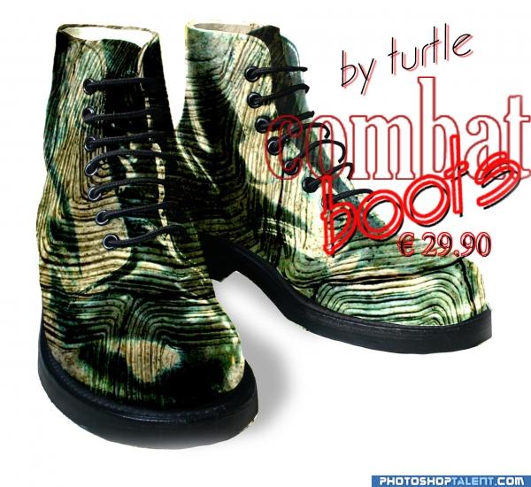
curves copy erase ligth screen (5 years and 3947 days ago)
Good idea, but high res is sloppy...fix & blur some edges. Try to give the center boot more volume, and make the type bolder. Maybe a shadow would be nice, too...
nice idea good luck!
Poor turtle  Good luck
no turtles were harmed in the making of those boots lol
nice
GL!
nice
Nice idea, but need some clean up here and there (for example, I see some of the turtle texture coming from under the soles). The right shoe (for viewer) looks more convincing than the left shoe, maybe a bit of more shading there were the sole and texture comes together so that the difference in quality (the shoe source looks sharper) is let noticeable. Good luck!
Howdie stranger!
If you want to rate this picture or participate in this contest, just:
LOGIN HERE or REGISTER FOR FREE
nice...
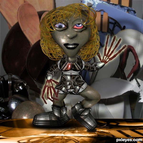
quality work........ eyes will be more effective if you put a narrow dark shade in the eyes near the eyelids ( eye lid shadow). and eye position... i think you intentionally given the wired eyes... but it will be more good if you give a normal posture for both eyes........ that's all i want to say..... love this one tooooo..... Good luck...
cool eyes
cool eyes
wonderfull XD
very cool...eyes are totally wacky...good luck
enhanced the Eye shading.. kept the googly eyes cause that was done on purpose
pretty amazing. seriously! and i love the sbs! i keep learning new things.
My dear, I knew it was you!... Your creativity goes beyond our imagination! It's really a wierd kitchen creature, certainly!
 !
!
But, pls... upload in hi res; I'd like to see the details! Because I
yes hi res be nice Great chop Author
uploading hi res as we speak.. for got to click the little square.. WHOOPS
 sorry guys
added the hi res
Amazing work....Keep it up..GL..
wow.......... great chop again
Great chop author

Funny!
marvelous entry
Great, I just love all the items you chose to use for your kitchen being. Excellent execution of such an awesome entry!! A definite fav of mine!!
congrats , i will say this contest was made for you lol
Howdie stranger!
If you want to rate this picture or participate in this contest, just:
LOGIN HERE or REGISTER FOR FREE